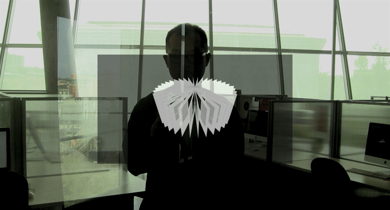
Page Transition
Before the Hairspray show started on the Broadway theatre, all doors were closed, and all lights were off. The auditorium turned to pitch-black, and the opening stage curtain made a rolling sound. Some tension and a feeling of expectancy for the musical opening arose for an abnormally long moment. Then, suddenly, the colorful stage popped up with bright lights and rhythmical music played. The audience finally released their breath. The transition from the waiting time redounded to the impression of the show. It was the moment I realized the practical aspect of visual transition techniques and the darkness.
Transition in graphic design is a solution that switches one visual information to the other. The method connects the two and adds another type of information, as if a blank front page of a chapter in a book gives some impression of the upcoming content. Also, it is the way a machine responds to input. For example, unlike all models, a television screen momentarily shows a black screen when we push a channel button. The null response is the information saying that it is in the input process.
Before the digital video editing technology enabled many different actions between frames, only a few page alterations existed, fading and rotating. The classic transitions were occasionally used in a movie for a scene transition. Fading out effect with harpsichord sound, for example, naturally leads the viewers to a flashback scene. Transition helps watchers to understand the connected information if it is used properly. Otherwise, it is just uninteresting graphic jargon; the face change in Chinese Sichuan Opera is even more enjoyable. Video editors, computer programmers, movie directors, and graphic designers have been oblivious to the possibility of page transitions on the screen until the first Macintosh was introduced in 1984.
The Macintosh was the first successful personal computer featuring a mouse and a graphic user interface. Although Douglas Engelbart in the Stanford Research Institute had already invented the early version of the mouse and visual user interface in 1963, I would cite the Mac example for this time because it led the technology to the next level. A mouse, a two-dimensional motion detector, fascinated computer users because it allowed them to freely move the cursor on the screen by dragging their hands. The command-line interface limited approachability because the language was complex to learn. However, a mouse was accessible and easy to understand. The browser view moves down as we move our cursor (hand on the mouse) down on the scroll bar; the hand cursor icon is brilliant. As the cursor on the screen and the mouse are indirectly but strongly connected, using an animated graphic is inevitable because of the hand motion. Thus, vibrant graphics unlocked many different page transitions. Later on, many script languages gave the body many (unnecessarily) types of page transitions.
From a graphic design perspective, selecting appropriate page transitions is more important than having many options because it strongly affects understanding the content. Presentation slides are one of the popular methods to share an idea. It should articulate contents and convey without misapprehension. So we can learn the helpful page transition from presentation software. Keynote, the most popular presentation software for Mac users, has provided various graphics effects. Animated transition enhances the presentation quality. Although Apple has been releasing new versions of the Keynote since 2003, its transition options are almost the same. The Keynote example proves that the diversity of transitions is not critical.
One day, my computer had a malicious virus. It showed all graphics opposite the mouse’s direction; the arrow cursor moved to the left when the mouse moved to the right. The virus distorted the relationship between the mouse and the computer and affected my user experience negatively. I realized that the user experience is not always defined by the computer’s sensitivity to our input.
User experience becomes a significant concern for page transition. As sensor technology improves, computers gain a better sense of human gestures. The multi-touch technology requires gestures using their fingers, like swiping, pinching, shaking, and twisting. And the gestures strongly relate to the behavior of transition. The page on the screen moves in the direction of swiping and rotates toward turning. The manner of the page transition follows the motion of the hand. The principles have shaped Keynote’s page transitions since 2008; the first iPhone with a multi-touch screen was released in 2007. Color Planes and Fall effects in the 08 version were removed in the 09 version. Unsurprisingly, they did not have a strong interrelationship with finger gestures. Eventually, gesture-based page transition will be retained.
The page transition is not decorated. It should help users understand the relationship between the contents. Computers will gain a better sense of human intention through sensors; three-dimensional input devices like the Wii Remote and the Kinetic for Xbox are already commercialized in the game industry. And computers will react more sensitively to our physical motions via sensors. Developing expeditious page transitions should strongly relate to the study of human gestures. Although many different graphic elements have been designed for transition effects, some visual elements do not concern their users. I expect to see better and more natural page transitions on screen soon.
The best transitions disappear into the content. 2011/08/03