Design Translation
My interests and a mixture of various influences formed me as a unique individual. For you to understand my design style, here is my design journey.
Language
Learning a new language
Born and raised in South Korea, I came to the States in 2003 to learn English. The years were tremendously challenging for me, but they were worth it. Later, I expressed my internal process of the time in this self-initiated project called Konglish.
.webp)
Arduino-controlling servo motors depict my effortful translation process between English and Korean.
Language is Louder than Visual
Studying English as a second language taught me to think carefully with written information, from a beginner language course to a professional career environment. And I desire to improve my reading and writing skills.
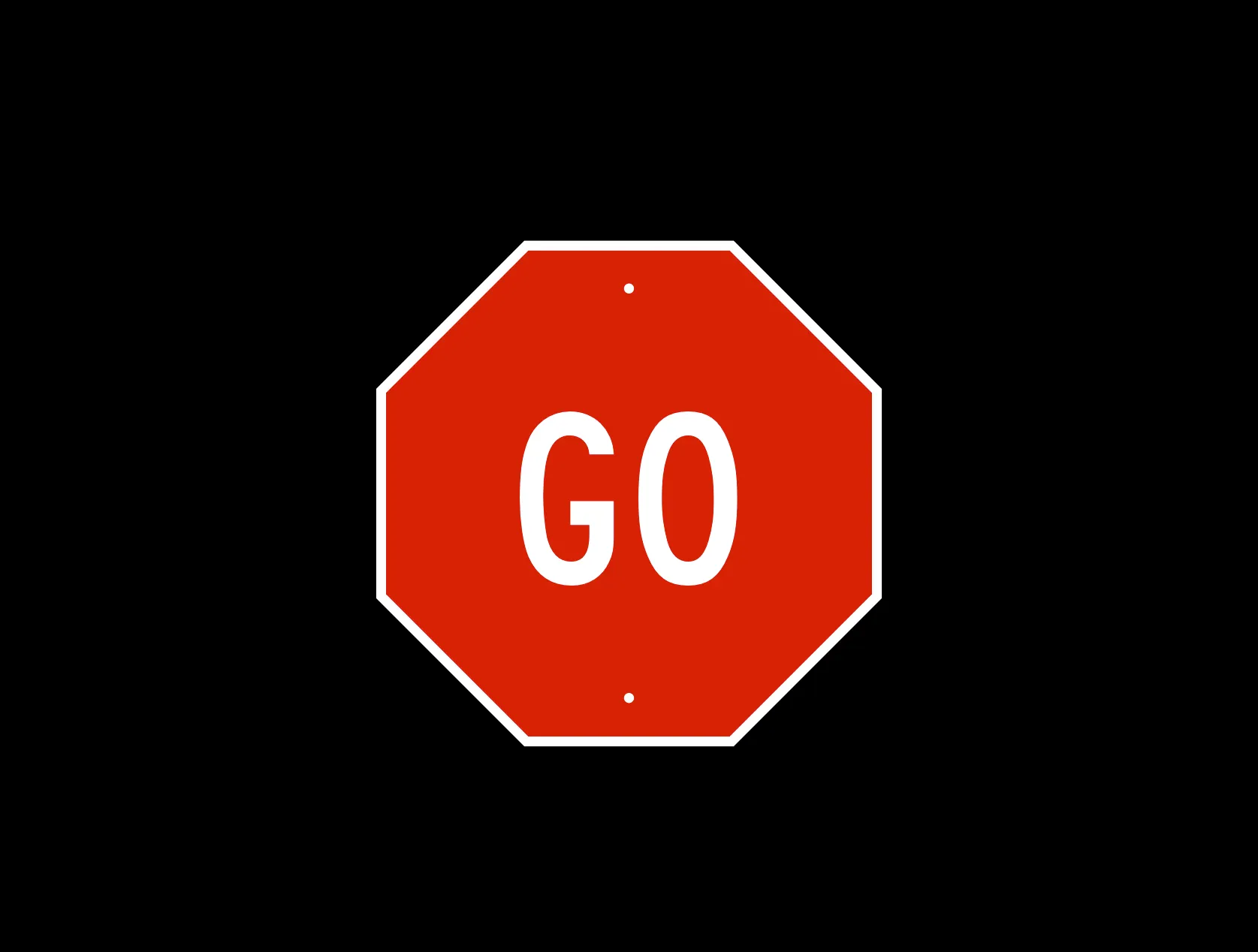
Facing this traffic sign on the road, would you go or stop?
Content Design
In product design, content design is one of the best ways to understand users’ needs and provide solutions that actually fit.
The more I learn about language, the better my chances are of providing reasonable design solutions to design problems. Although English is not my first language, I will never stop studying it because it strengthens my thinking.
Visual
Graphic Conversion
Beyond translating between English and Korean, I learned to convert concepts into graphics. Starting with visual exercises in typography, I noticed that graphic design and language translation share the same core: perceive the input correctly, pursue precision in the output.
A square rendered in perfect measure might look narrow or wide to each of us. Finding an optical square is a subjective decision made by the individual translation.
Logic
Some design challenges require a perfectly logical process that can only lead to a satisfying solution. Therefore, I adopt this attitude through hypersensitive projects, drawing, and writing.
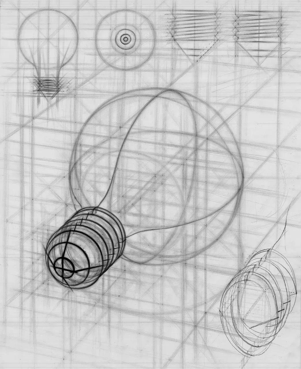
An inaccurate translation between observation and drawing would cause discourse to find a perfect result.
Writing
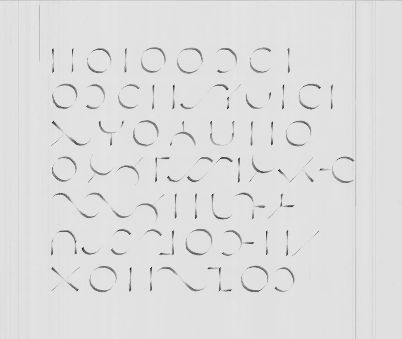
Creating consistent brightness on a page won’t allow you to make a single mistake. Restart otherwise.
Pictogram
Once I realized that internal interpretation is part of visual communication, I started noticing the everyday things already surrounding me. That's when I expanded the visual principles into pictograms, interaction design, and product design.
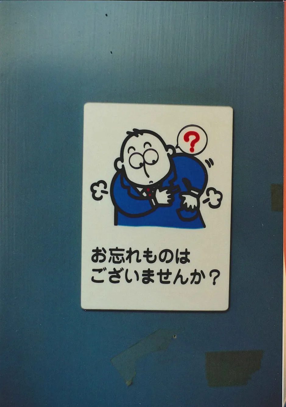
Tokyo, 2003. Not knowing what the sign says in Japanese, you check if you left any belonging as leaving the space. The pictogram is set on the inside door to remind those exiting the room.
Technology
I think of all visual artifacts as the result of variables. Print designers mandate hard proof to minimize the random variables of the machine’s settings. And sometimes the machine creates its own interesting errors, like a rolling shutter distorting a moving object.

Do we see ‘I’ or a dot? Does it matter what it is?
Human Error
Human error can be the variable of the visual outcome. But is it a defect or an opportunity to overcome the original design goal?
Combining the technique of a long exposure camera and a hand-held device playing a motion graphic, the performer executes the letter’ A’ differently each time.
Collaboration
Reading and writing are still the most intuitive way to communicate and collaborate. But at some point, the written idea needs to become visual before it drowns in email threads and chat apps.
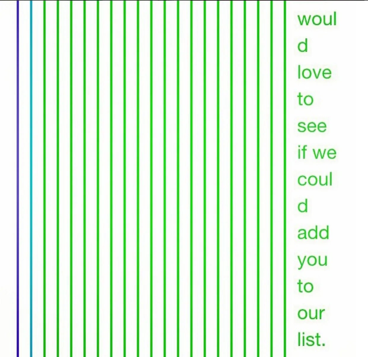
Reply. Reply. Reply. It’s time to visualize the idea after understanding and sharing the summary with a team.
Communication for Front-End Development
When the subject is visible, showing is a better way to convey an idea than writing about it.
Save thousands of words by showing the idea in a video format that the audience can pause, play, repeat, and share with others for better understanding.
3D Mockup
For physical solutions like installations, prototyping and videotaping the 3D views is the best way to share the idea. Imagine how many words that saves.
Watch the video rather than imagine with static images of front and side views.
Video Prototype
Interaction design ideas are best shared in animation. Imagine trying to describe this concept in words. Video lets the audience play the idea over and over.
The primary entry points in modular format provide more detail at different scales on the homepage before the user goes to the page.
Icon Library
An iconography system built on the brand's color scheme and visual language. Before drawing any icon, I defined the color, stroke, and level of detail. I started each icon by writing the noun it represents and the adjectives that tell its story.
The icon library created for the Discover.com web pages
What If
A green screen and a video editor can turn everyday objects into digital mockups. This technique lets us imagine digital solutions in our surroundings and bridges the gap between an idea and shareable graphics.
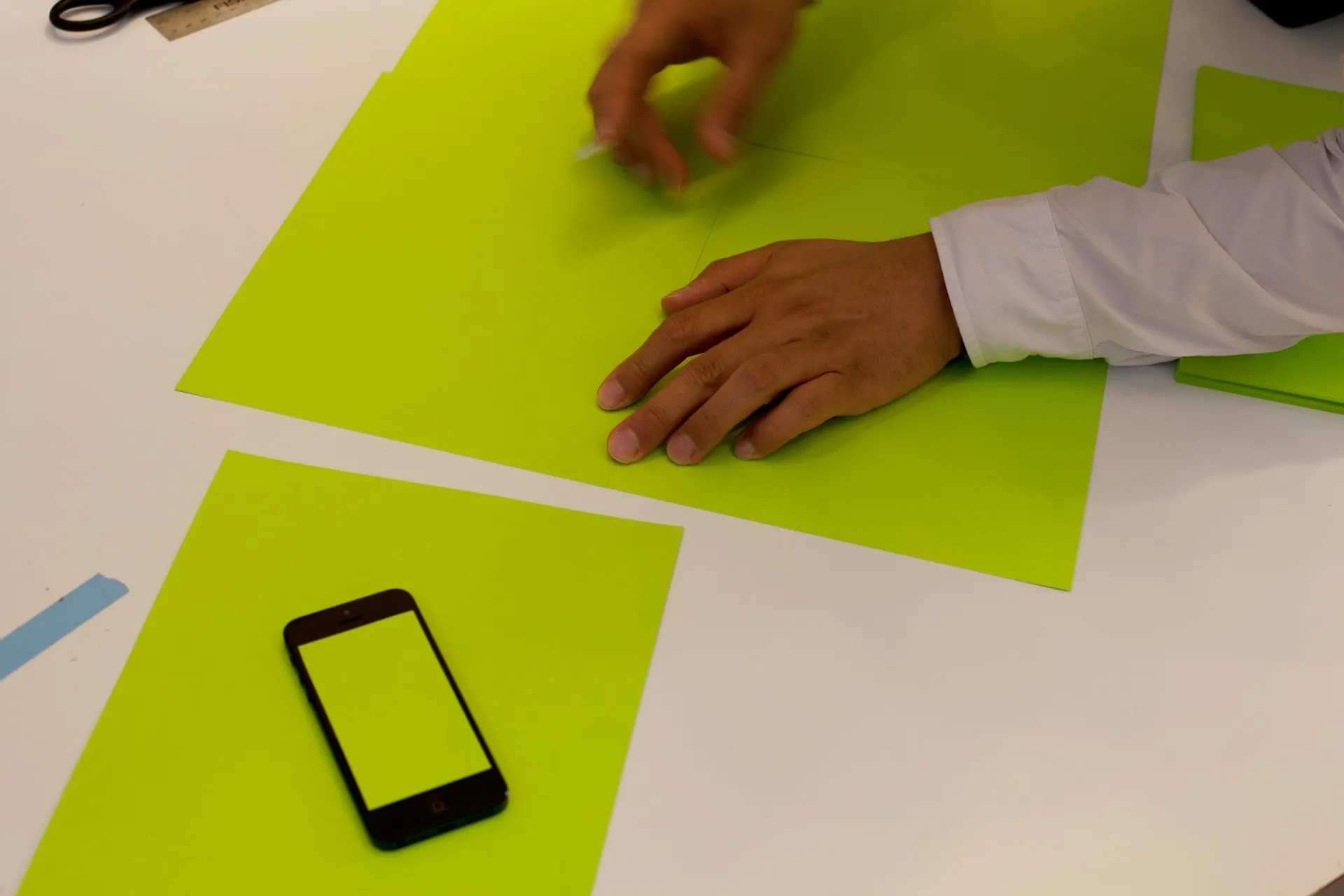
Me making green screens on handheld devices.
What If is a powerful statement that pulls us to think outside the box and activates the imagination to complete the sentence.
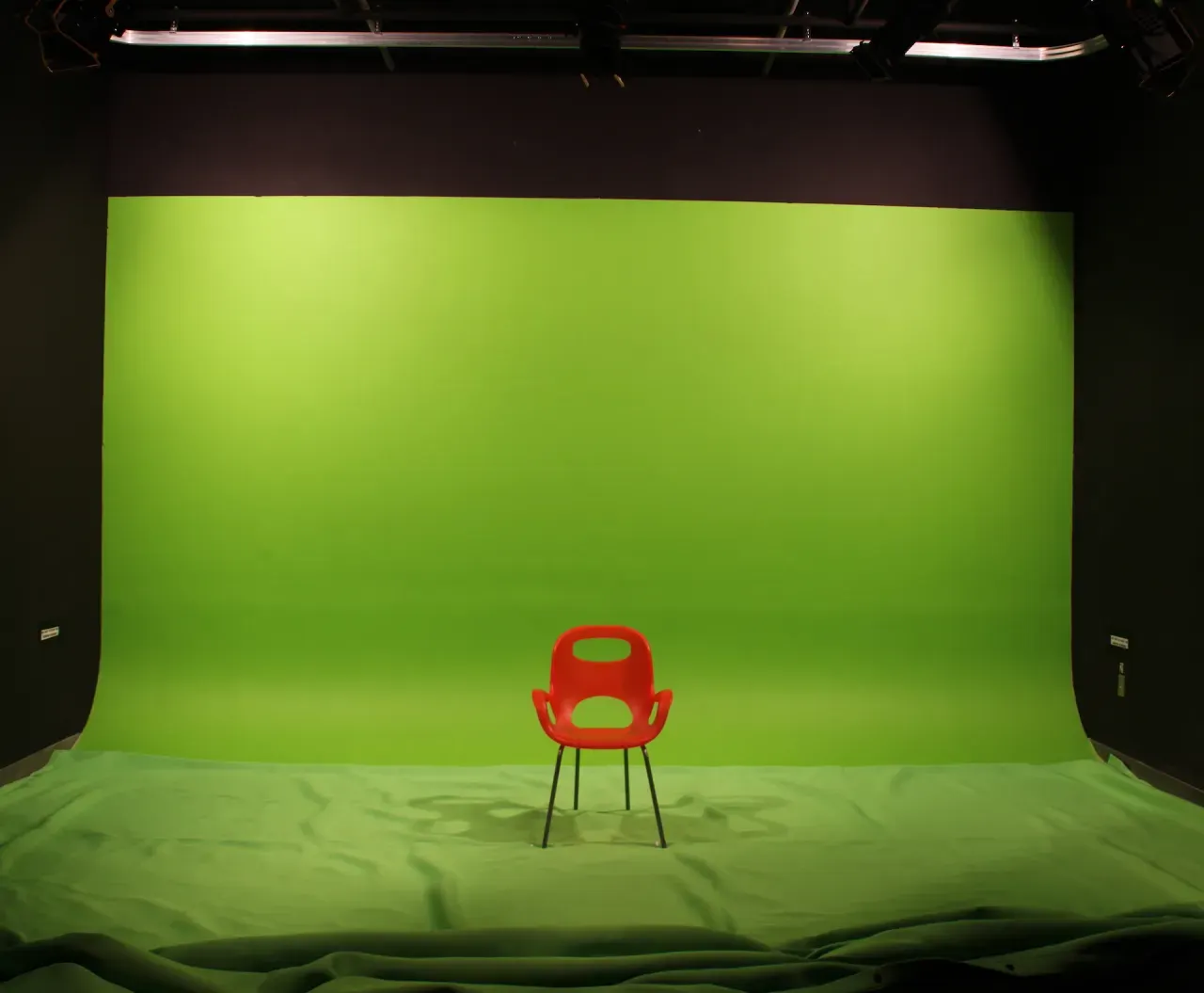
I created video assets for thesis studies in this studio on the MICA campus.
Closing
Design Translation is an abstract term, but it captures my design journey. It starts with honoring the originality of writing and its power to develop an idea. From there, communicating effectively with collaborators makes the outcome more precise and closer to what we imagined.
The journey continues. 2022/01/01