Letterform

Tags: Typography Date: 2006/05/12

This project shifted how I see the typography all around us, prompting me to delve into the processes of type designers.

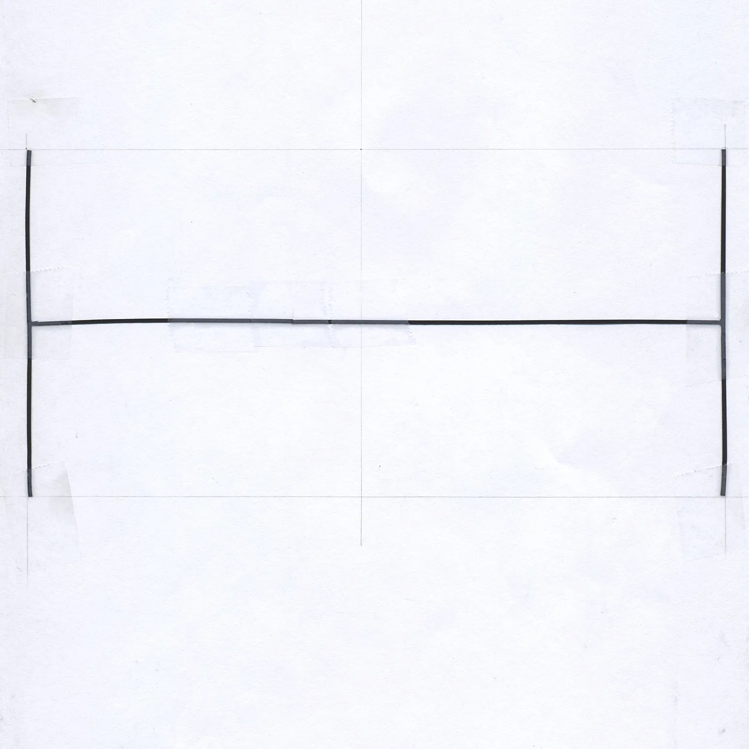
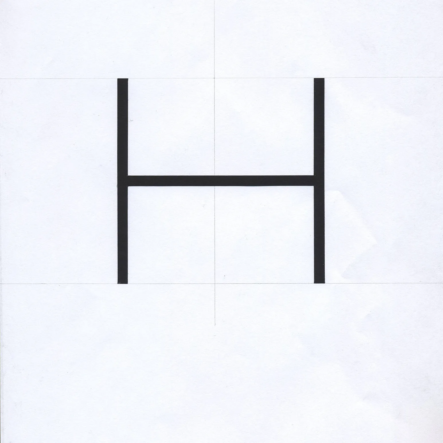
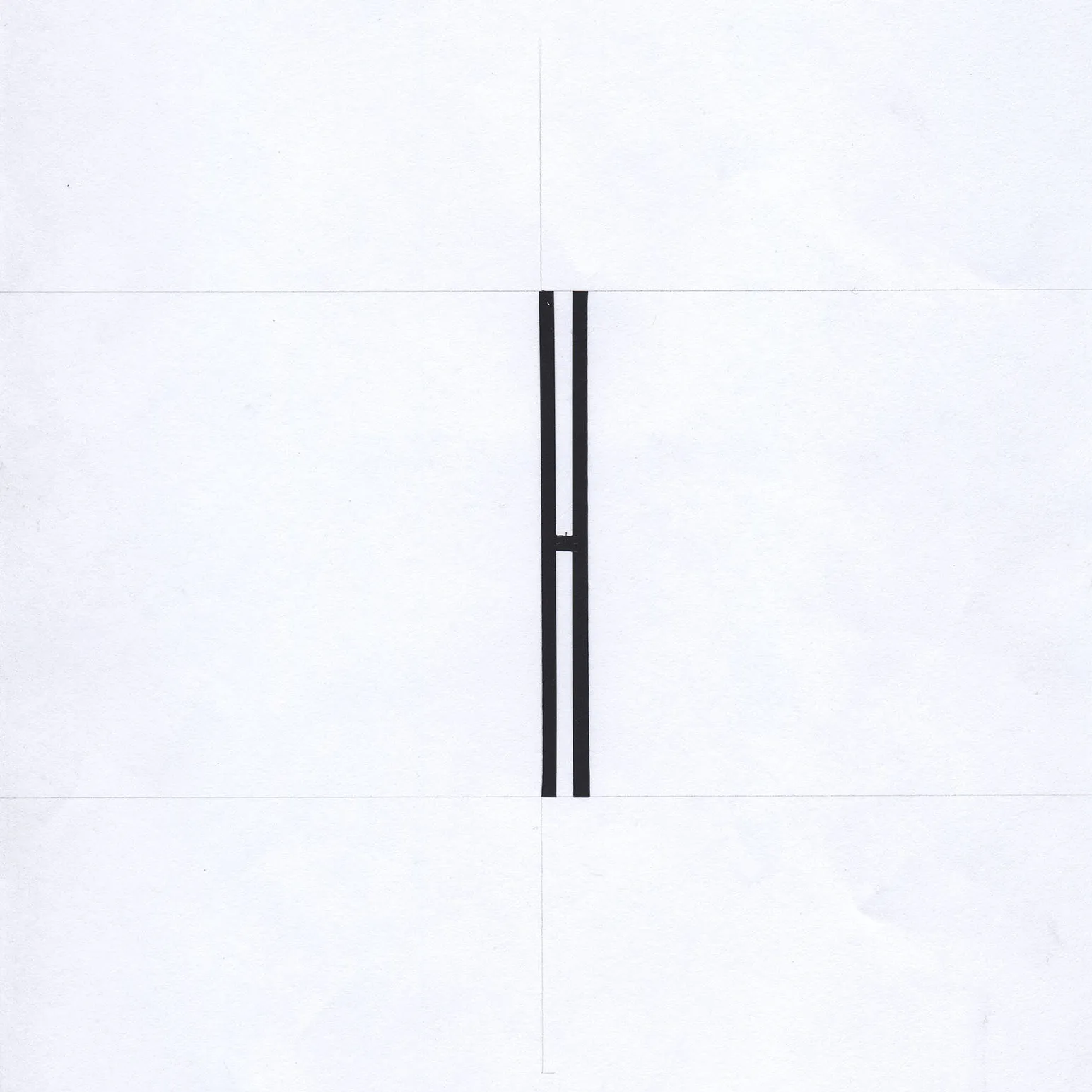
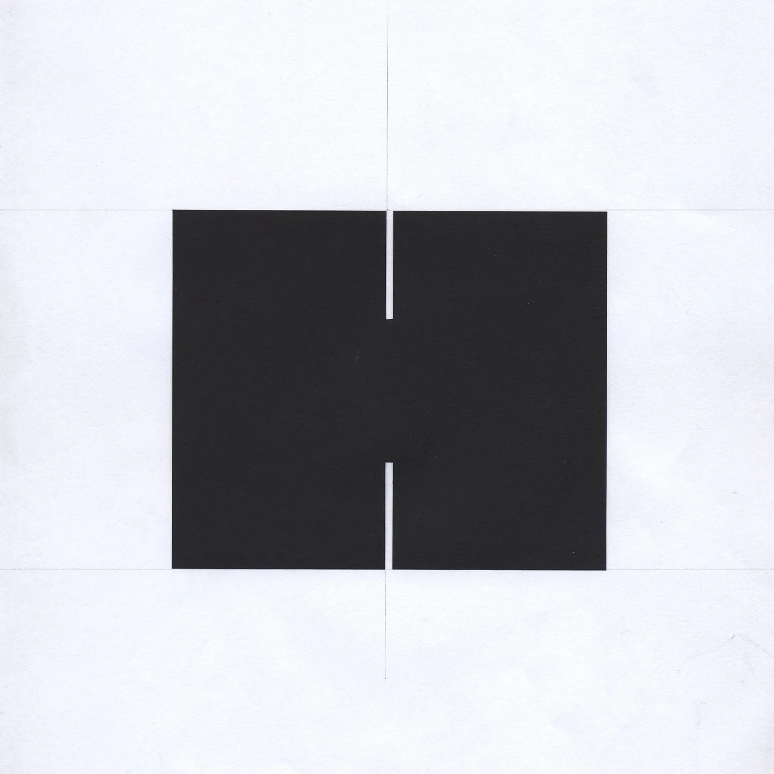
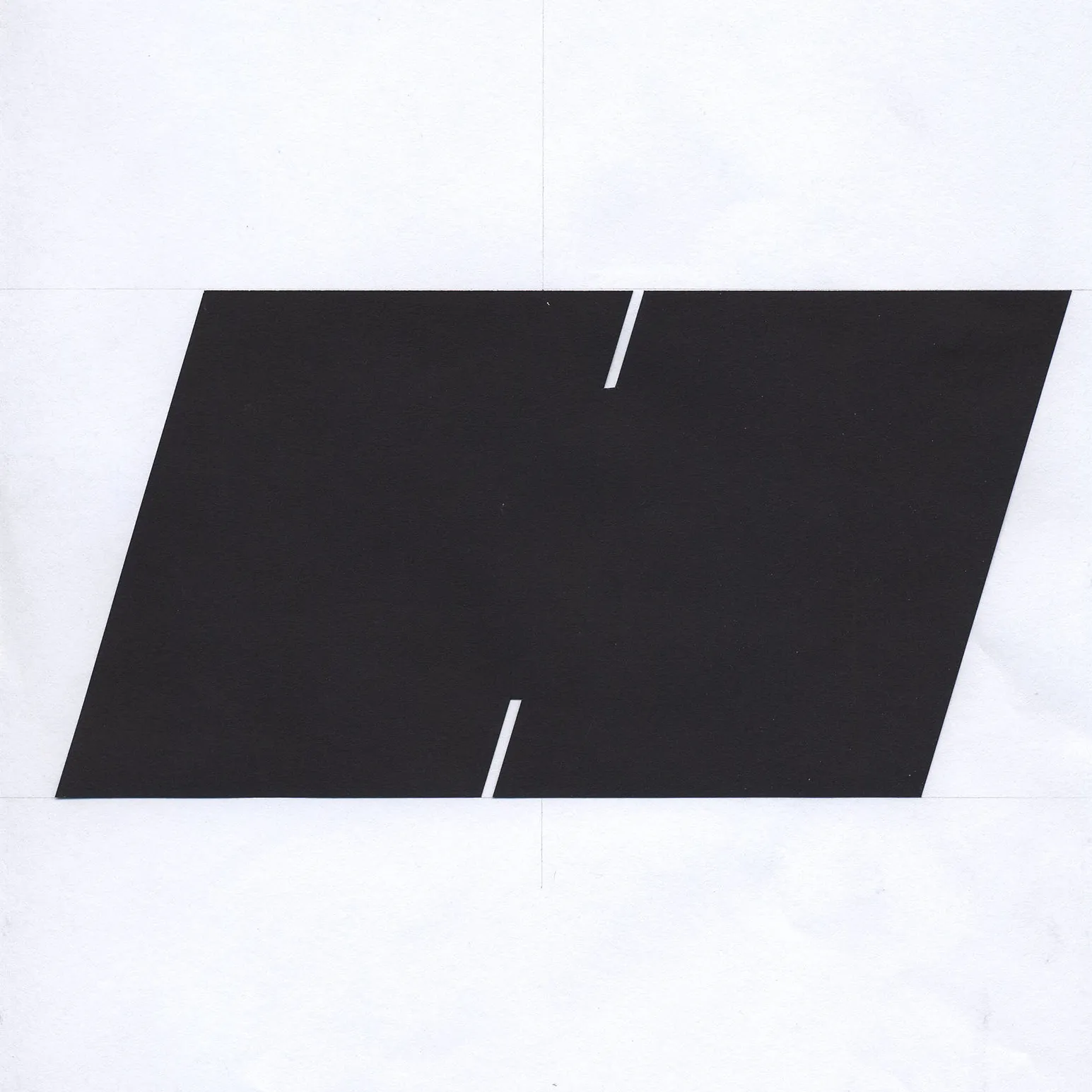
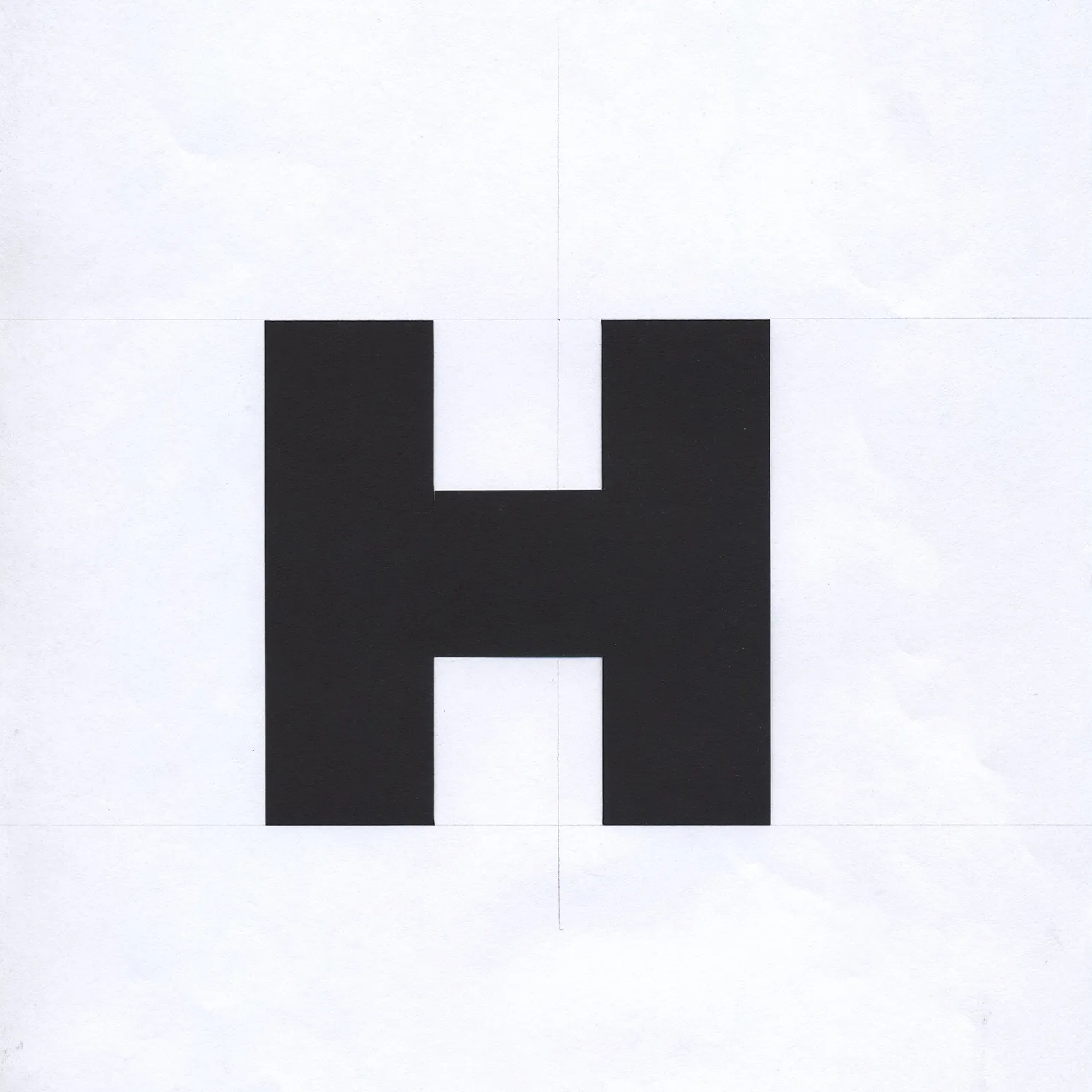
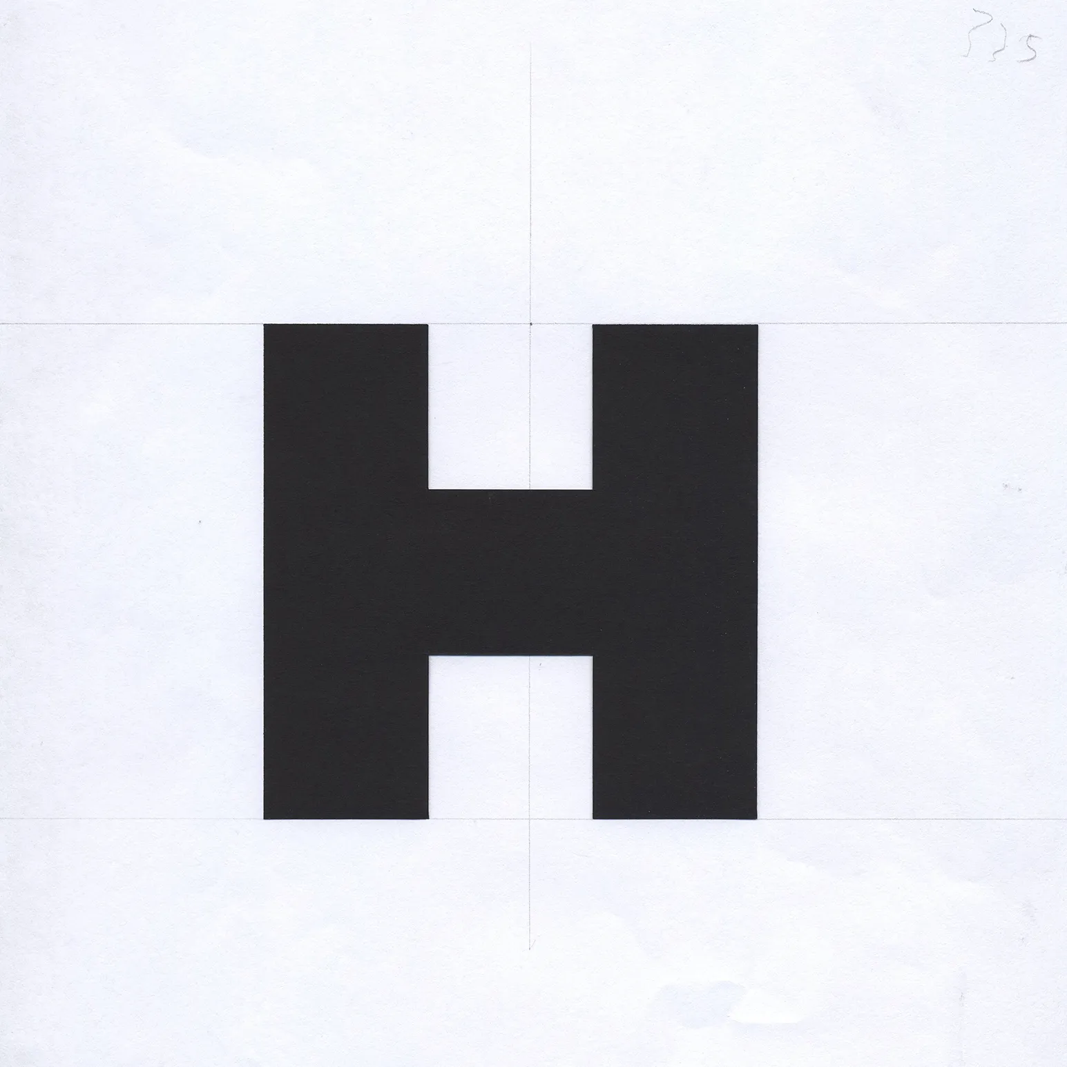
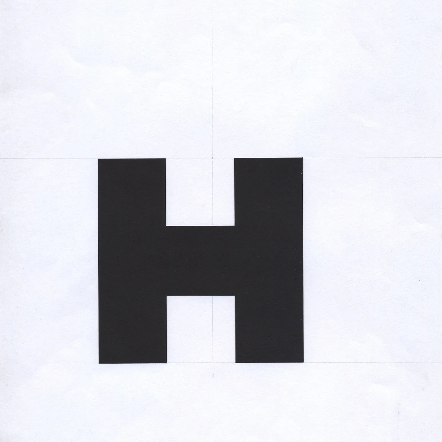
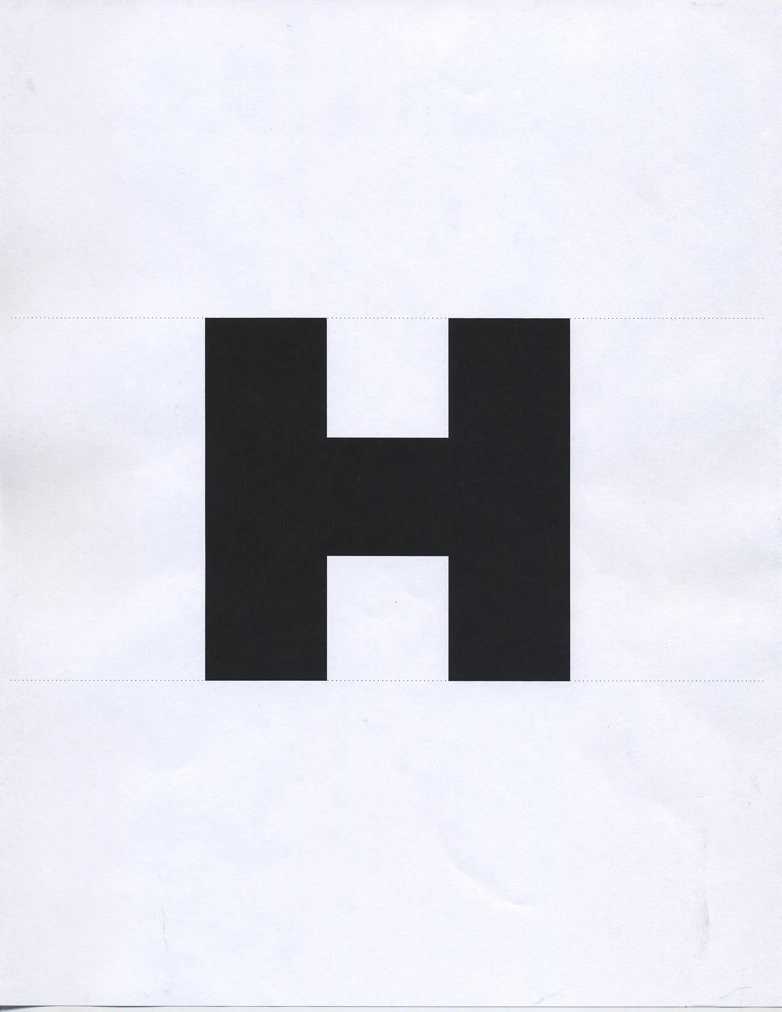
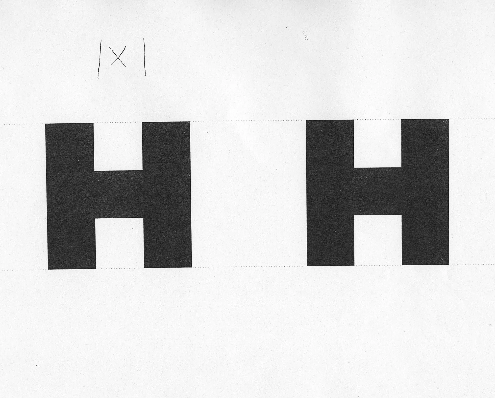
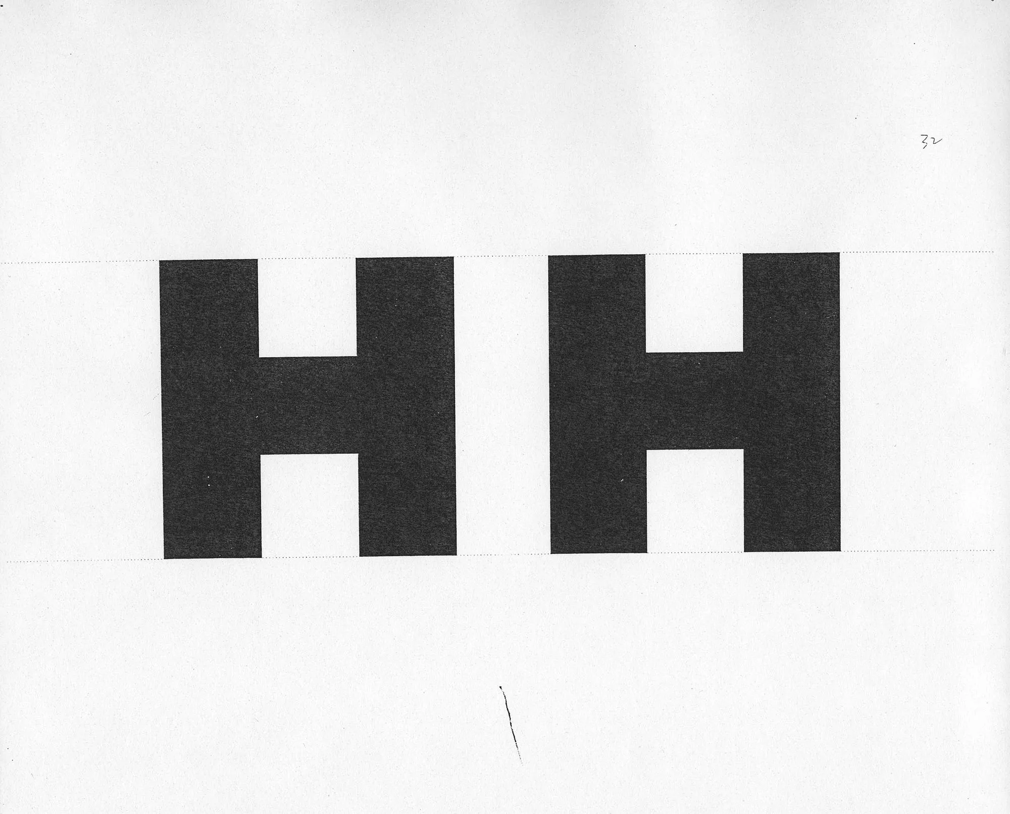
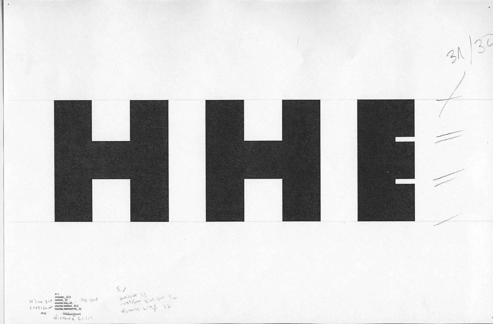
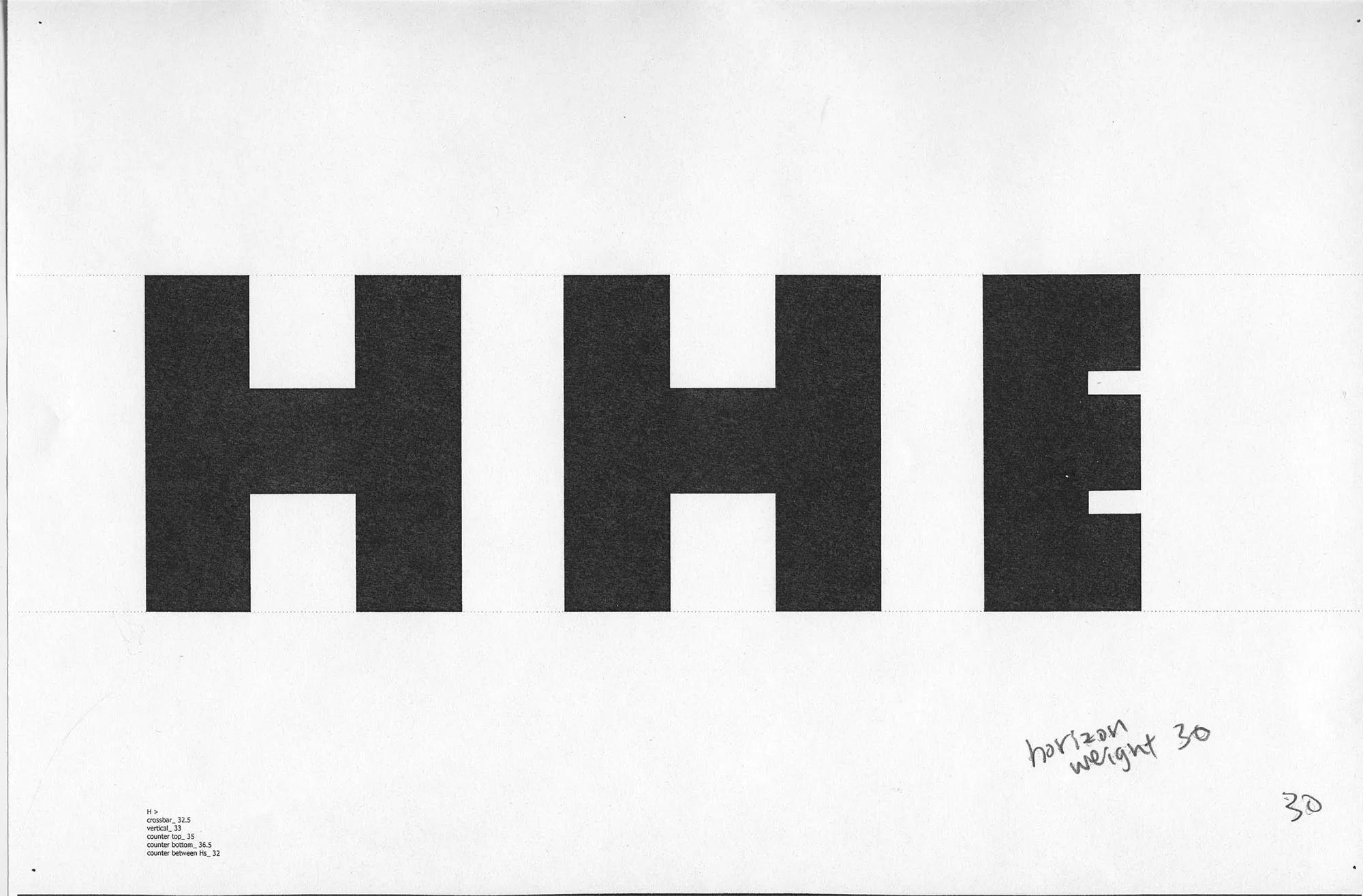
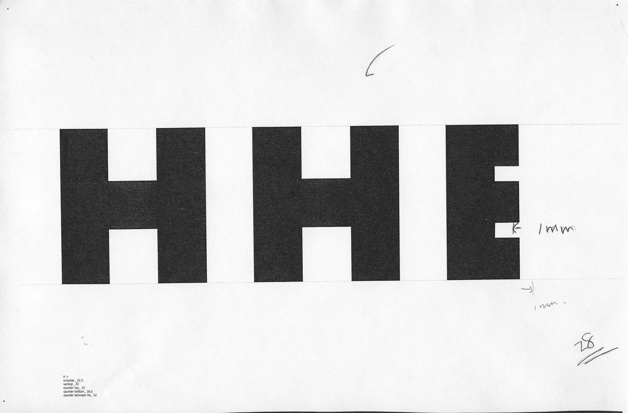
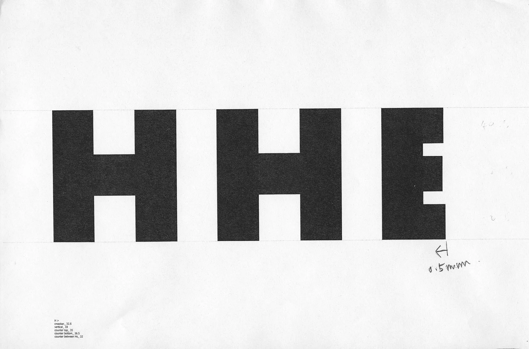
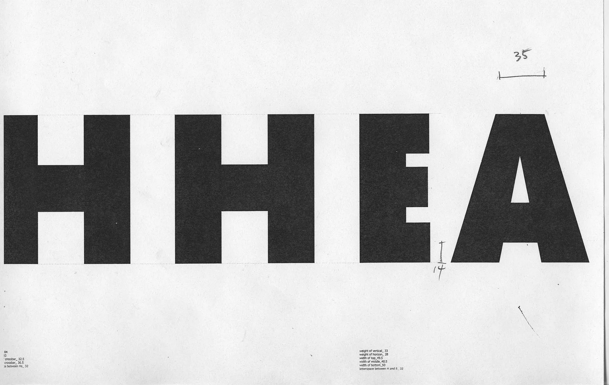
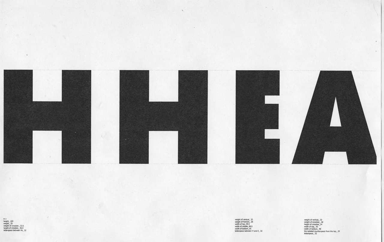
Find my H, while some sketches look like I.

0-1-1.webp
0-2-1.webp
0-3-1.webp
0-4-1.webp
0-5-1.webp
0-6-1.webp
0-7.webp
0-8.webp
0-9.webp
0-10.webp

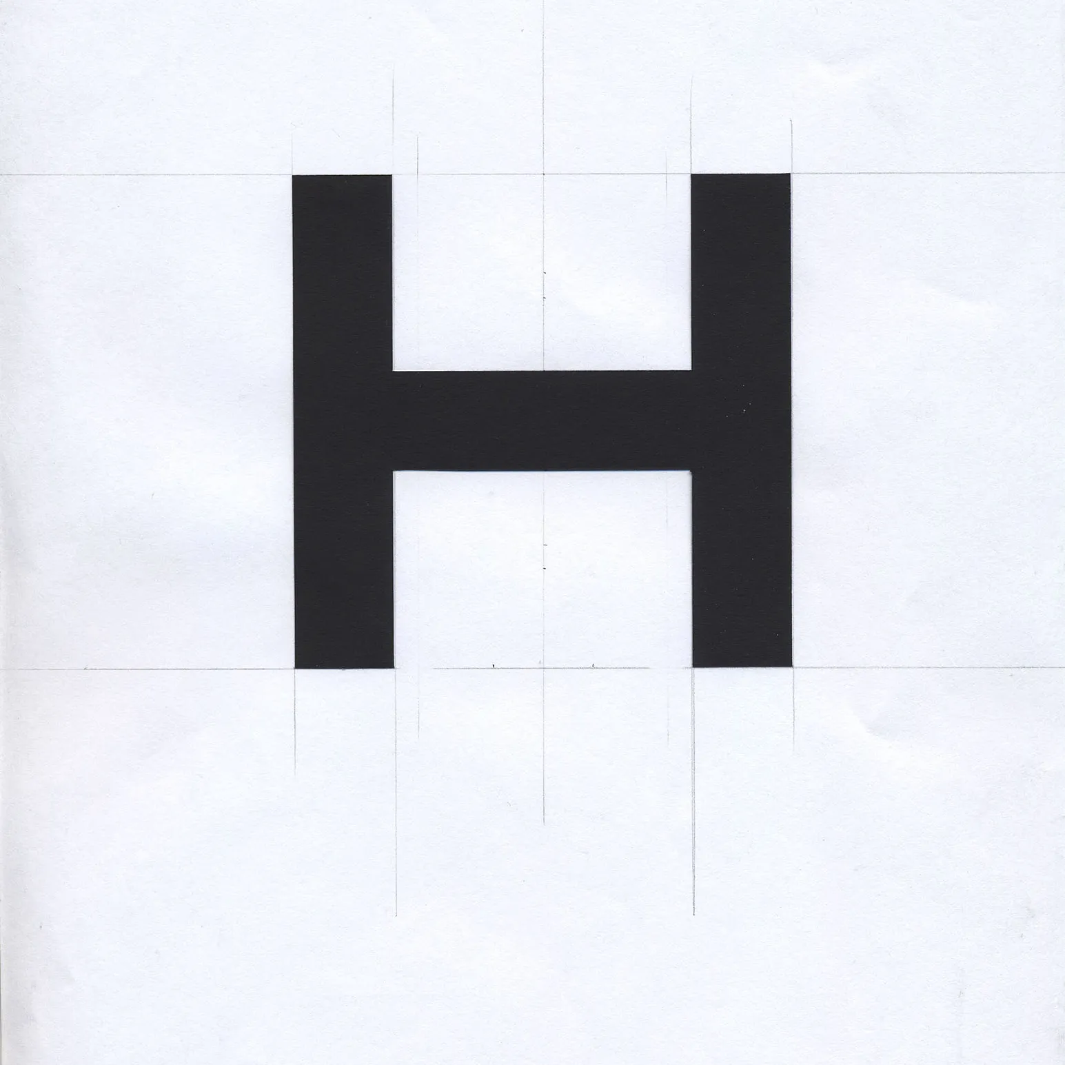
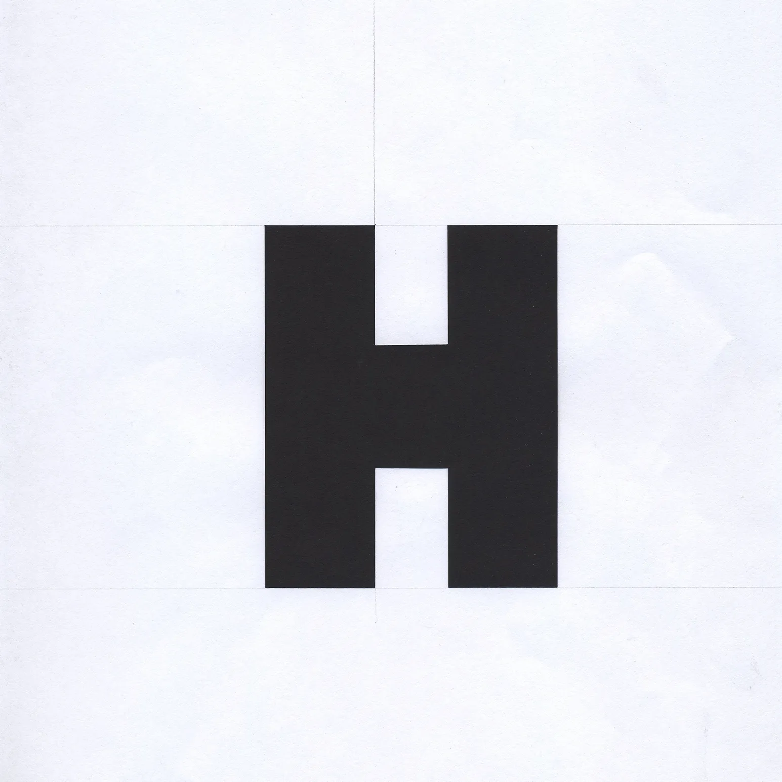
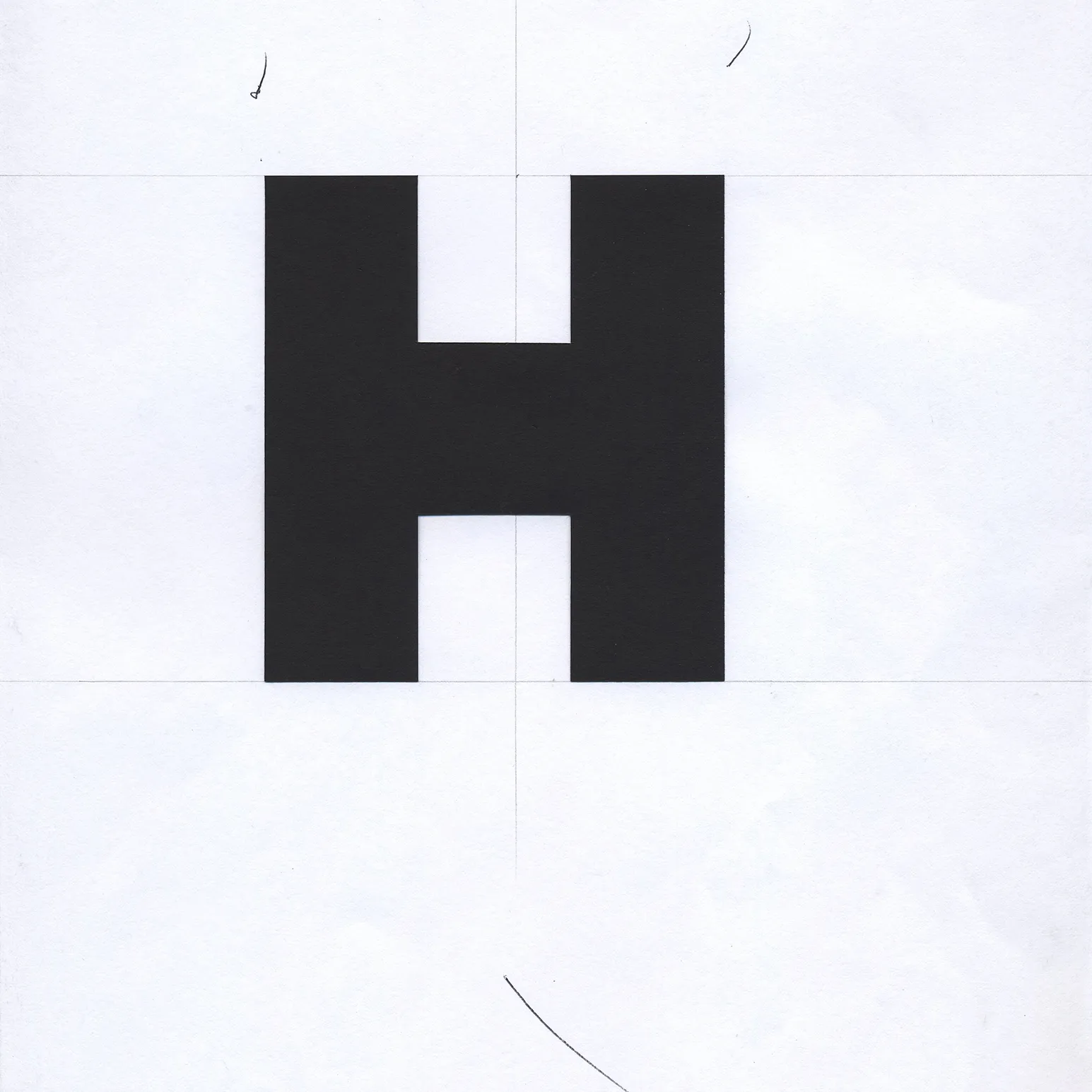
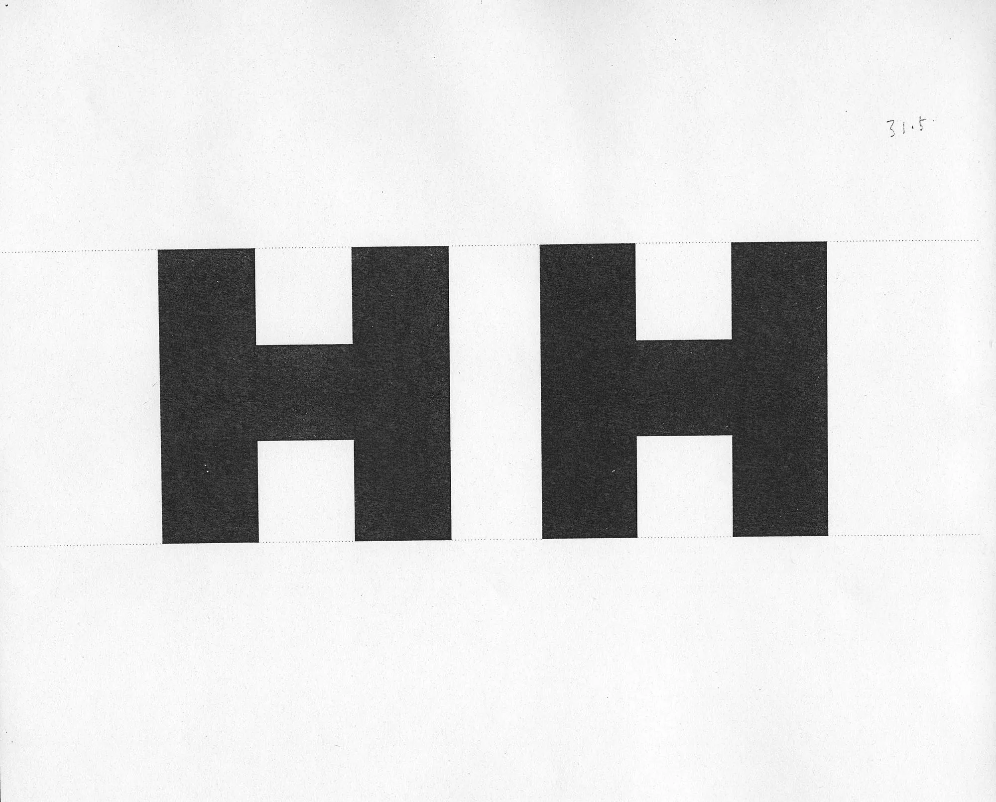
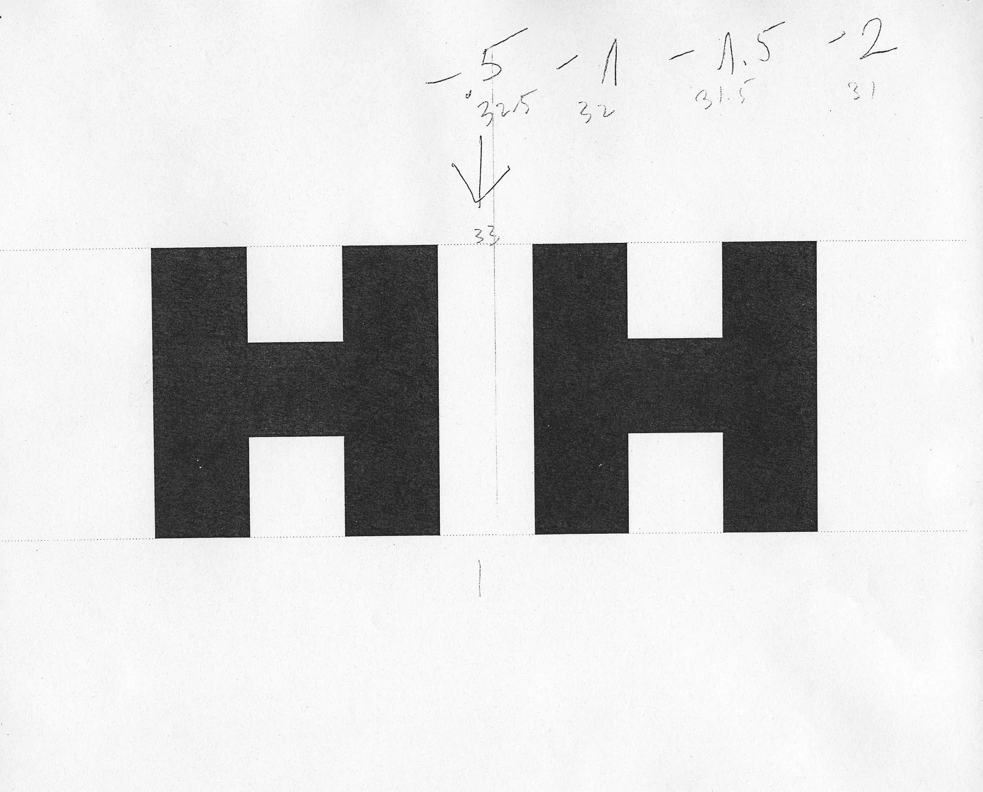
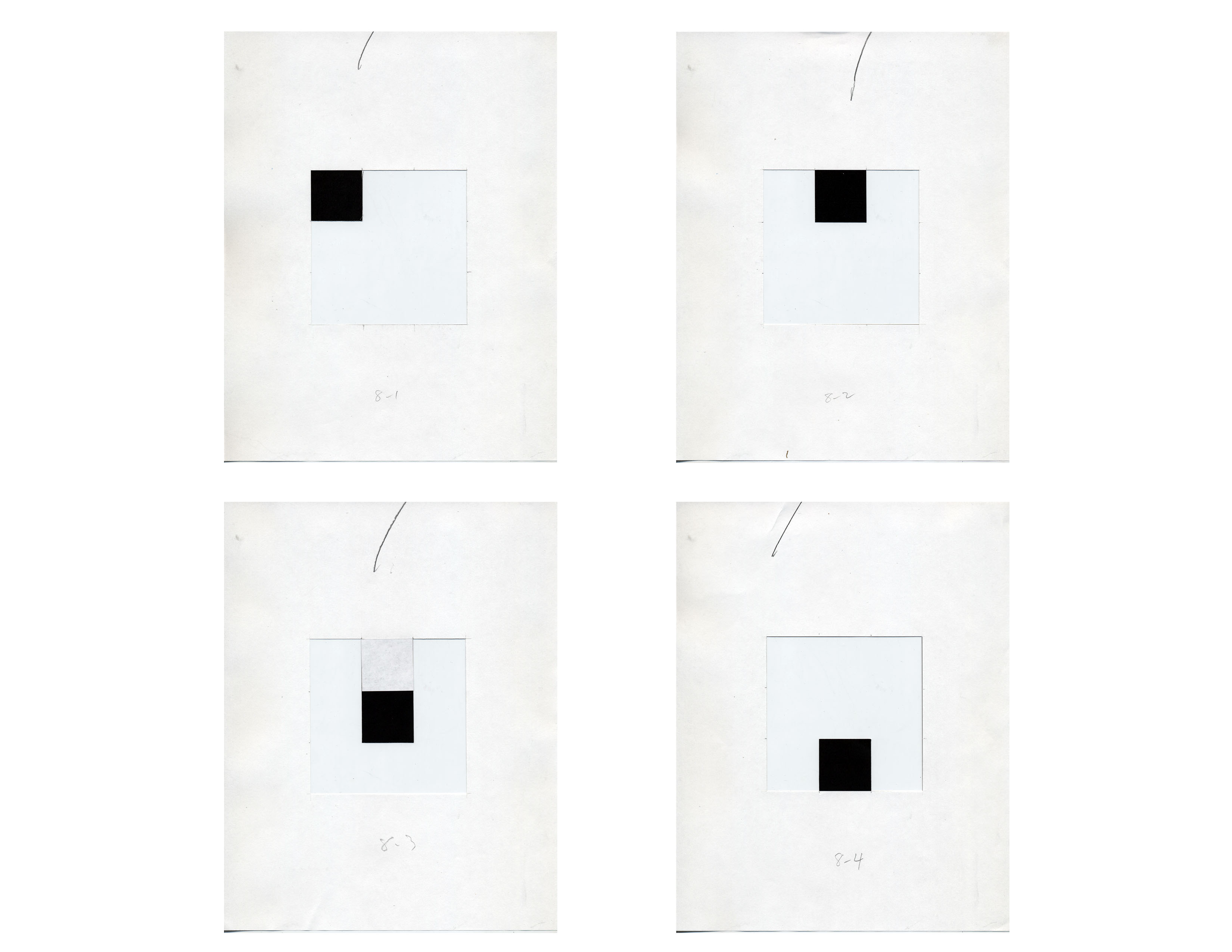
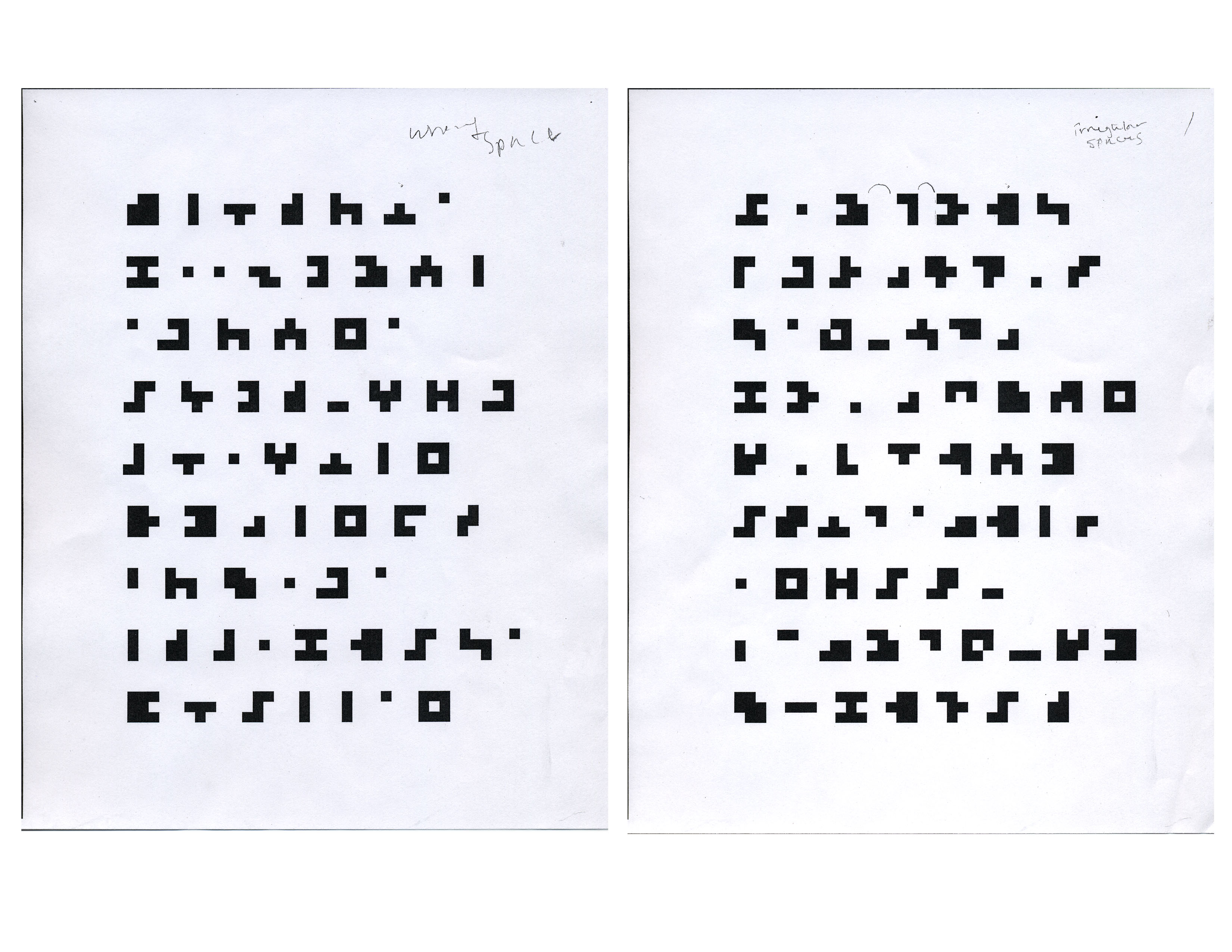
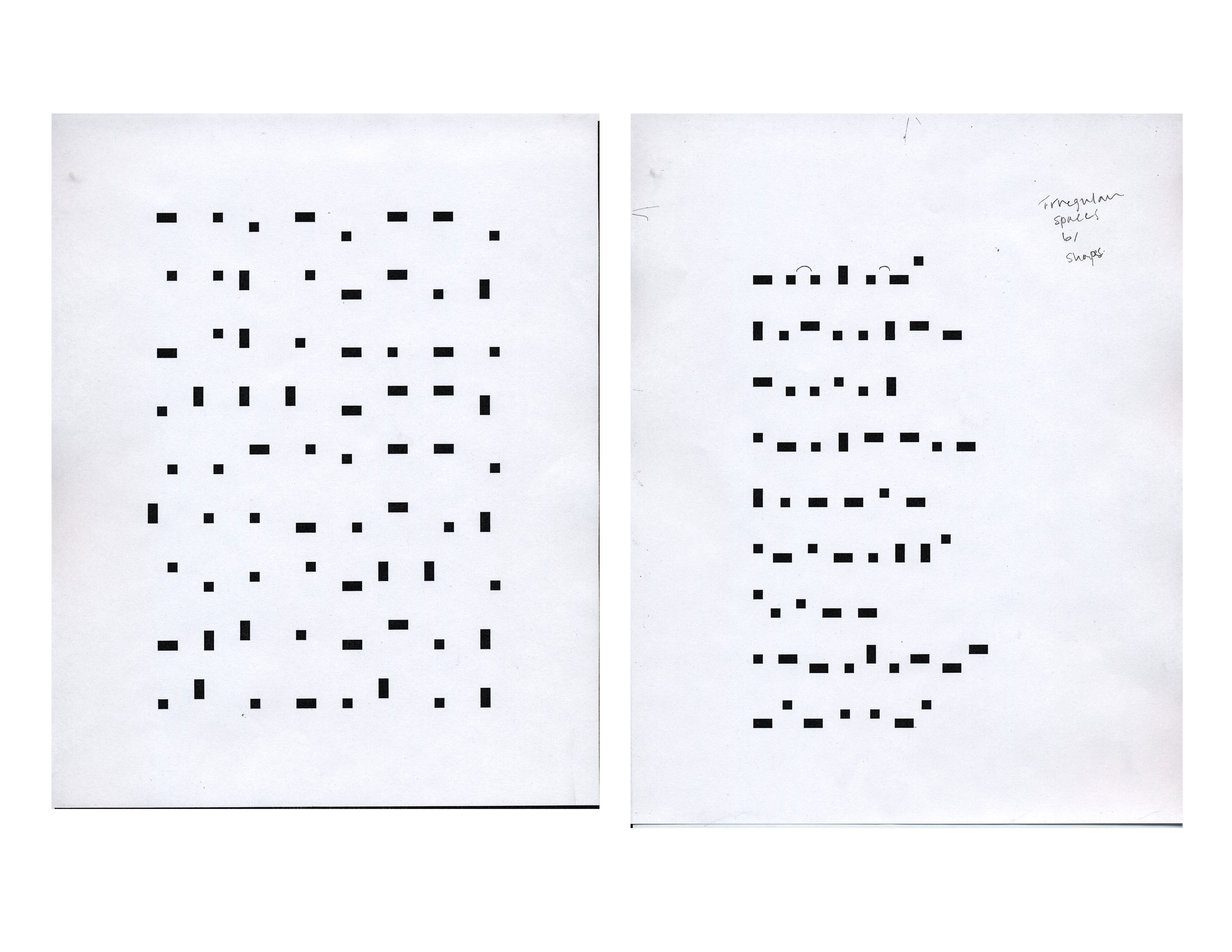
Counter space brightness
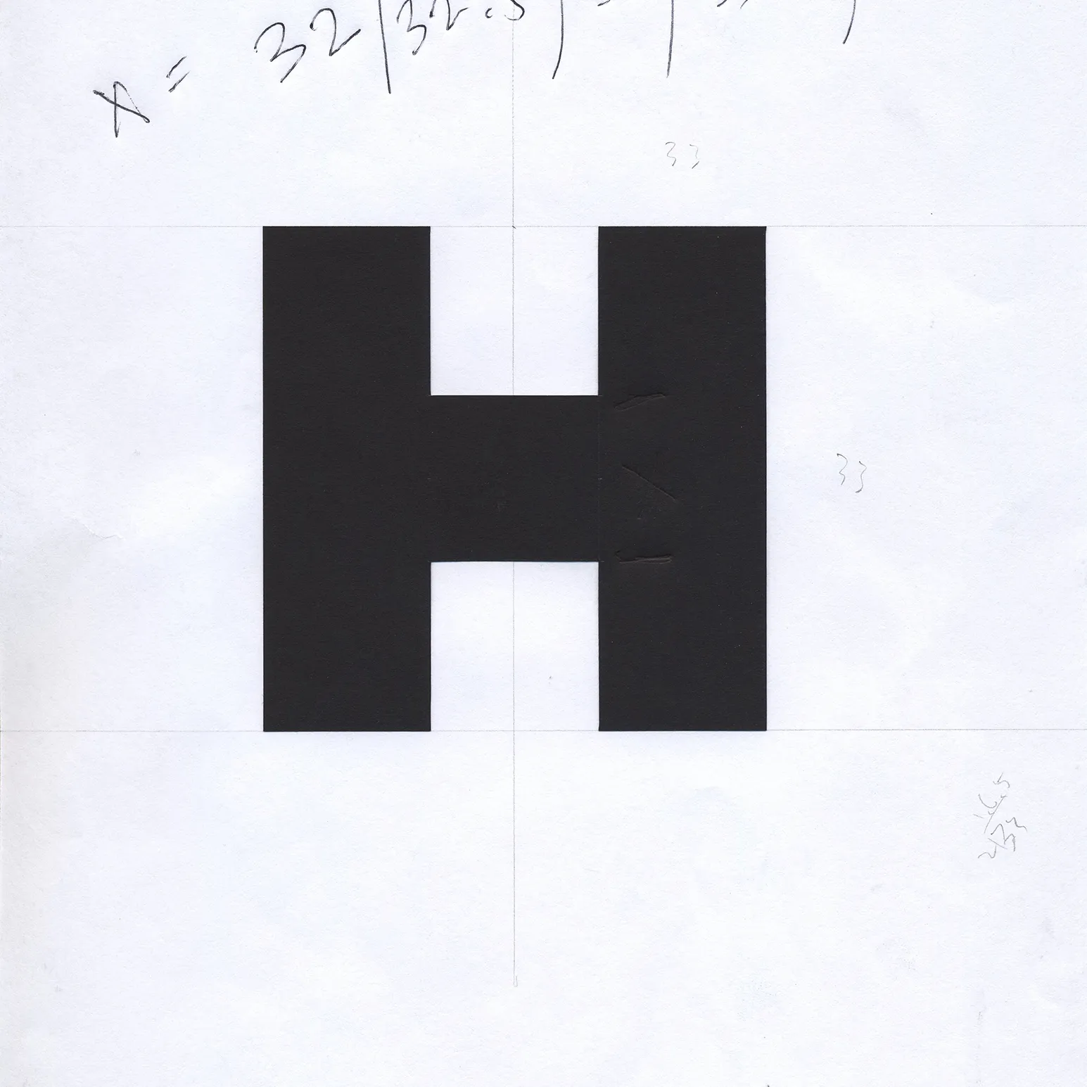
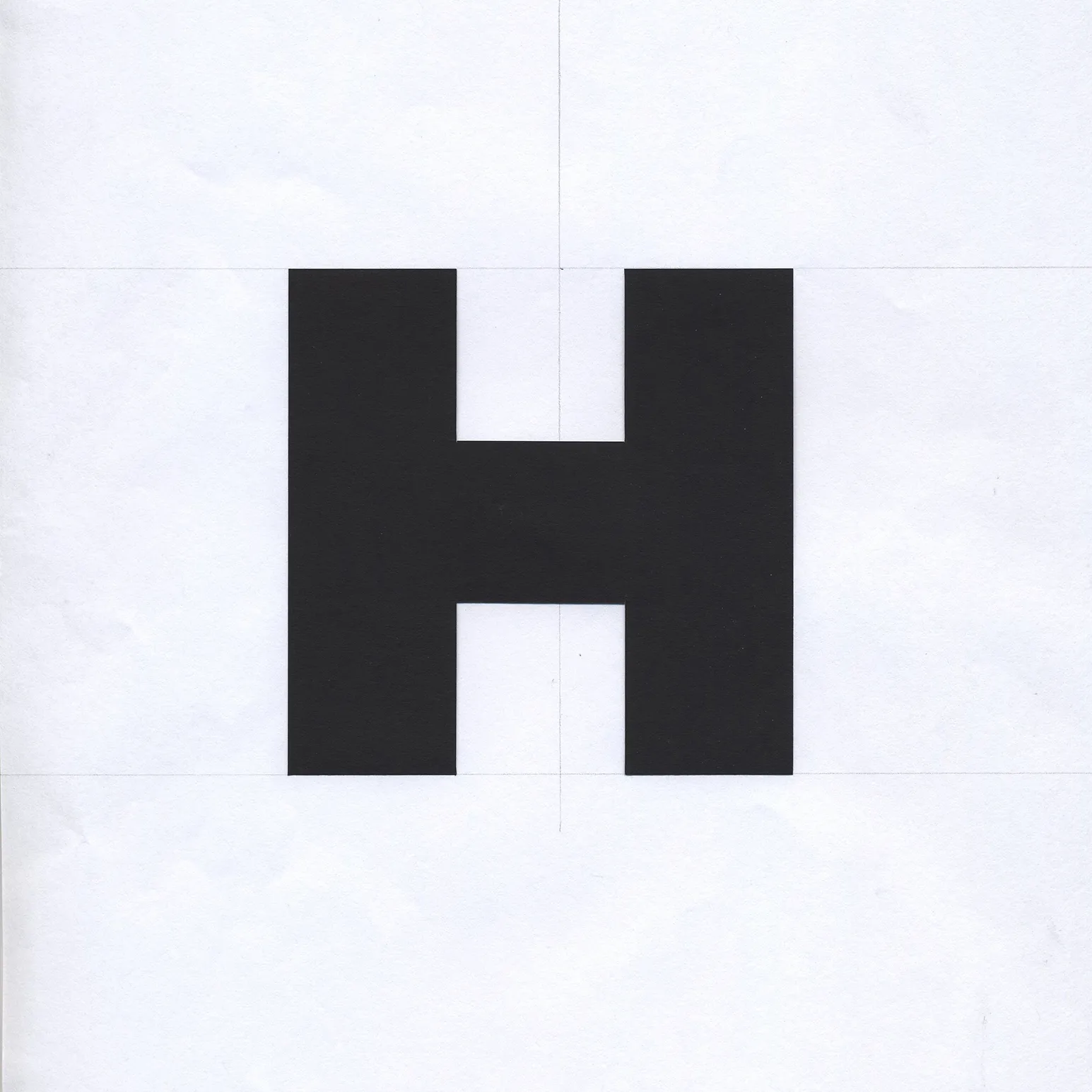
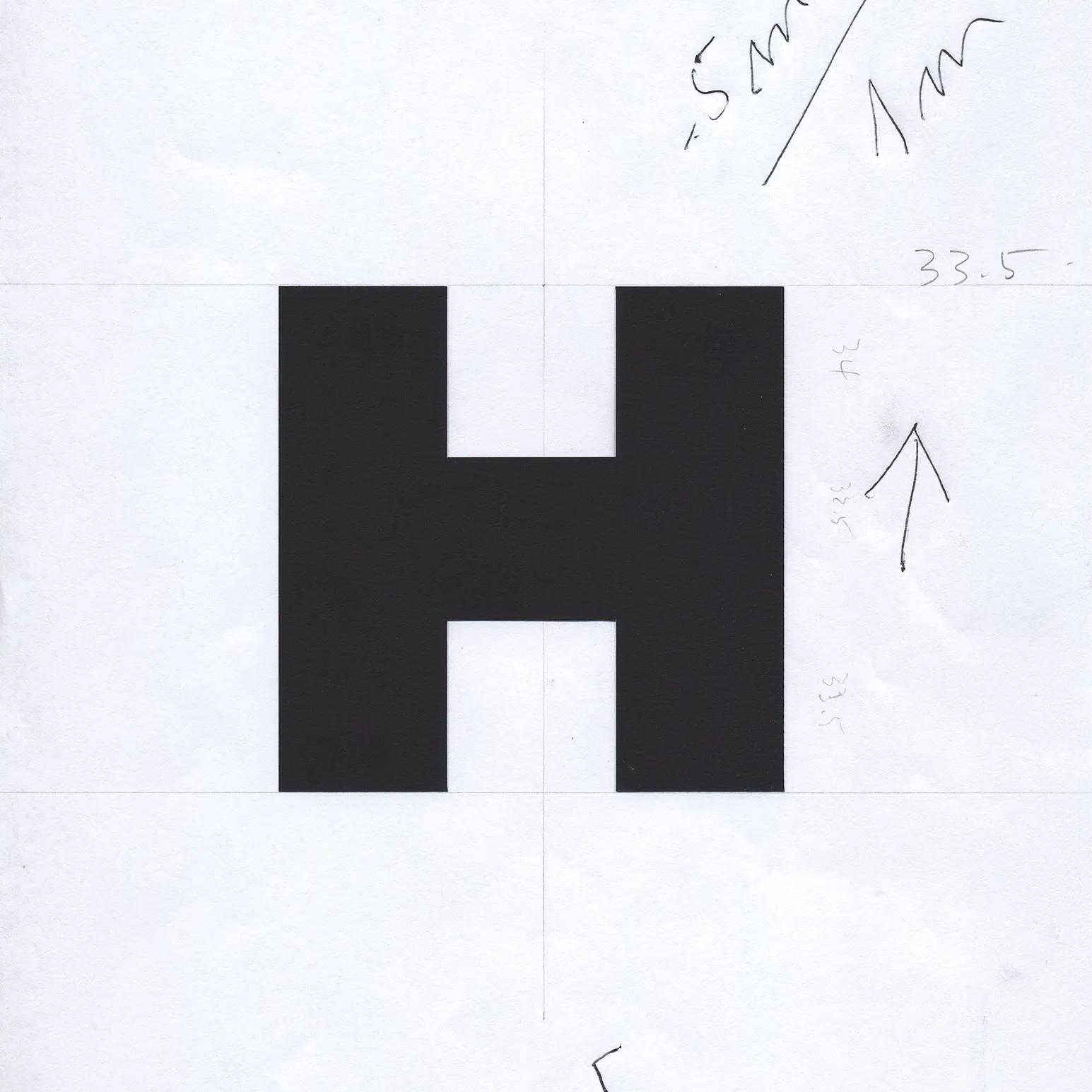
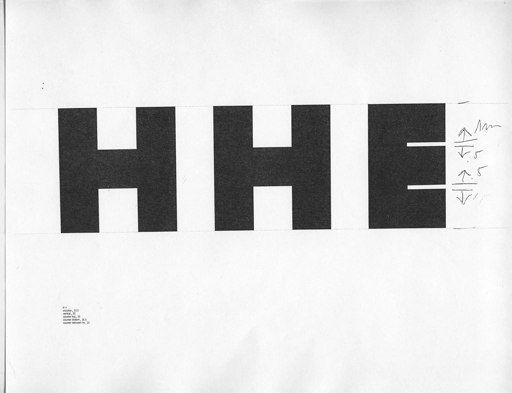
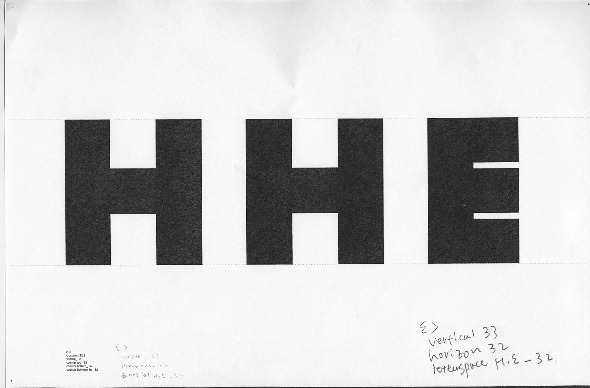
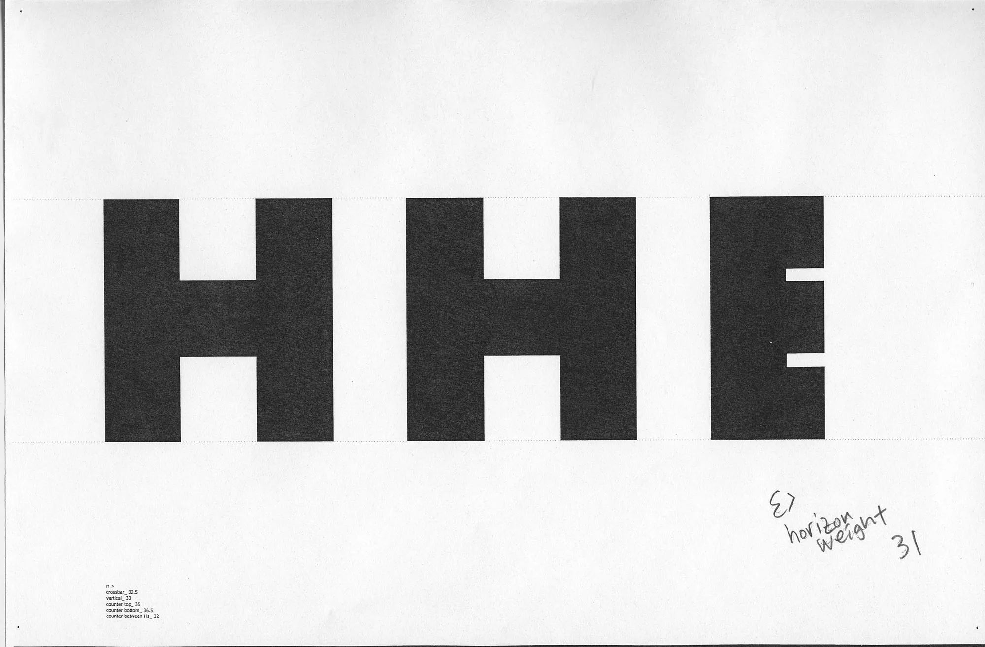
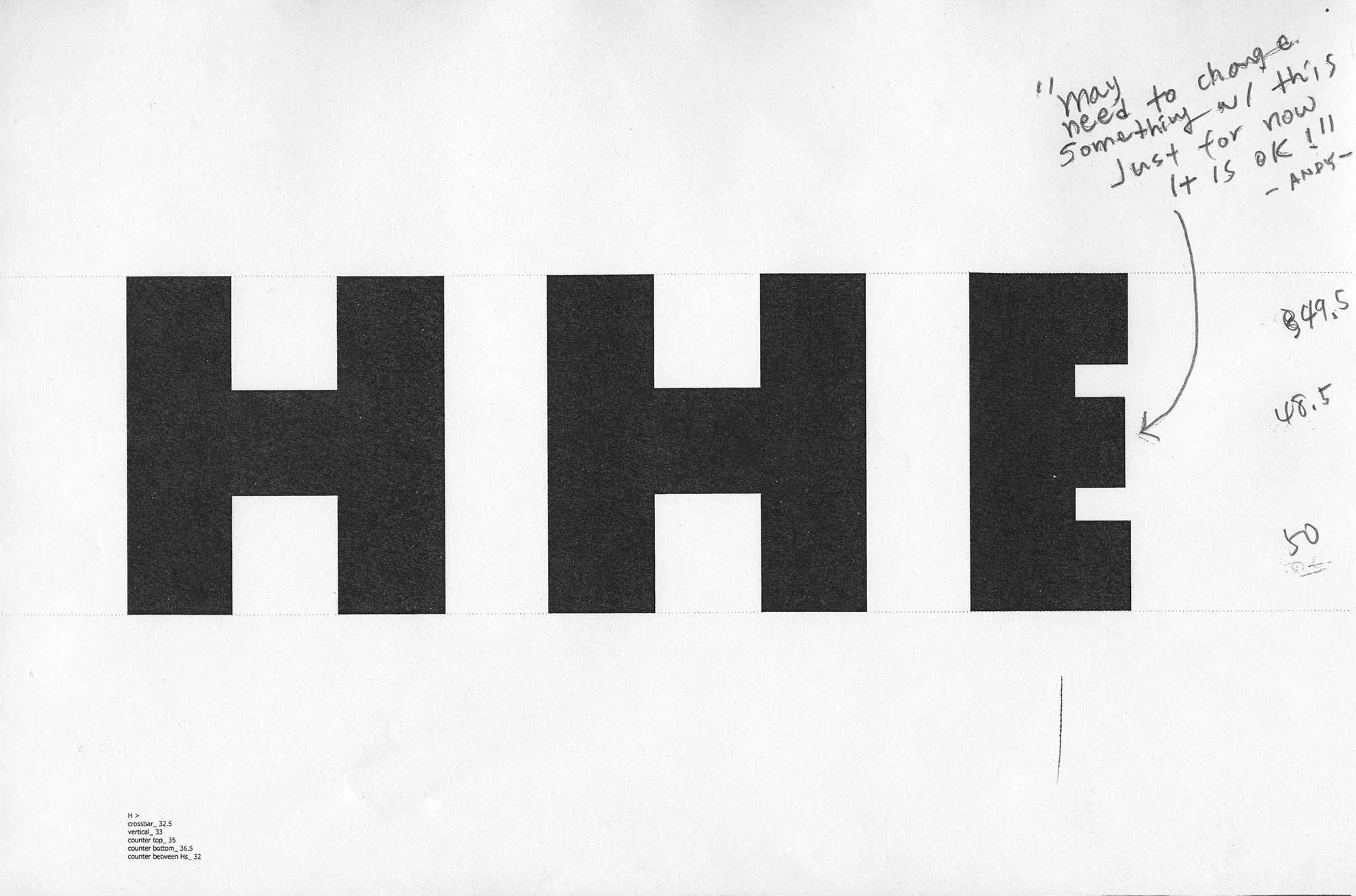
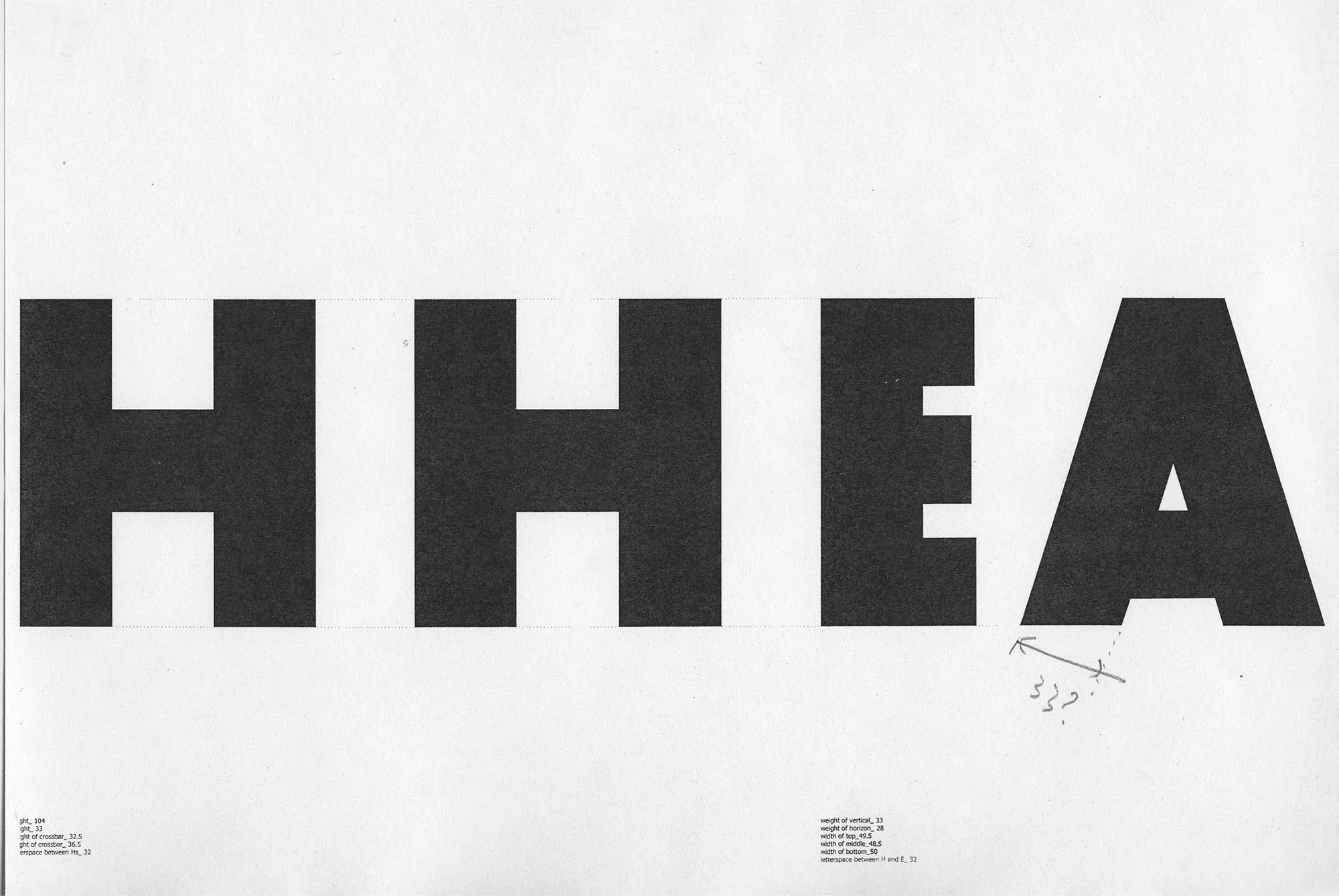
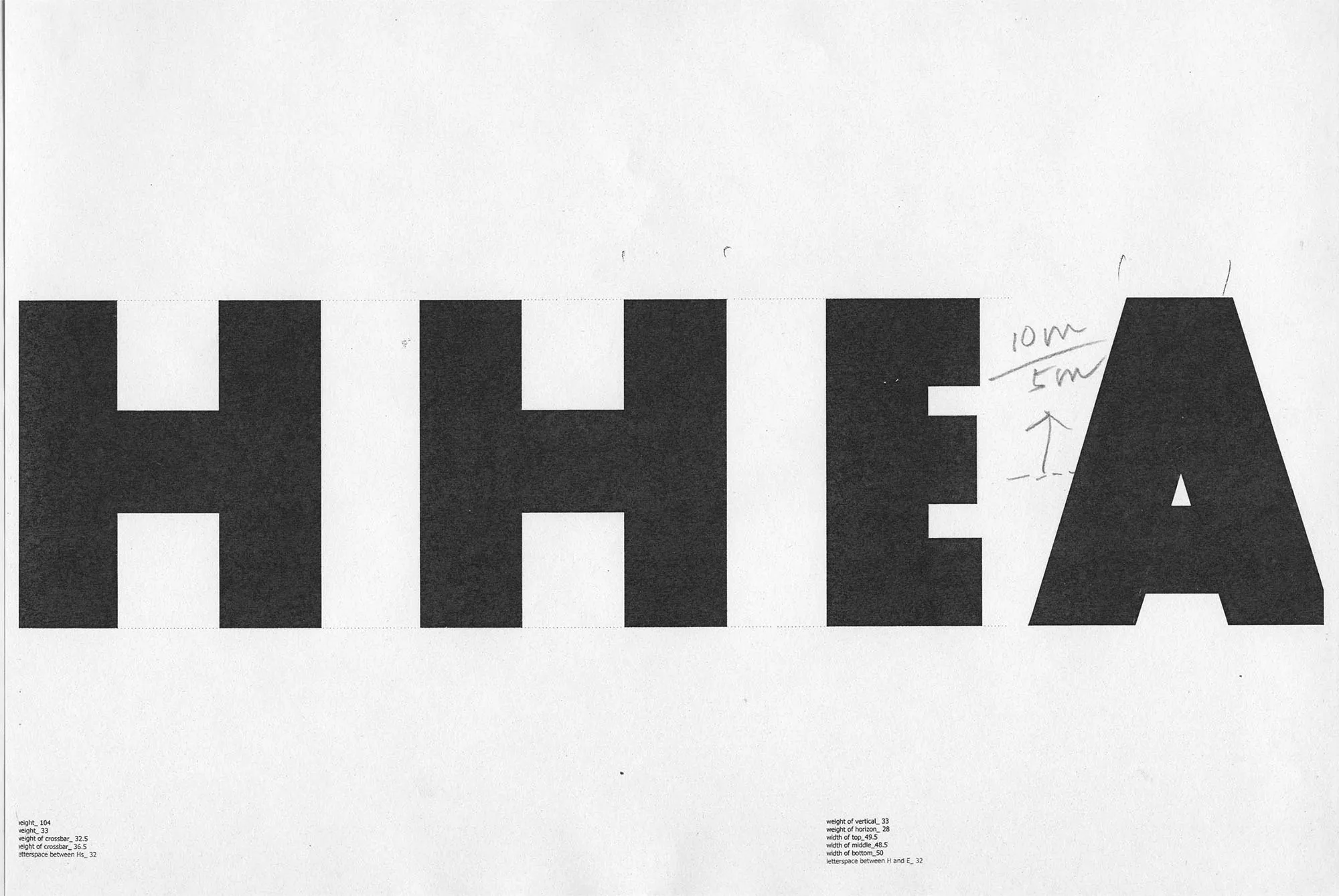
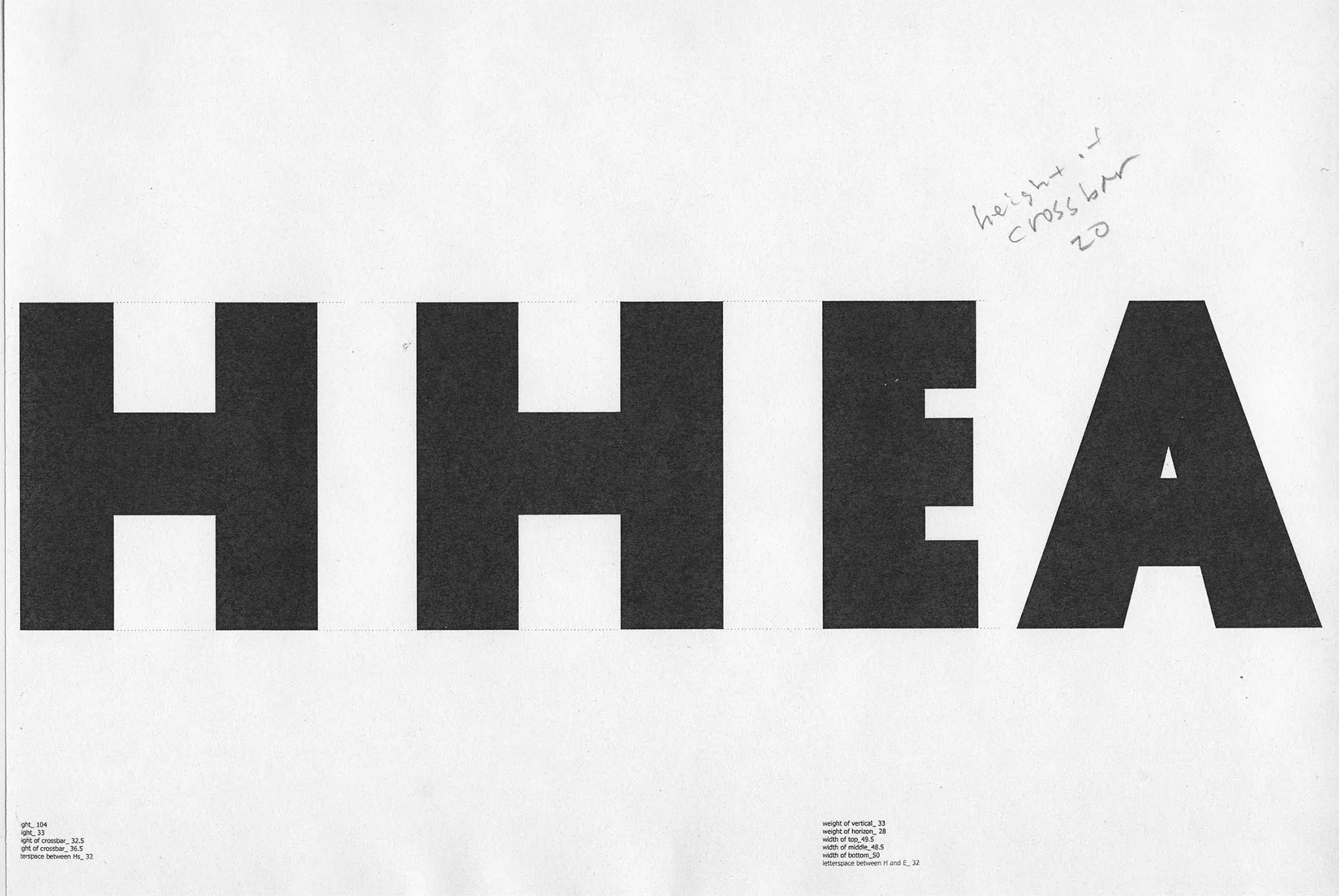
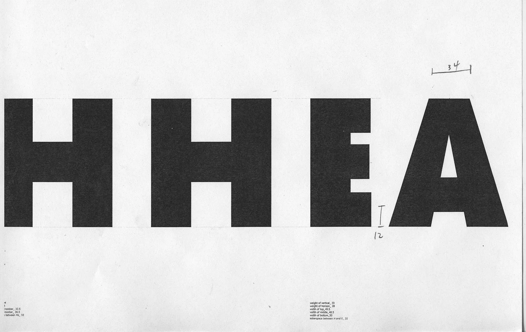
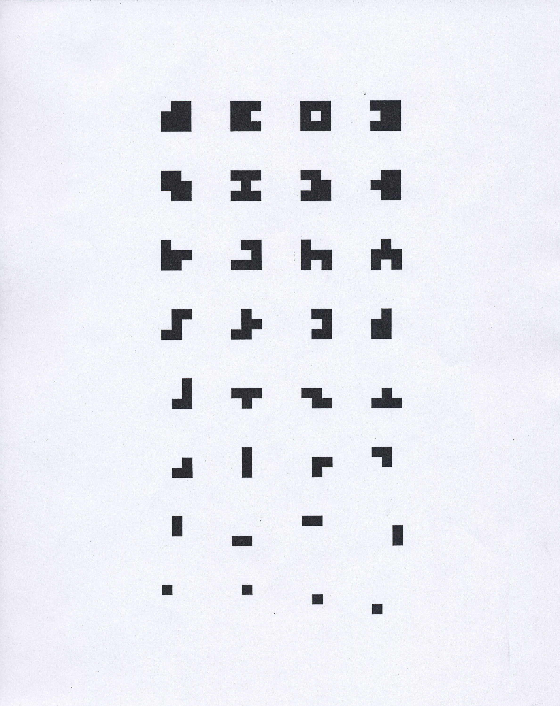
2-1-1.webp
2-2-1.webp
2-3-1.webp
2-4.webp
2-5.webp
2-6.webp

Crossbar height

3-3-1.webp
3-1-1.webp
3-2-1.webp
3-4.webp
3-5.webp

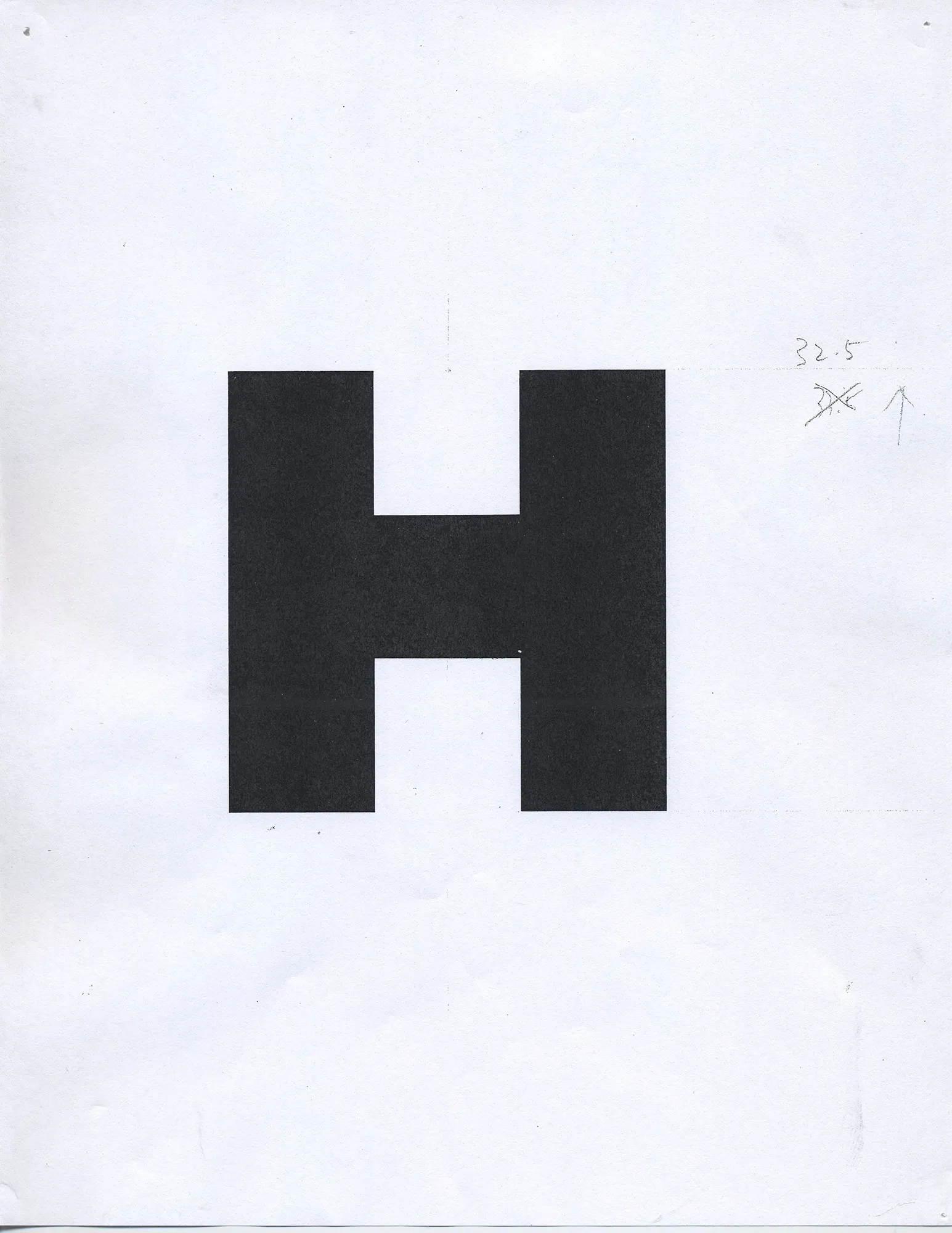
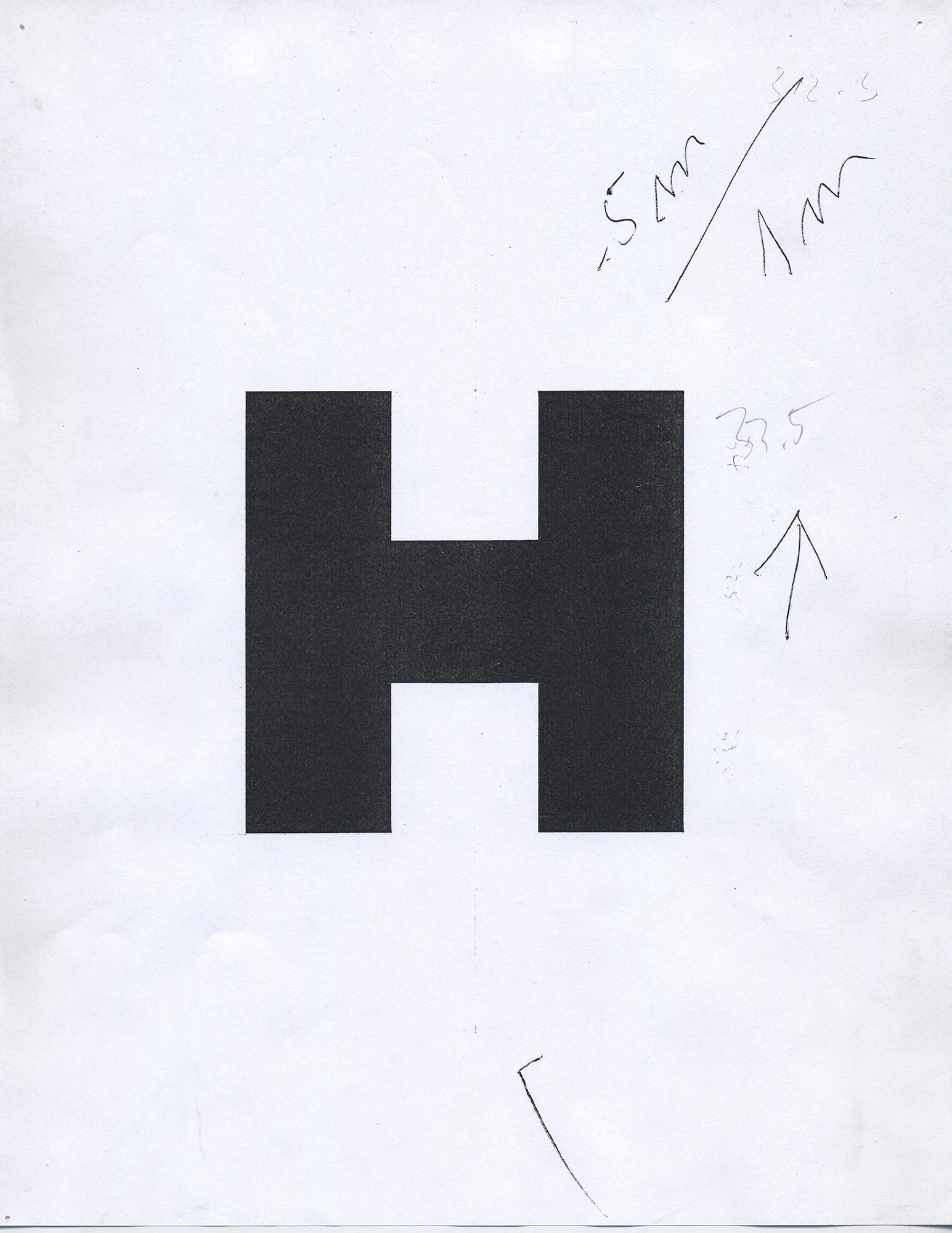
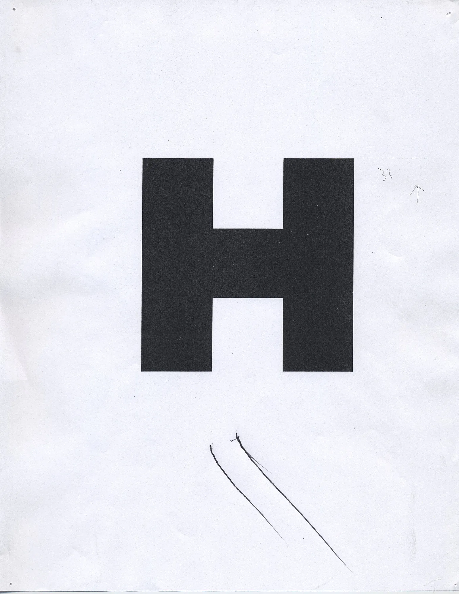
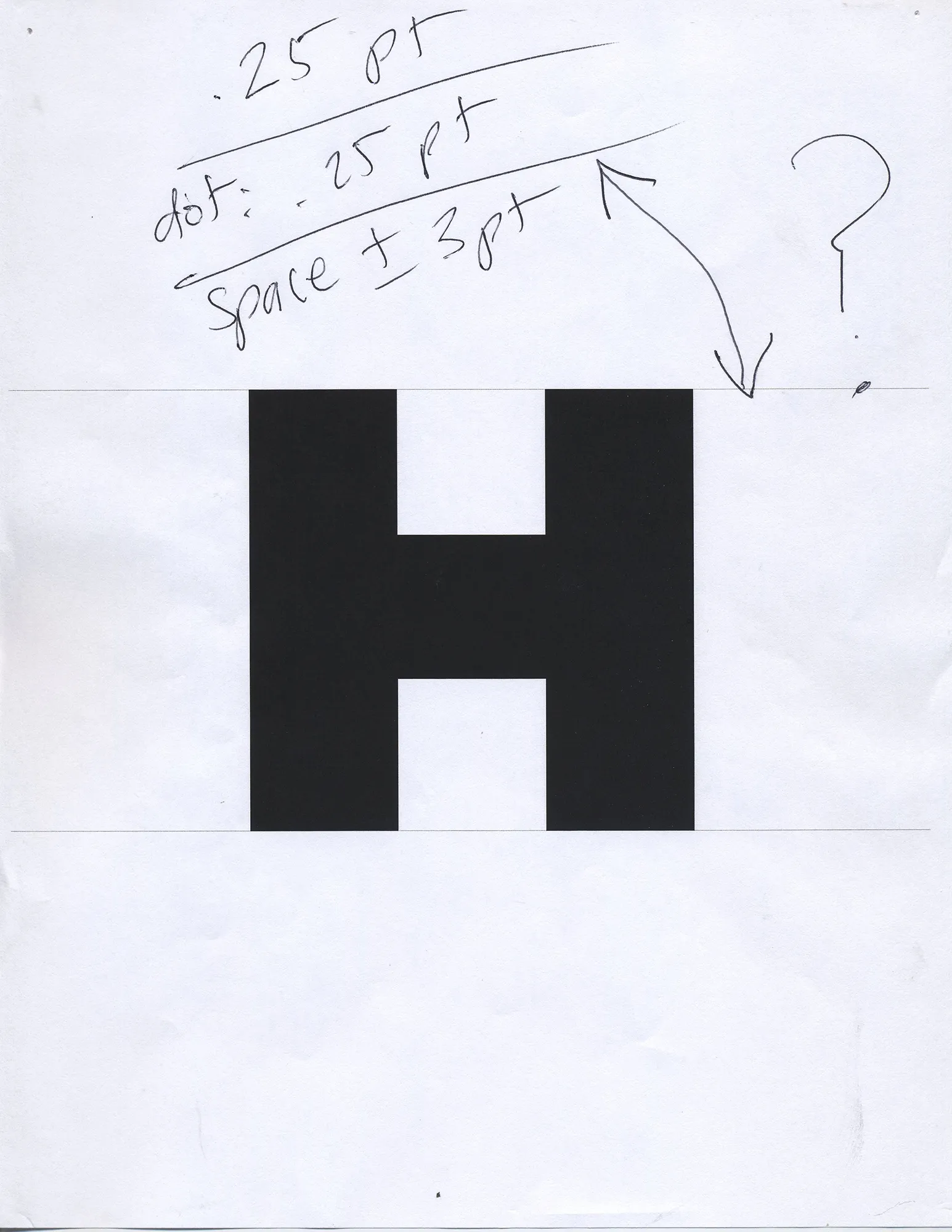
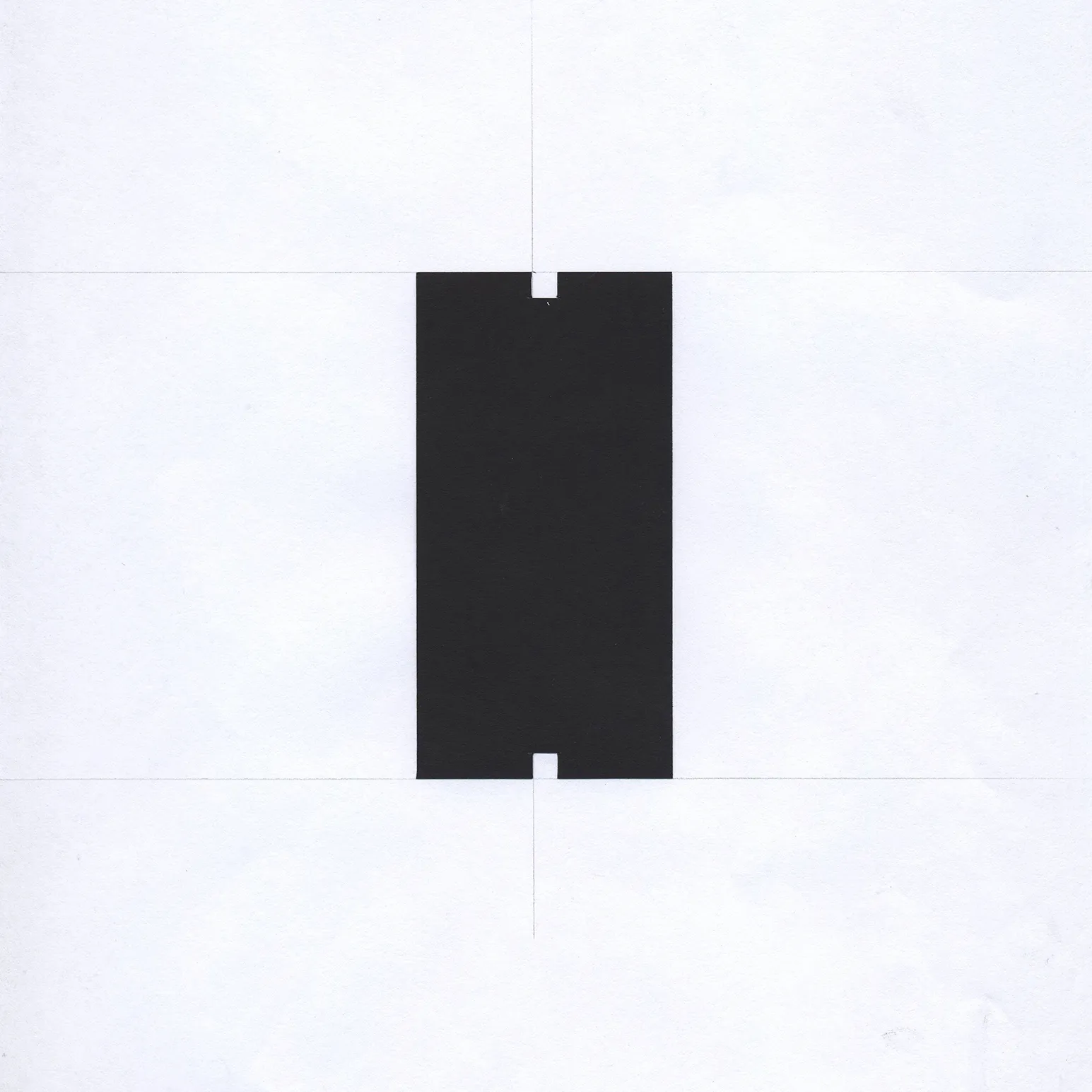
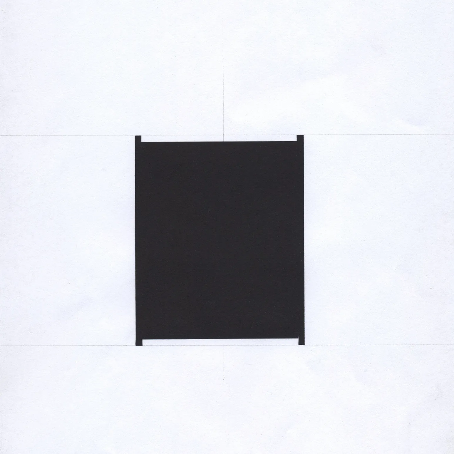
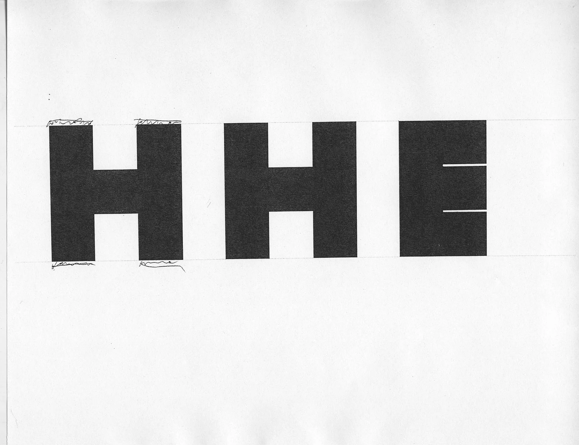
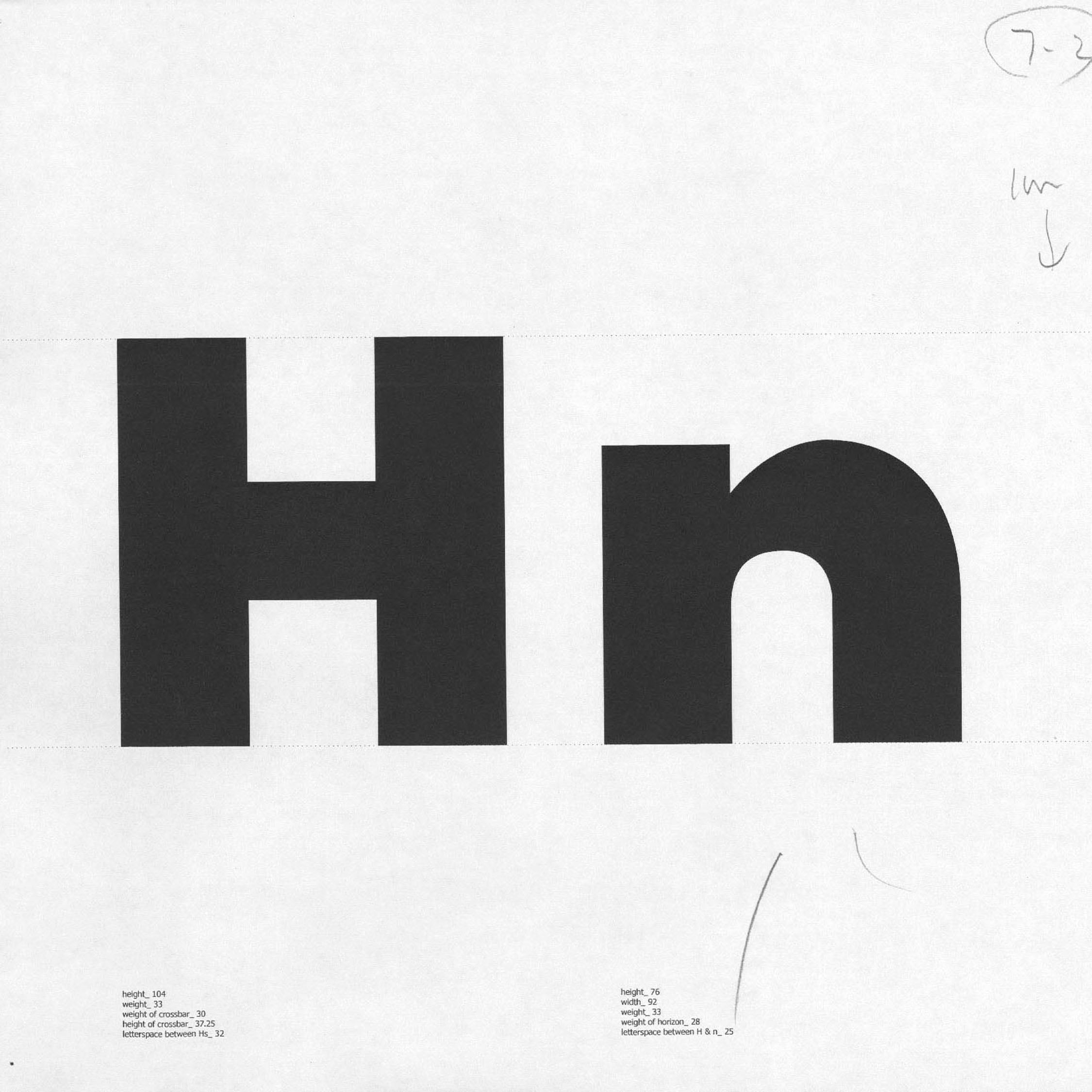
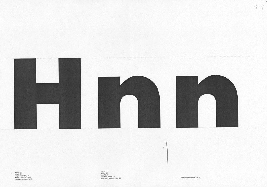
Space between H and H.

4-1-1.webp
4-4.webp
4-2-1.webp
4-5.webp

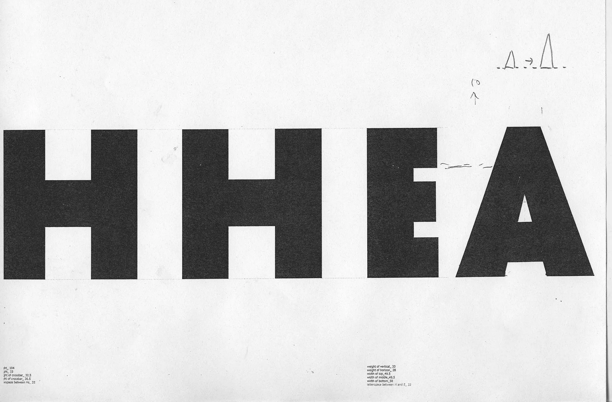
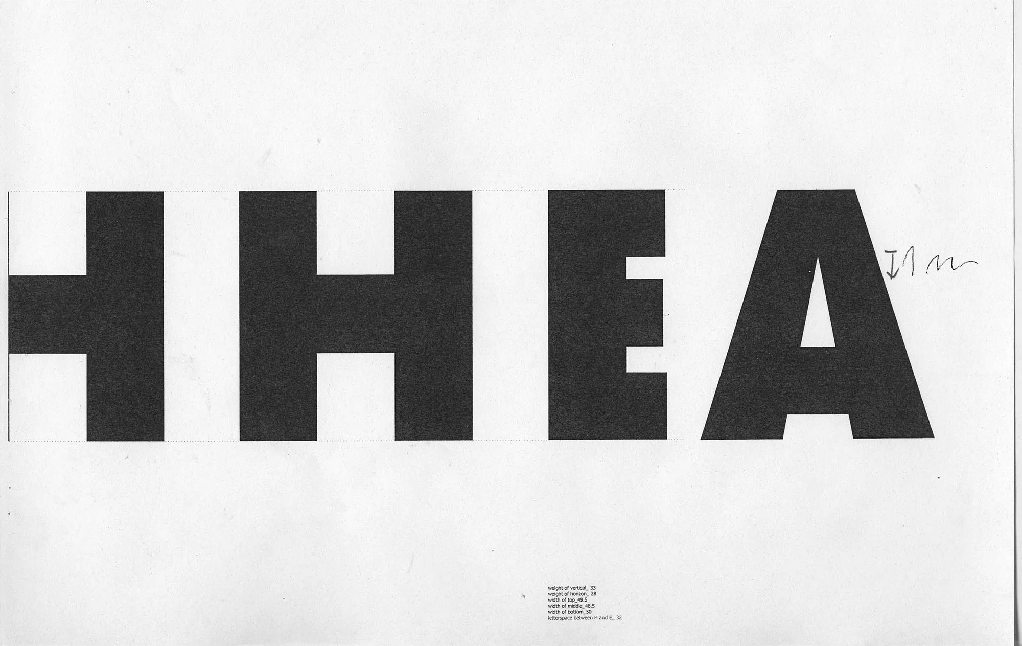
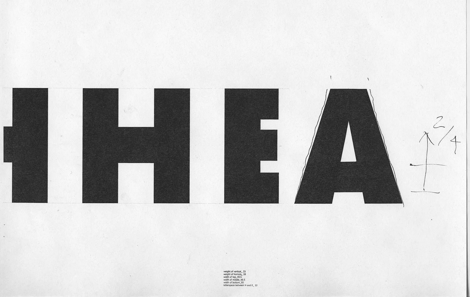
Letterform E from the optical rectangle shape.

5-1-1.webp
5-4.webp
5-3-1.webp
6-1-1.webp
6-2-1.webp
6-3-1.webp
6-6.webp
7-1-1.webp
6-4.webp
7-2-2.webp

Letterform A from the rectangle triangle shape.

8-1-1.webp
8-2-1.webp
8-4.webp
8-6.webp
9-2-1.webp
9-3-1.webp
10-1.webp
10-2-1.webp
9-4.webp
10-3.webp

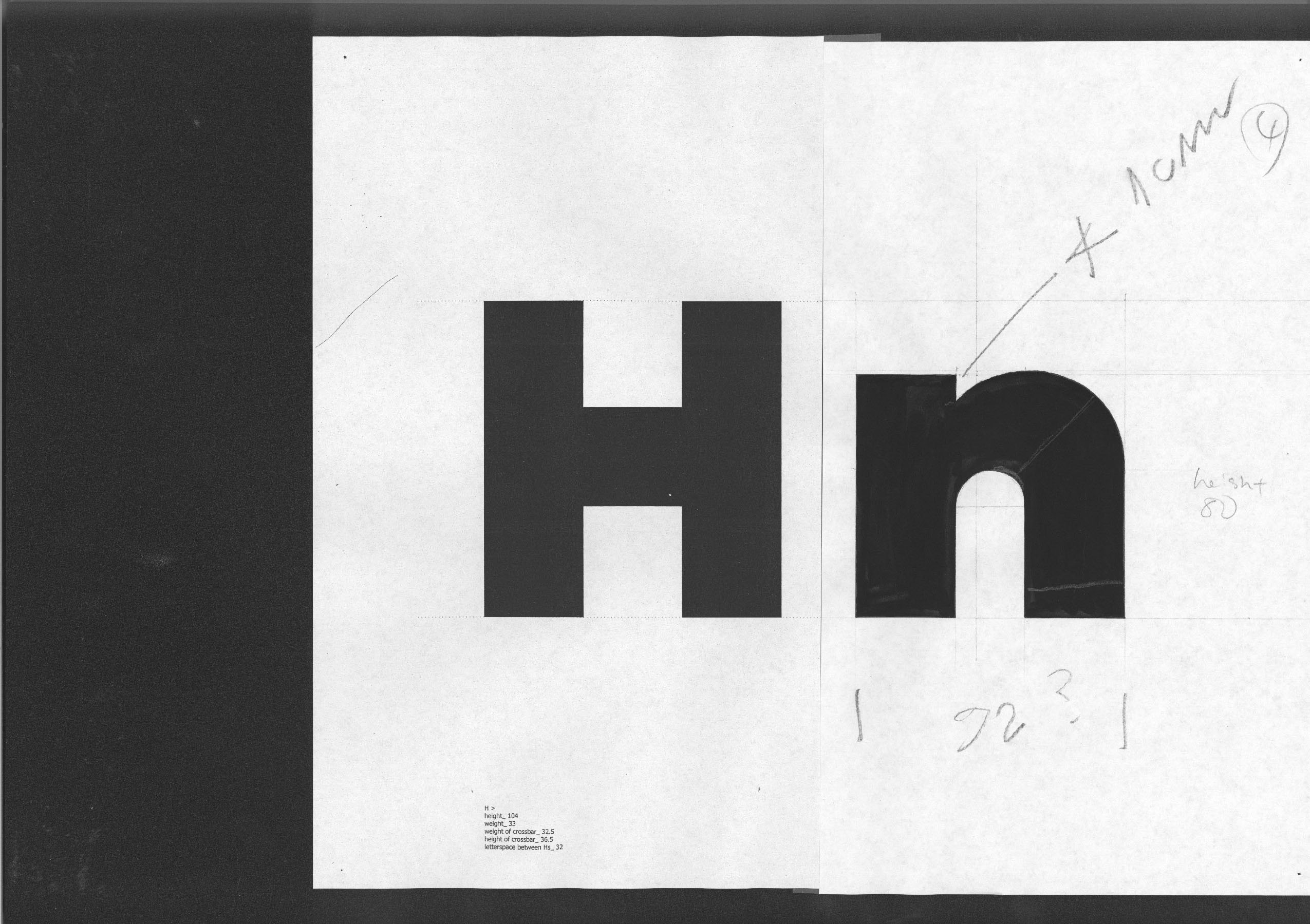
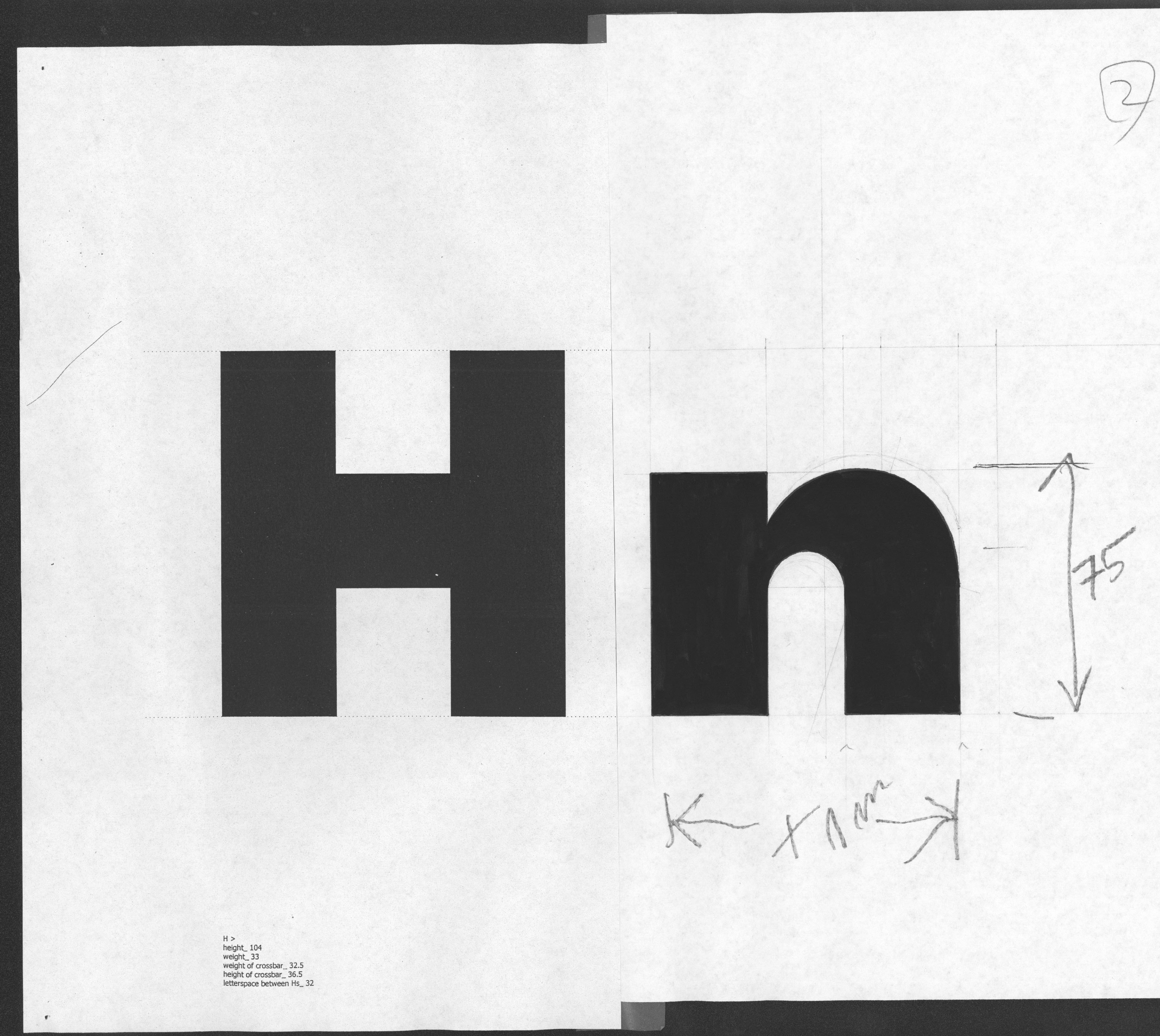
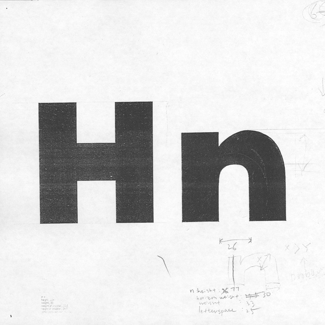
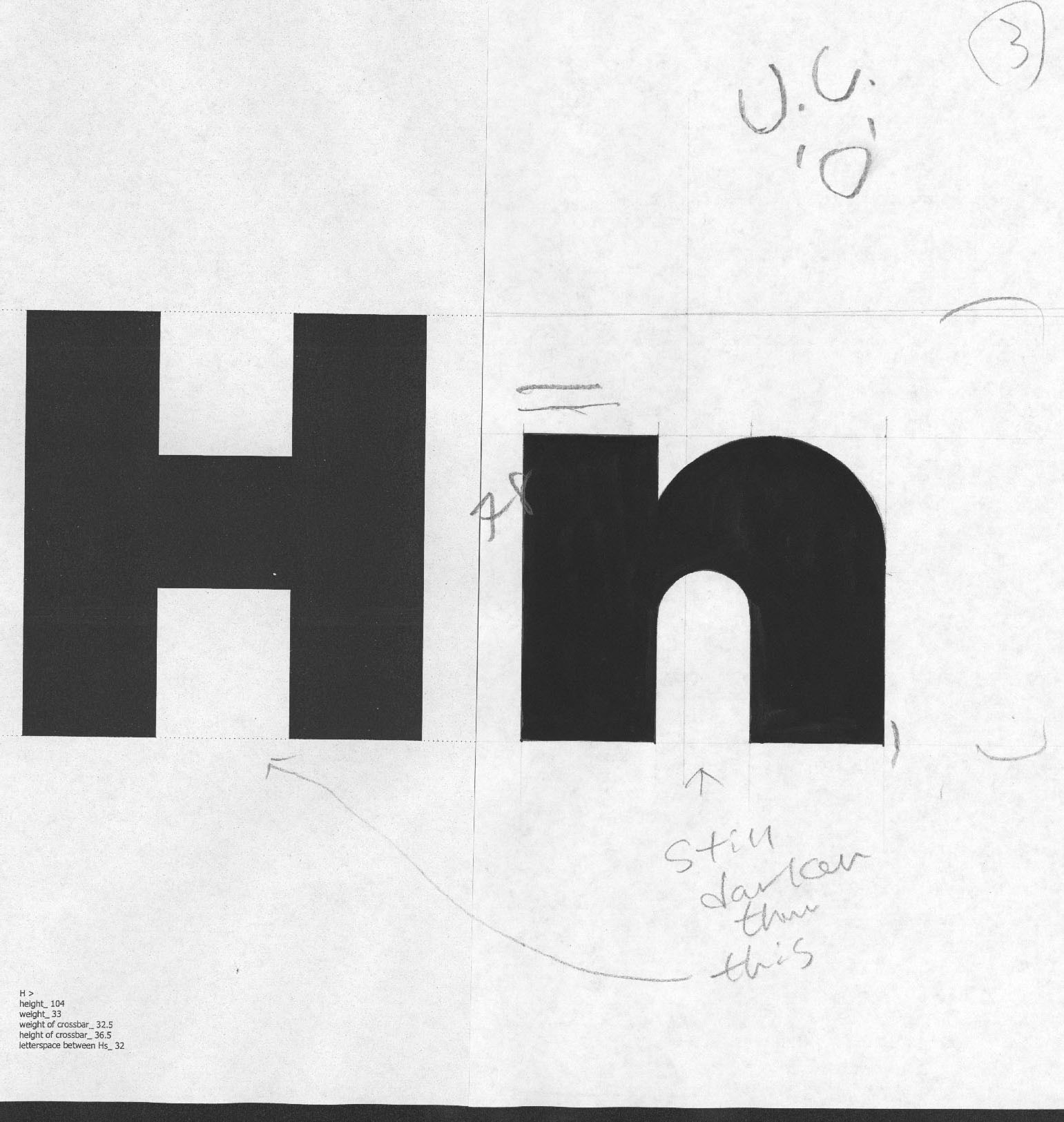
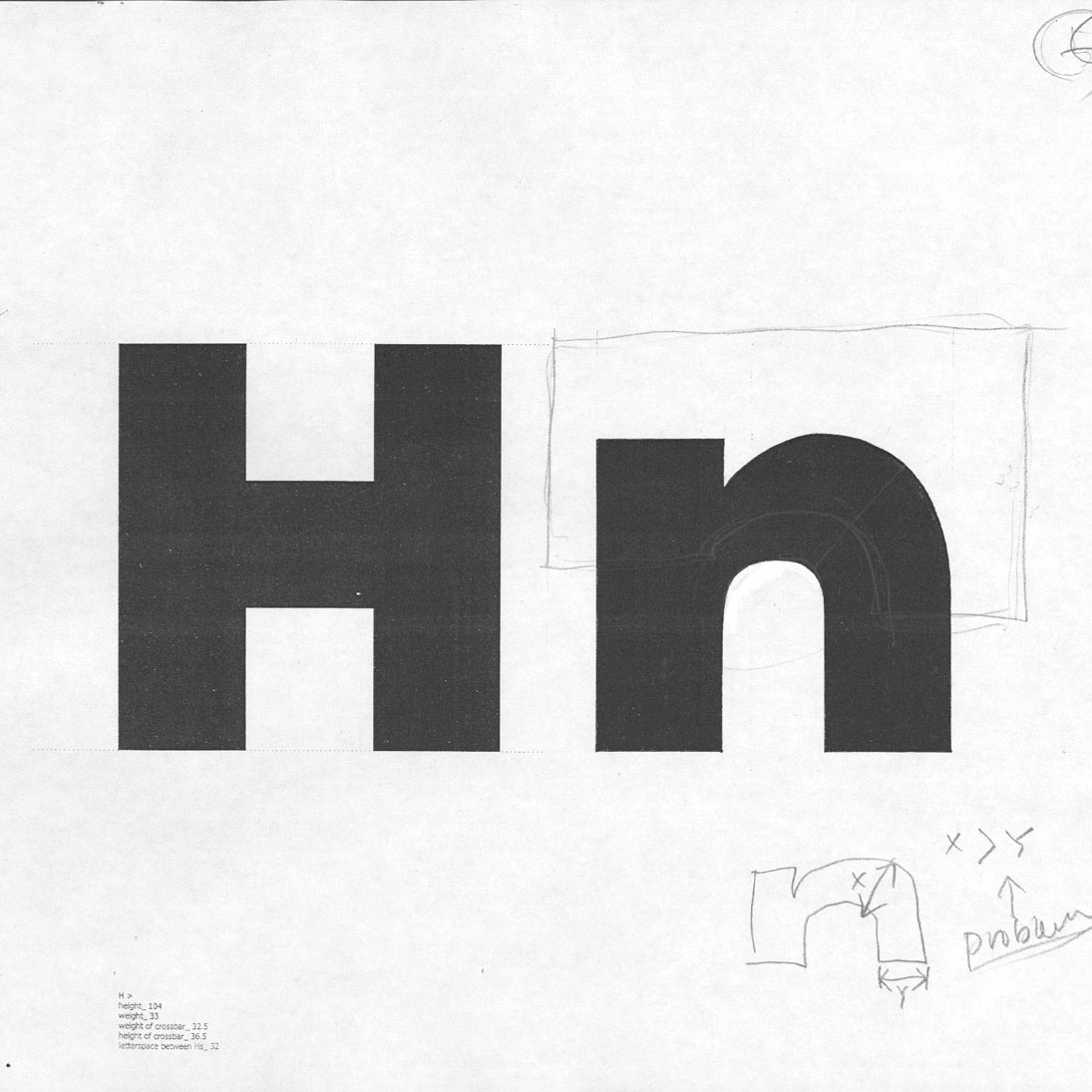
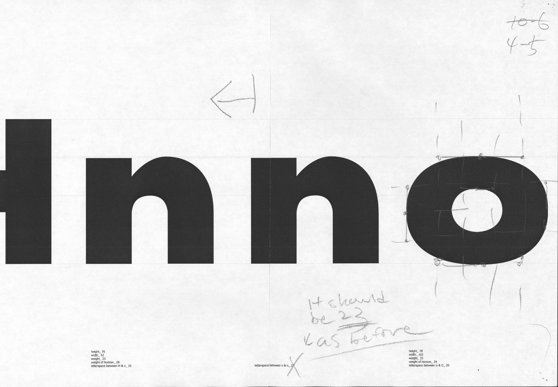
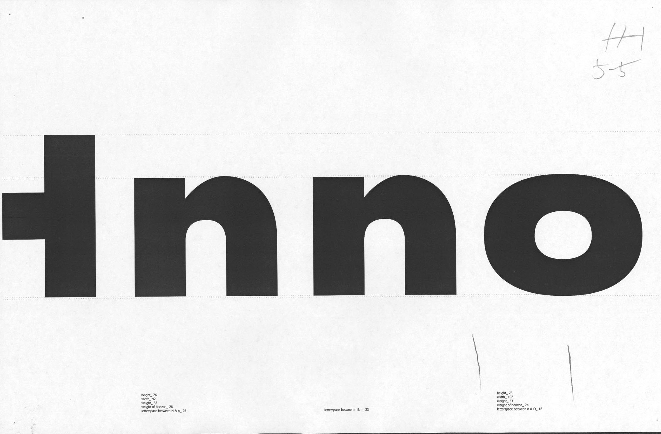
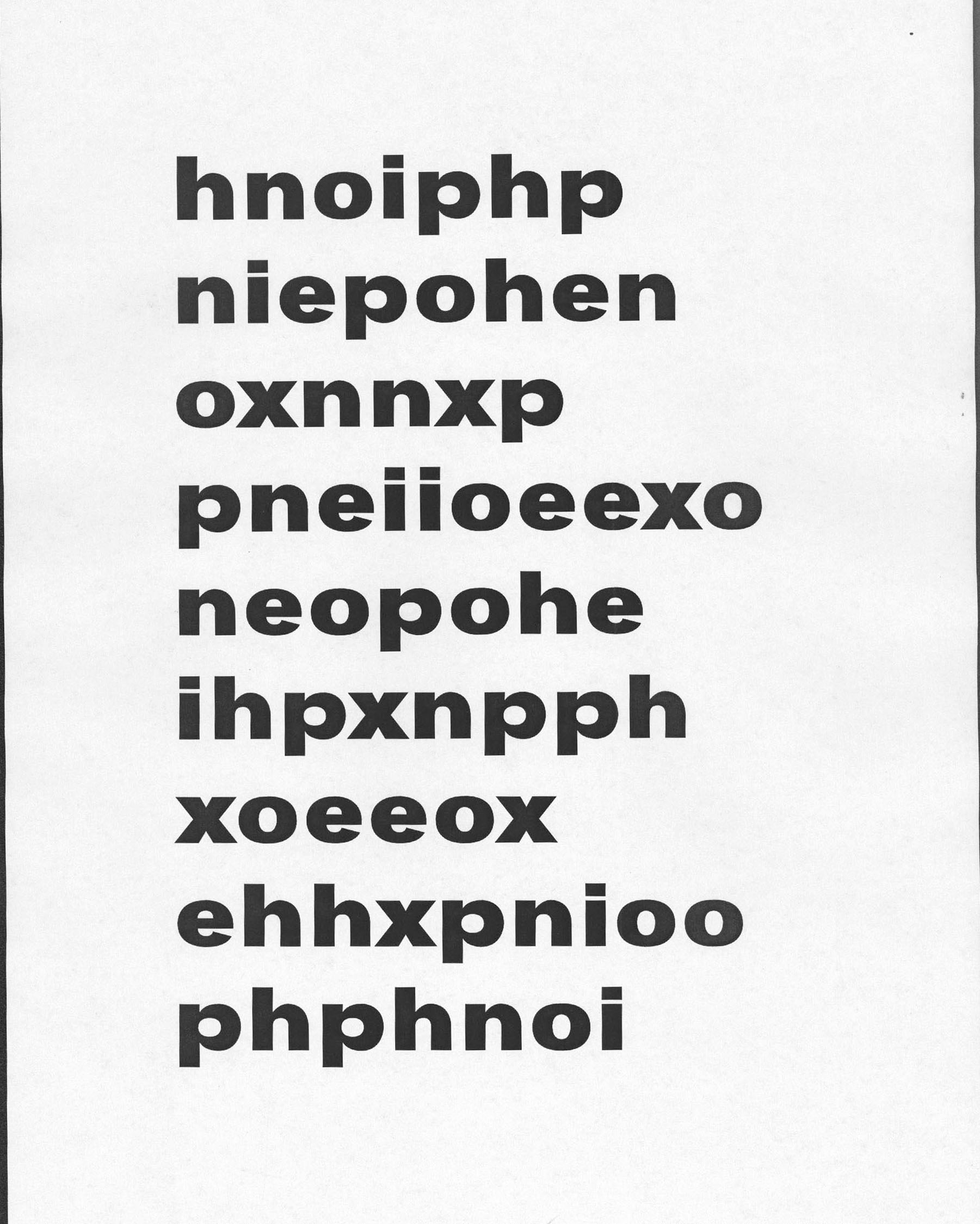
The first lowercase n

1-4.jpg
1-2.jpg
2-4.jpg
1-3.jpg
2-1.jpg
2-5.jpg
3-2.jpg

The lowercase O and P by the n

4-5 width of circle.jpg
5-5 shaping circle.jpg
6-5 shaping p.jpg
7-5 shaping e.jpg
8-3 space p n e.jpg
9-3 i n resahping e.jpg
11-5 x weight.jpg
12-5 x space i n x.jpg
10-3 shaping x.jpg
8.jpg
12312315123.jpg
11112232135.jpg
S-2.jpg

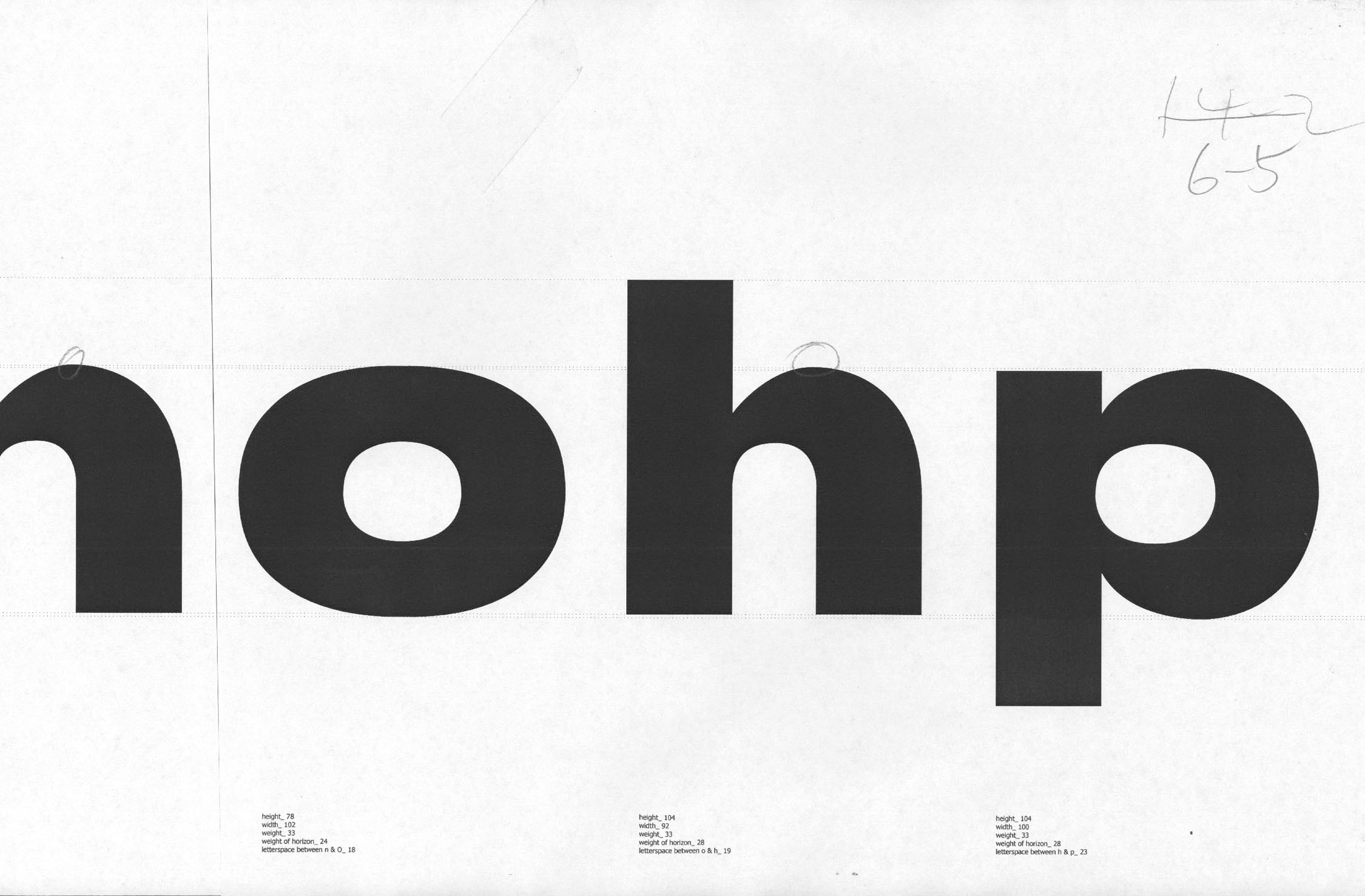
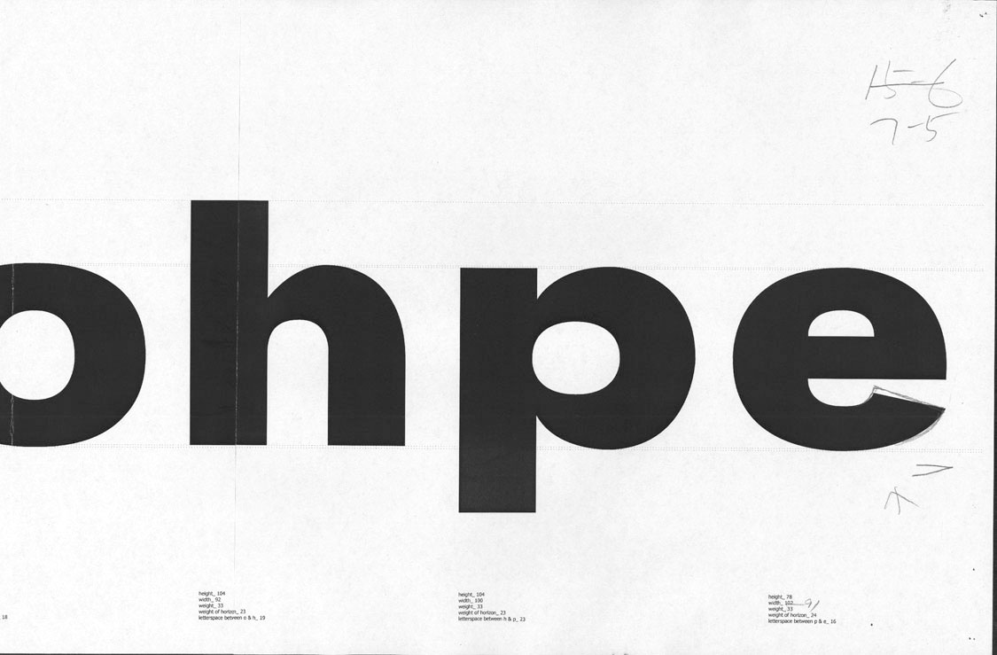
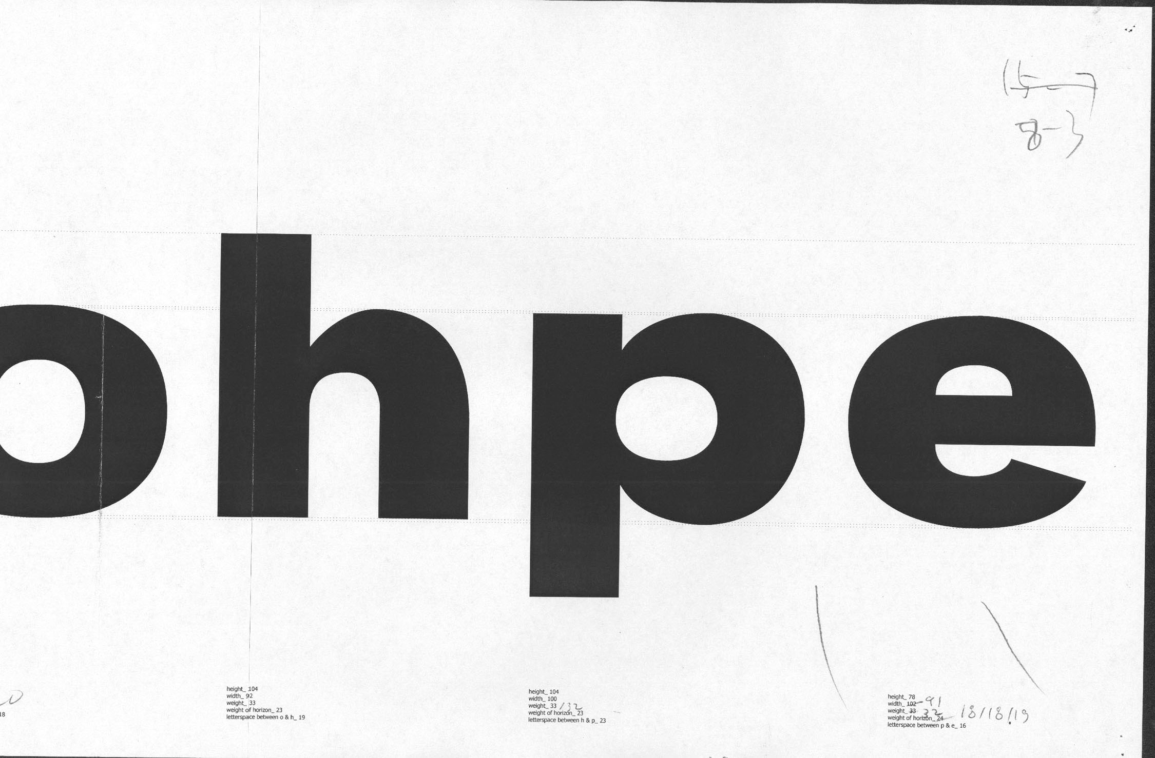
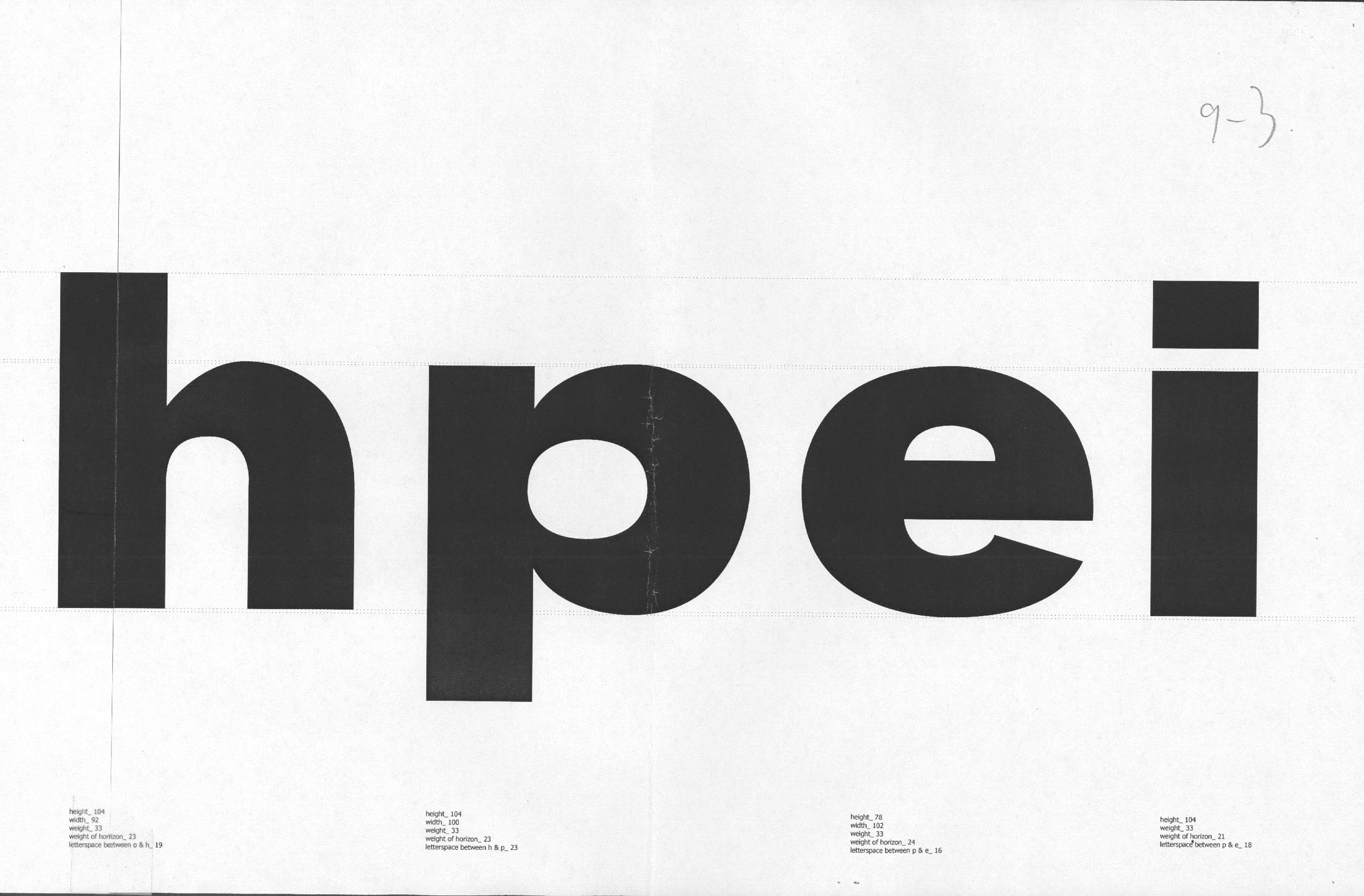
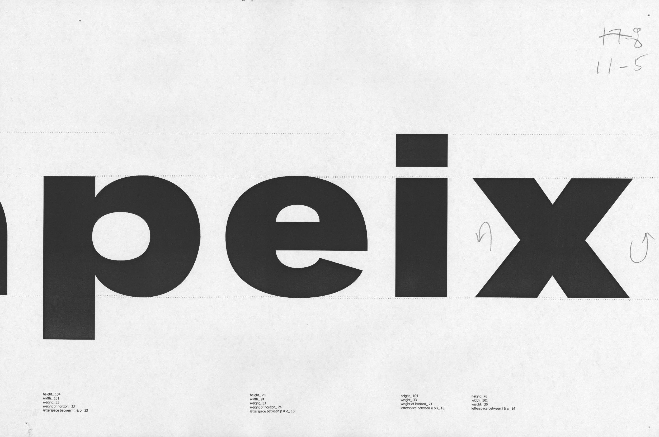
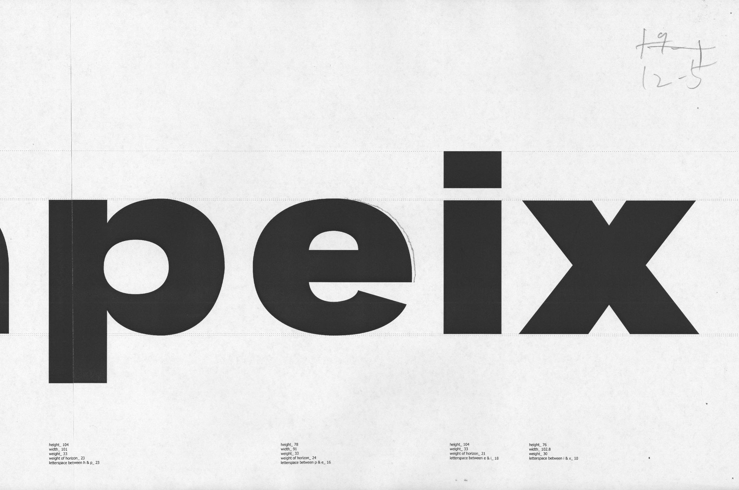
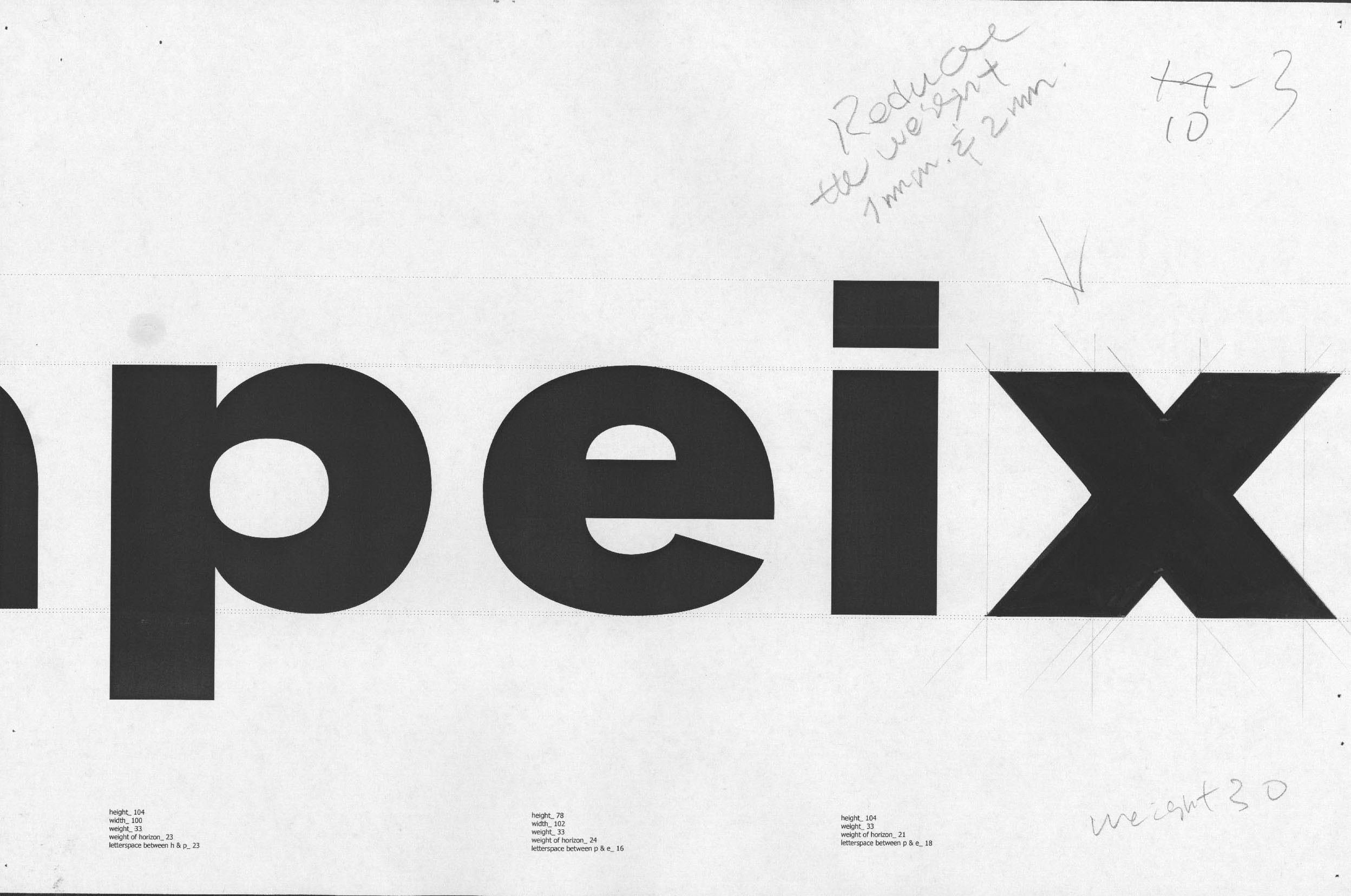
Crafting the ultimate lowercase letterform for optimal spacing and visual balance between counter space and the darkness of the typeset.

13-3 composition.jpg

End.