Design Translation · 2006

Basic Writing

Medium
Pencil
Lines
Vertical, horizontal, diagonal, circular
Tools
No ruler, no eraser
Date
2006/05/12
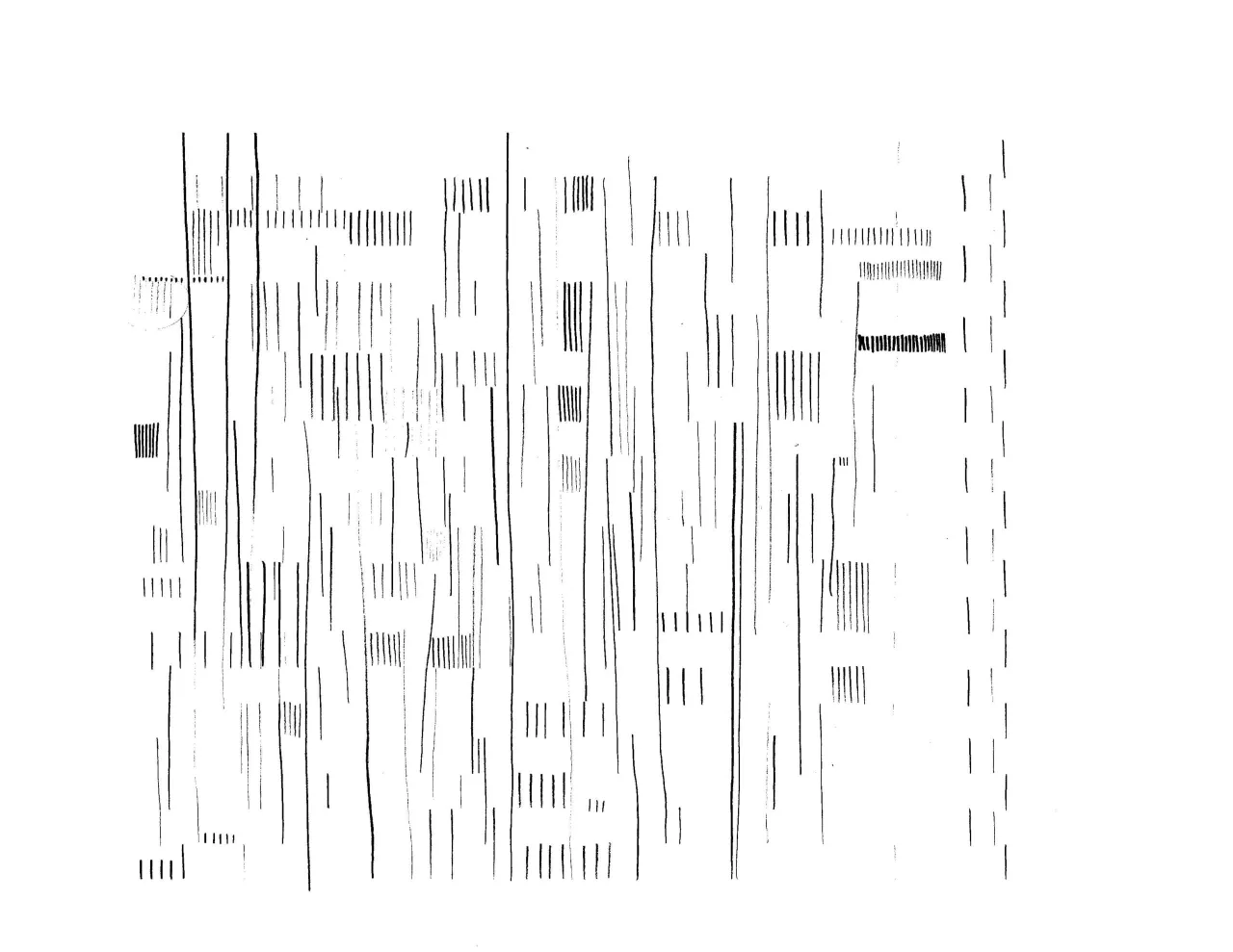
A sheet of pencil practice: many short and long vertical lines in different weights and tones, grouped in columns and rows

Pencil

Drawing a straight vertical pencil line is probably the best lesson to understand lettering.

It is such an art training if you perform it without a ruler.

01

Paper

First, I had to familiarize myself with a pencil in various softness and lead tones. Produce pencil line thickness by sensitive finger pressure onto paper. Control muscles, joints, and posture so that my line can be in a single color between the ends.

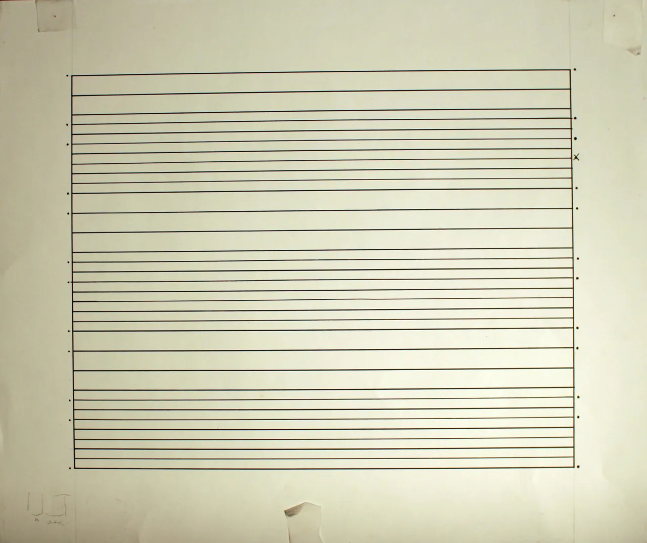
After many hours, I could expand my focus from the line to the frame sheet underneath. Yes, there are horizontal lines on the frame to fix my line height.
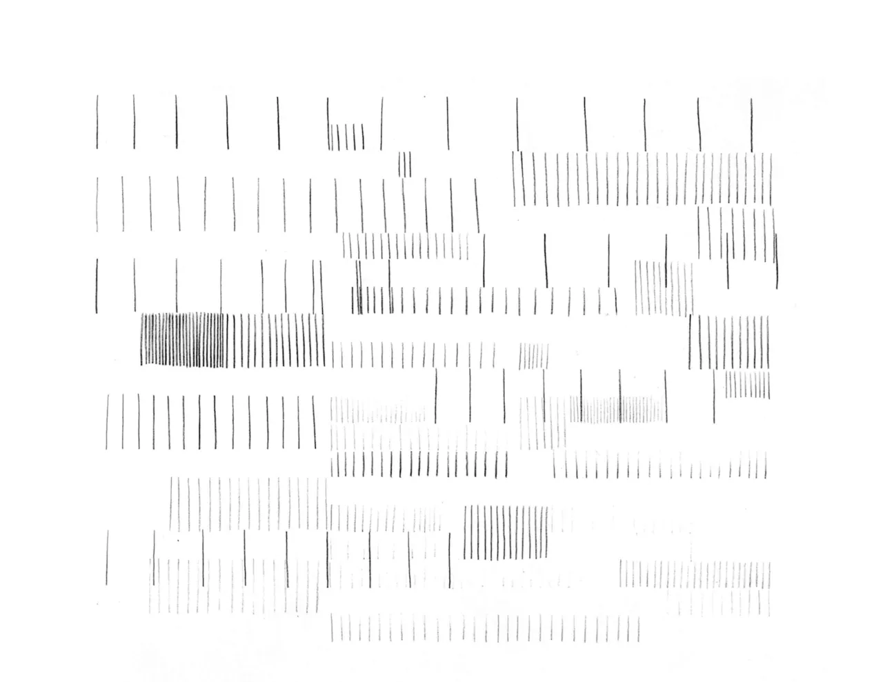
Rows of vertical pencil lines in light and dark tones, some thin and some dense
Rows of short vertical pencil lines spaced far apart on a plain sheet
02

Space

While I still brought the zig-zag lines, I slowly gained a sense of space between the lines horizontally and vertically. It became clearer and clearer to me. I knew the second when the pencil touched the paper whether the stem was set in the right position or not to create the space I wanted with other lines.

There are two kinds of space. Horizontal space between the lines and vertical space between the rows. Because the frame sheet defines the vertical spacing, I explored the horizontal balancing with various gaps.

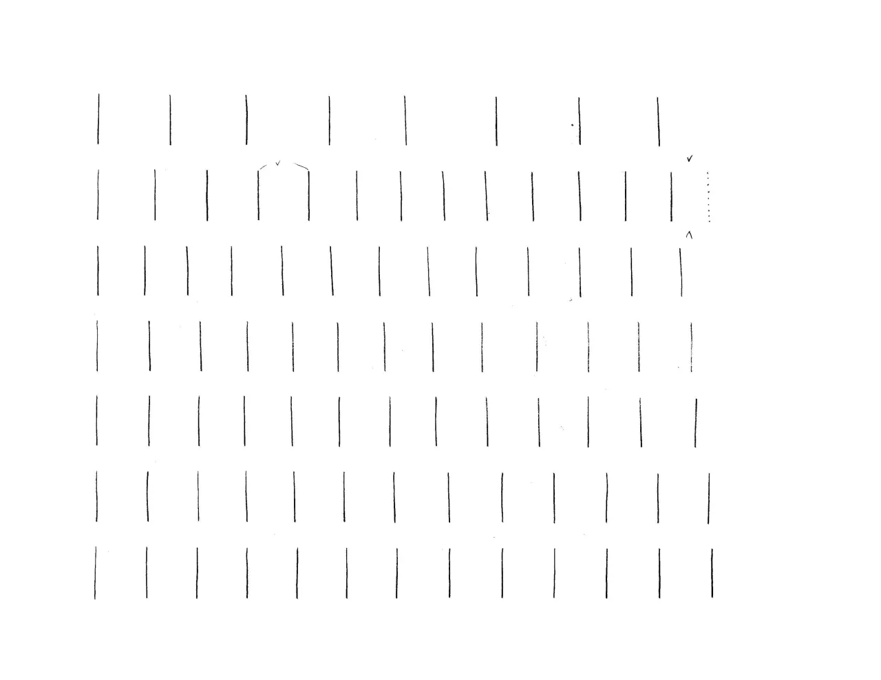
Rows of vertical pencil lines with different gaps between them, a few small check marks beside them
The frame sheet: a black rectangle on cream paper divided by horizontal lines at varying distances, with dots along both sides
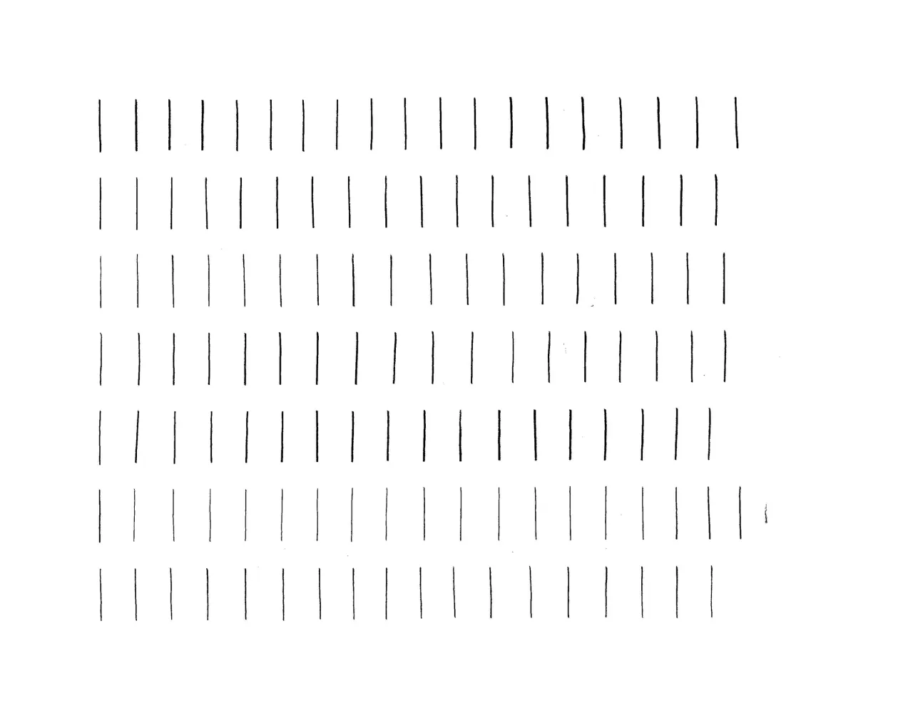
Seven rows of evenly spaced vertical pencil lines

Chisel Tip

Sharpened the pencil chisel tip benefits the lettering lesson two, consistent thickness, and more delicate stroke control.

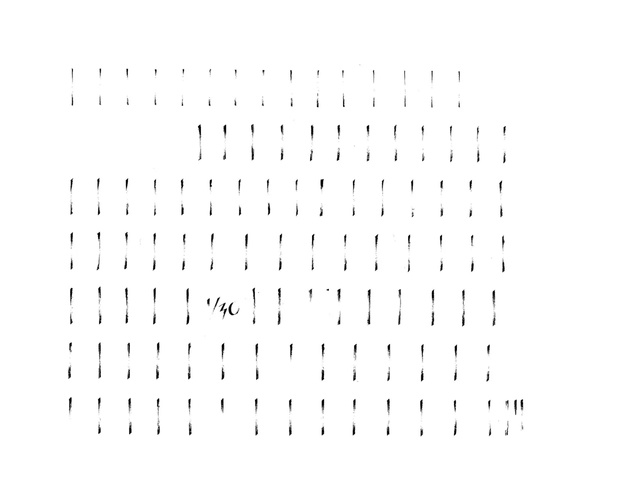
I had to learn how to grind and craft the chisel, how to keep the 45-degree angle while performing a line, and how to maintain the thickness while gradually changing the tone in a single line session.

Widened the line width and darkened the ending tone. I became fearless and adventurous because of the delicacy I gained over hours of practice. I love the most beautiful fiber lines drawn by the ground chisel tip. The unevenness often makes an exception at the most middle point of the line.

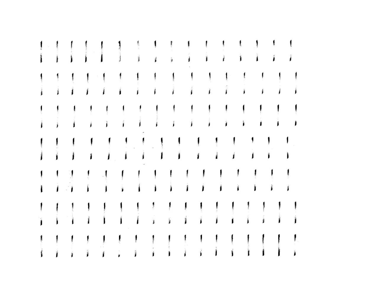
Rows of vertical strokes drawn with a chisel tip, each tapering to a thin middle
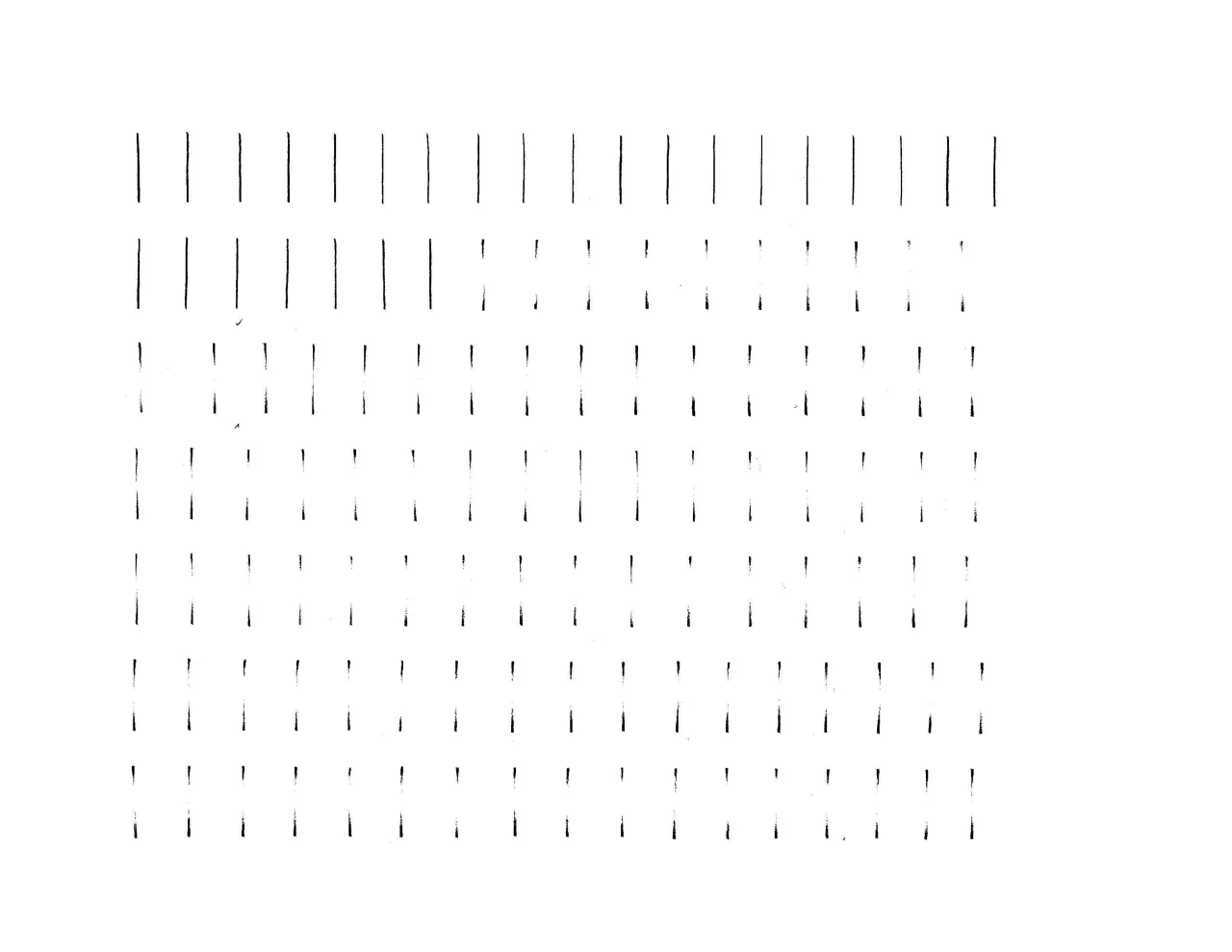
Rows of wide, dark chisel tip strokes, with a small handwritten 1/30 note in the middle

Perseverance

I spent ten seconds drawing the one-inch line and another measuring where to start.

No eraser use. Reset if a single mistake occurs. You can imagine how important it is to control oneself. The practice taught me patience, perseverance, and the love of typography.

Making a straight vertical line is so easy. Drawing one is hard. This lesson opened my eyes for the first time and taught me typography by words and experience. And I started to desire more.

Dense rows of chisel tip strokes, each with a dark end and a pale middle
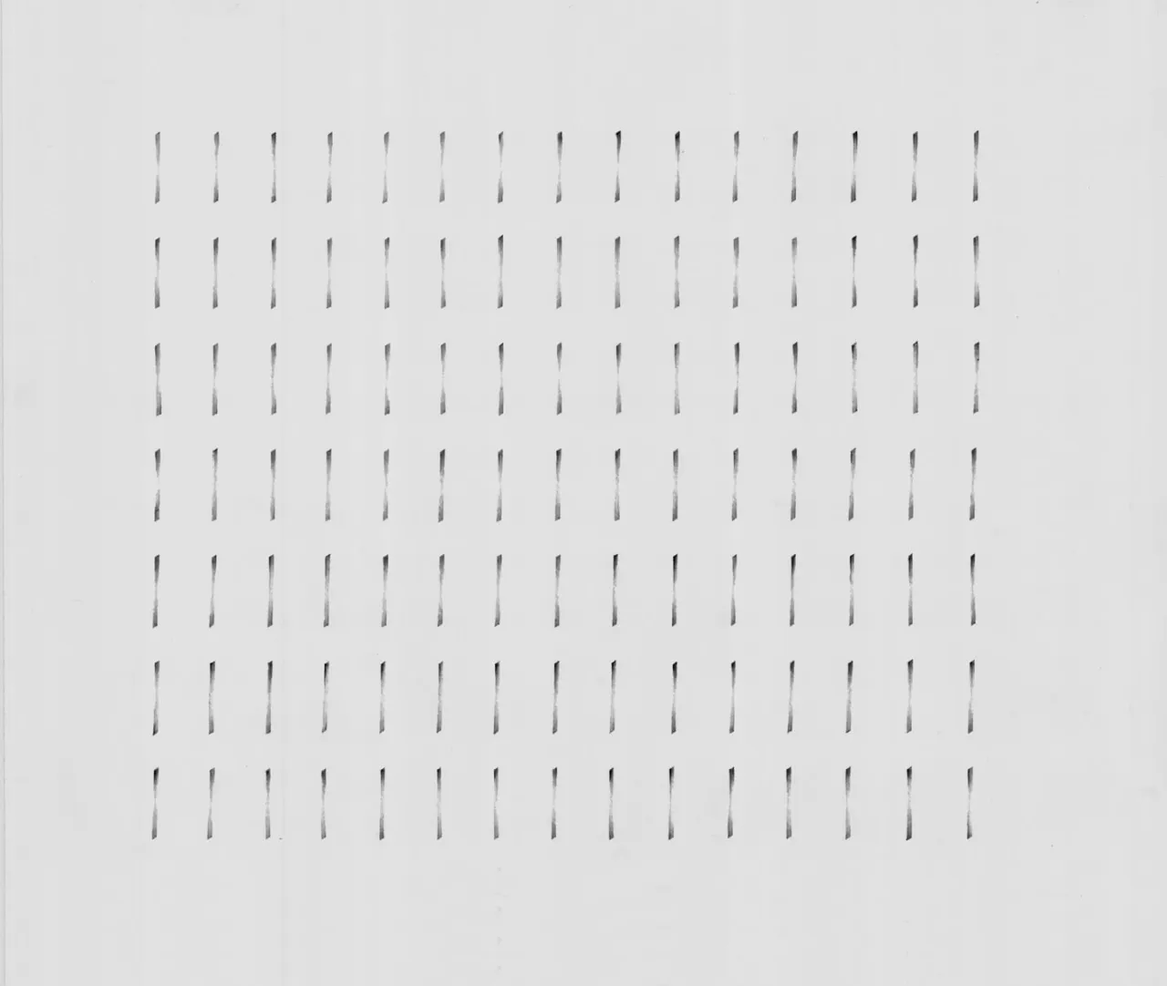
Seven rows of fifteen evenly spaced chisel tip strokes in soft gray, a finished sheet

Horizontal Line

Changing my pose to perform a different line direction from the previous one was critical.

01

Posture

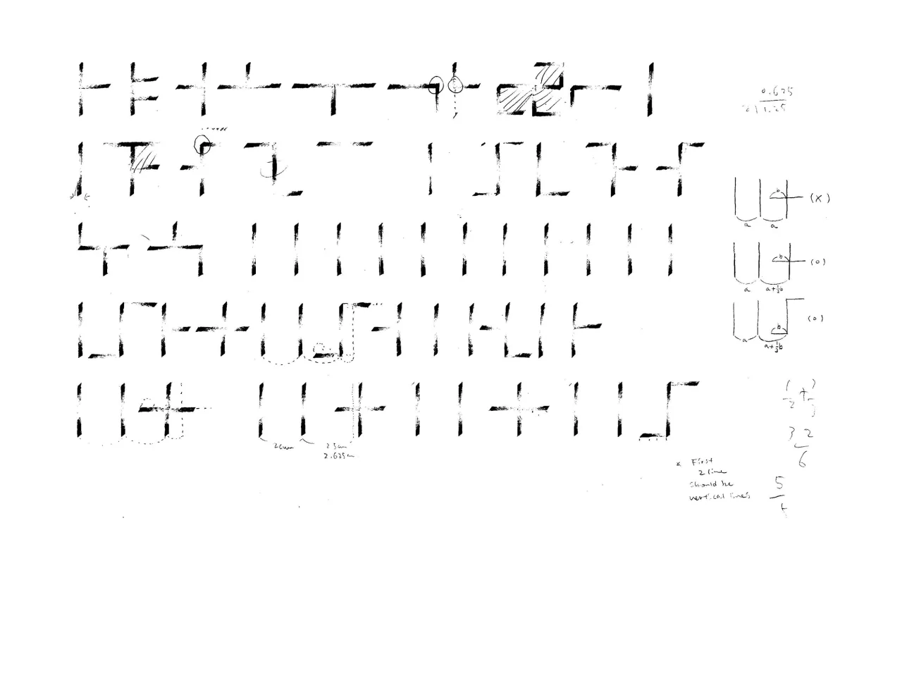
Changing my pose to perform a different line direction from the previous one was critical. After customizing the details from the elbow position to the finger range, I could draw a perfectly perpendicular line from the vertical lines.

A work sheet of vertical and horizontal chisel strokes joined into small shapes, with sketches, measurements, and handwritten notes at the right
02

Color of Space

Then, I faced a math problem. Depending on the position of the horizontal line, top, middle, and bottom, I had to adjust the gap between vertical lines to keep the space color consistent. Yes, there was the color of space.

Rows of vertical strokes with horizontal strokes attached at the top, middle, or bottom, and circled corrections
03

Shapes

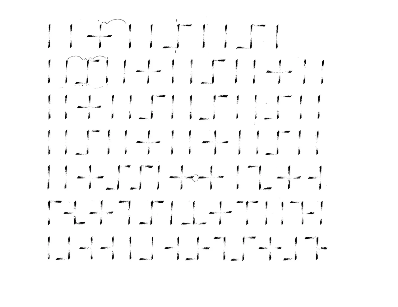
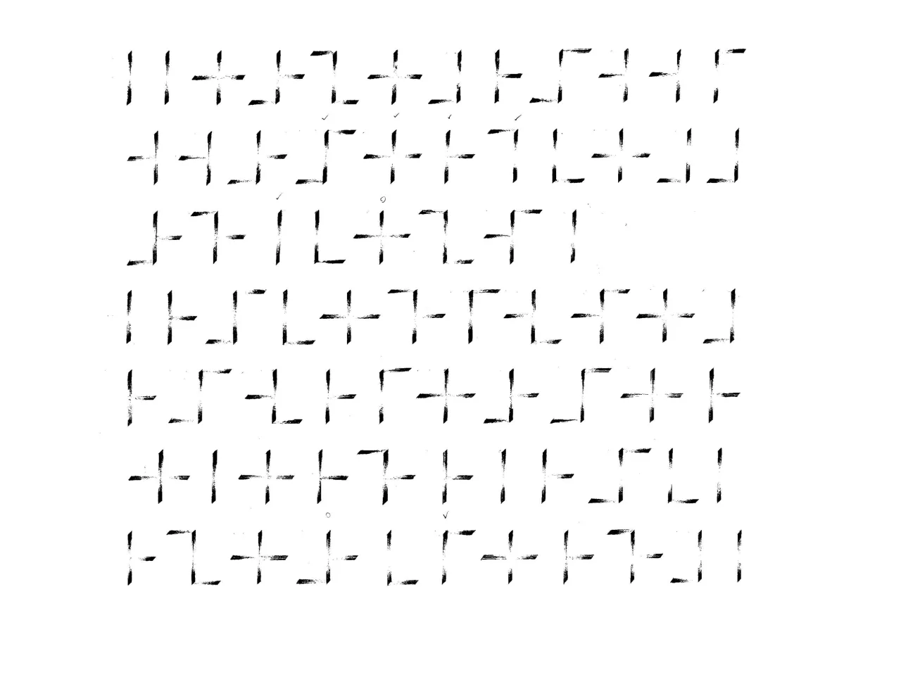
With two horizontal lines left and right from a single vertical line, there are 15 shapes I could draw. And I had to consider the many different colors of space.

A grid of shapes built from one vertical stroke with horizontal strokes to its left and right, some marked with check marks
04

Consistency

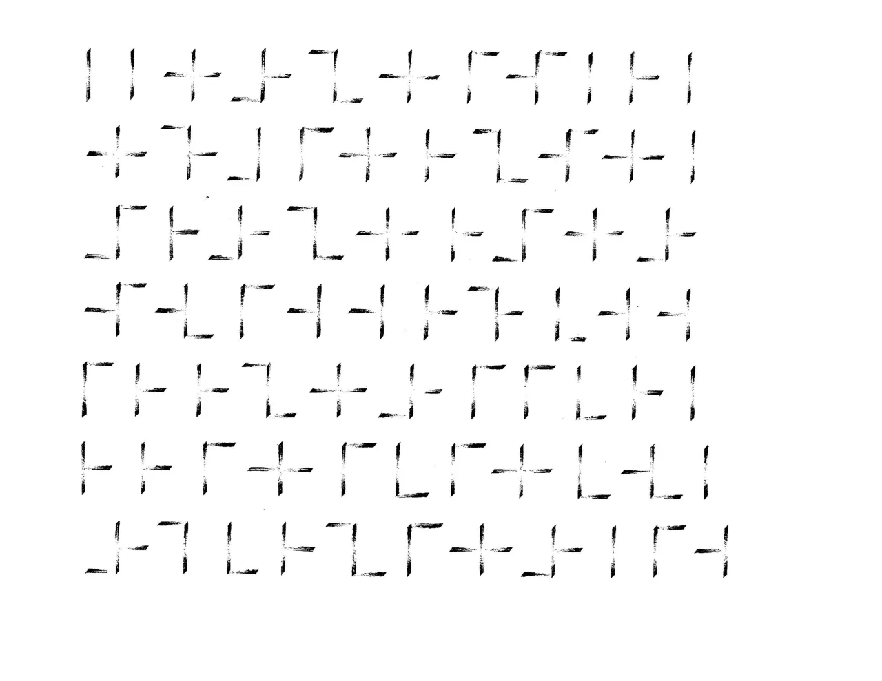
If you only look at the vertical lines in the work, the distance between them is not consistent. However, the space overall in the work looks uniform because of the horizontal lines.

Seven rows of vertical and horizontal stroke shapes spread across the sheet
05

Test

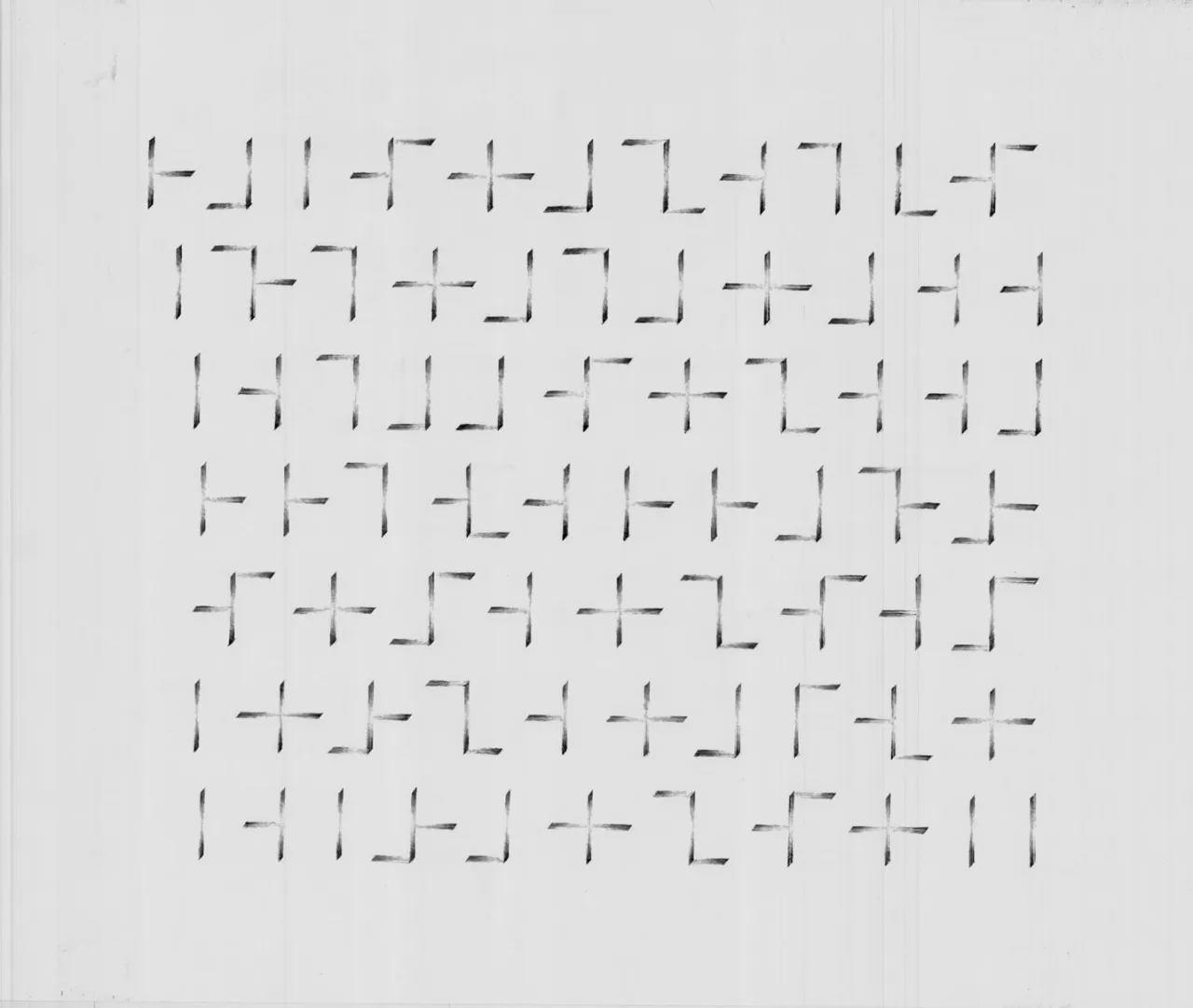
Straight line, check. Spacing, check. Height of horizontal lines, check. I had to test it by looking at the work upside down, tapping it on the wall, checking it in the distance, and fixing eye level right at the worksheet. Never stop the doubt until the exam.

A finished sheet of vertical and horizontal stroke shapes in soft gray pencil on pale paper

Diagonal Line

Diagonal lines carry a different line weight in each direction.

01

45°

When pencil lead width=X and draw lines by keeping the tip 45 degrees angled, the line weights by directions are:

  • ↘ = X
  • → = 0.71X
  • ↓ = 0.71X
  • ↙ = Chisel tip thickness
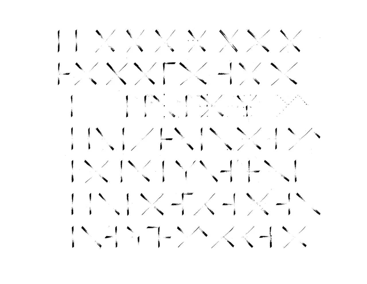
Rows of vertical strokes and X shapes with diagonal strokes crossing each other
02

90°

X shape has four counter shape openings: top, right, bottom, and left. I sensed the top-bottom counter space brighter than the left-right of the exact 90-degree X shape. It looked unstable and unbalanced. Although the cross of diagonal lines of X shape should be 90 degrees, my X opens more to the top and bottom to widen the standing ground. Then, all looked right.

After finding my X shape, I looked at its distance before and after the vertical/horizontal lines. Well, there are many more variations that I had to rely on my senses.

Many shapes. Still even gray color.

Rows of vertical strokes mixed with diagonal strokes, showing different spacing around each X shape
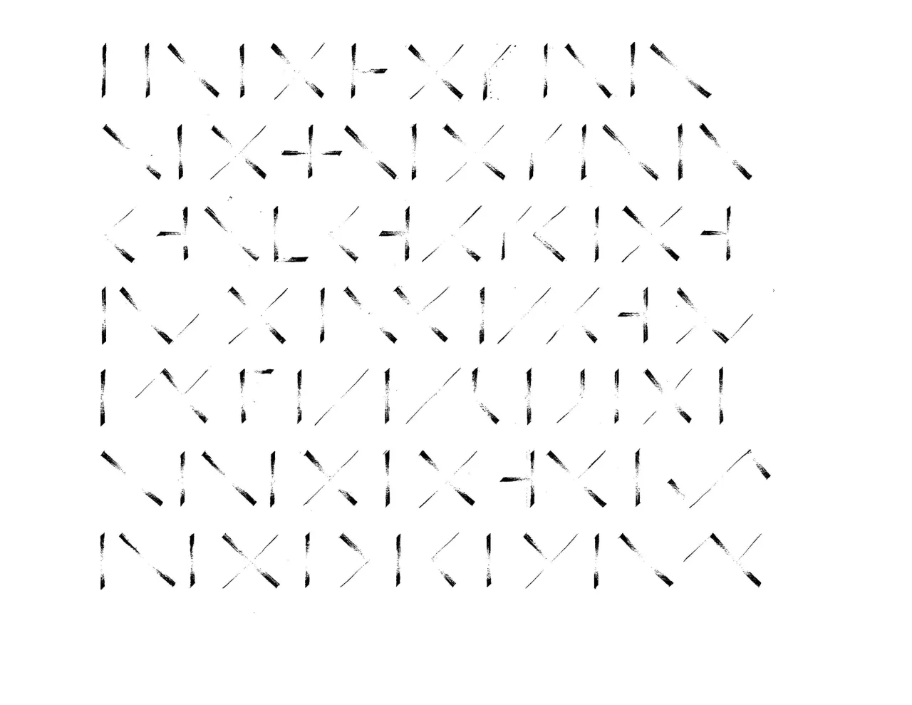
Six rows of vertical and diagonal strokes in varied combinations
A finished sheet of vertical, diagonal, and horizontal strokes in light gray pencil, forming an even texture

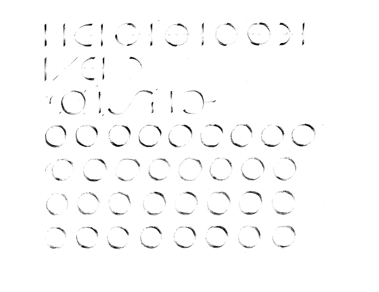
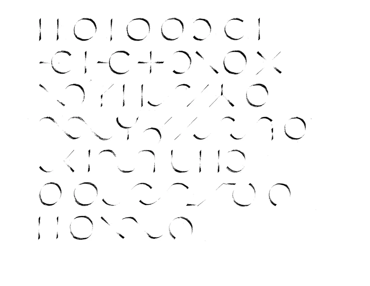
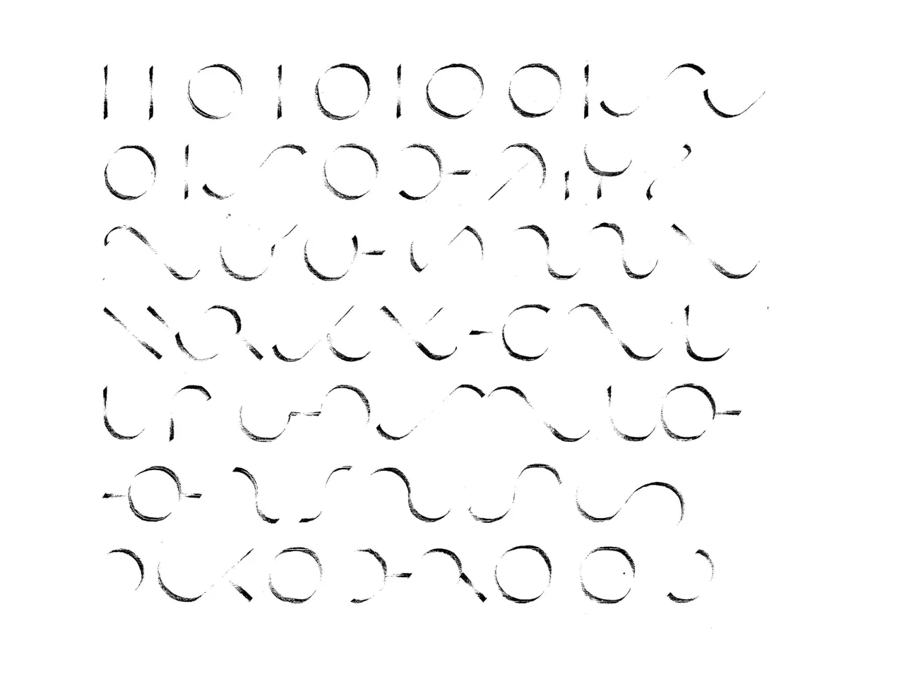
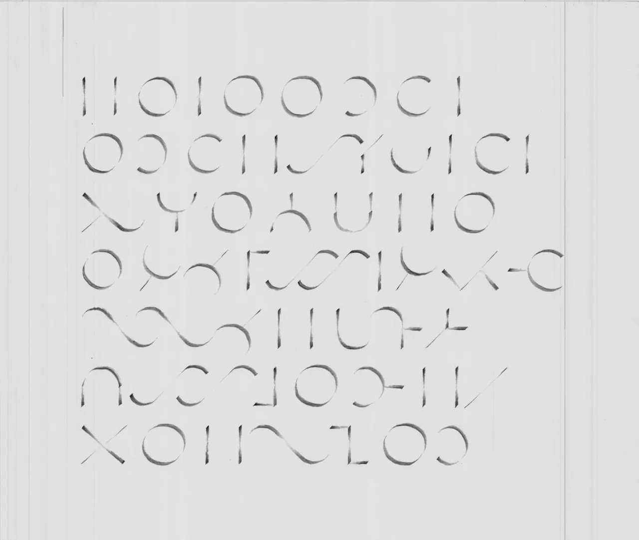
Circular Line

The circular line is the most natural artifact that the human body can produce.

However, drawing a perfect circle line is a challenge.

The first mistake was forming a circle with two standing half-circles, joining at 12 and 6 o’clock. The second mistake was setting stress at the ends of the half-circle line. They were supposed to touch the tips at 2 and 7 o’clock and emphasize the middle of the line.

Rows of circles drawn in pencil under a few lines of vertical strokes and partial circles
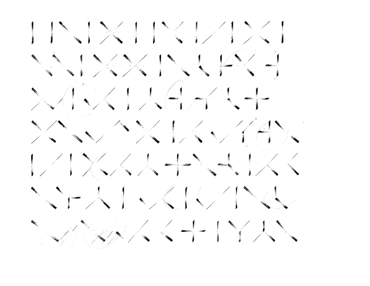
Rows of vertical strokes, circles, half-circles, and diagonals mixed together
Rows of strokes and circle arcs, with wave-like curves in the lower rows
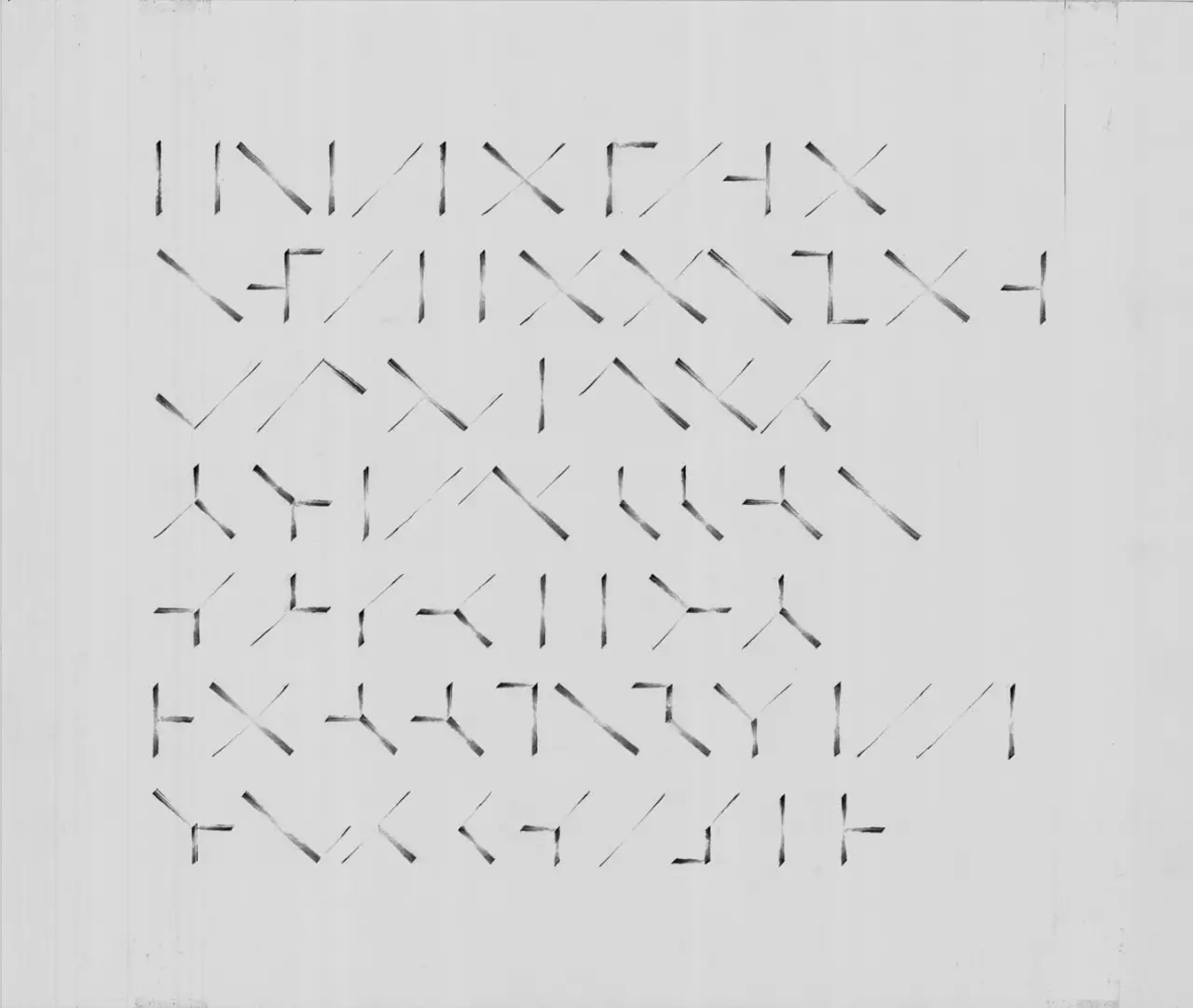
A finished sheet of strokes, circles, and curves in soft gray pencil
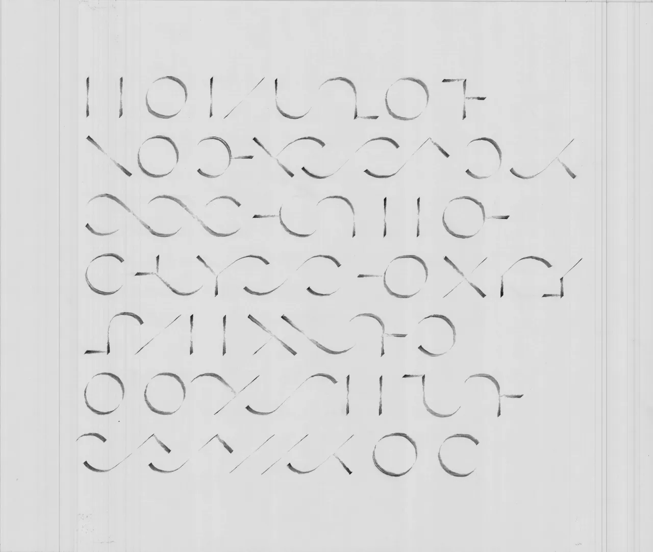
A final sheet of circles, arcs, waves, and straight strokes in soft gray pencil

Where it began

Where my love of typography began.

2006/05/12

More Design Translation