Design Translation · 2011

Geocentric Clock

The arm stays still and the numbers come to it. A wall clock that tells time by an unusual movement.

Object
Wall clock
Size
15 in diameter
Material
Plywood, bond-paper face
Readable from
20 ft
Year
2011
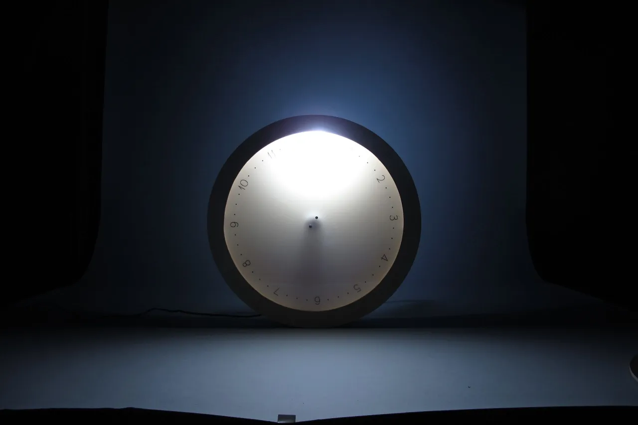
The clock photographed in the dark, with a light glowing at the top of its face
The light at the top is the fixed point. The face turns beneath it.

How to read it

The light stays. The numbers move.

The clock has a stationary light at the top of the circle and a rotating face with three dots between each hour. The gap between dots is 15 minutes, so the second dot after 2 at the light means 2:30.

123456789101112

Reads as

12 o'clock

Digital

12:00

This drawing follows the same rule as the object. It is not the clock itself, which has no readout beyond the dots.

Design decisions

Four choices behind the clock

01

Move the numbers, not the arm

A standard wall clock turns two arms clockwise over twelve fixed numbers. Read that way, the arms are the sun and the stars, and the numbers are fixed objects on Earth. That is the heliocentric picture, and it is a scientific fact. I designed the opposite: the numbers move to a stationary arm.

One light stays put. Everything else moves.
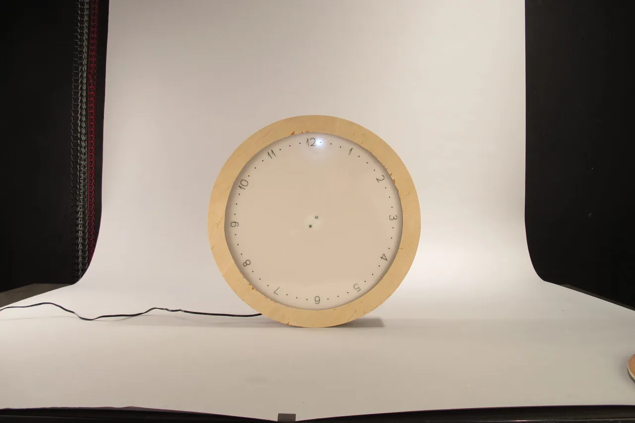
The clock face at twelve, with the light lit at the top of the face
02

Say the time the way people say it

Reading "It is 5:36 pm" off a wall tells you too much. We usually say, "It is a quarter to 6." Many people already round the time when they share it, so I designed the clock to read that way.

Three dots between each hour, 15 minutes apart.

Too exact

5:36 pm

How people say it

a quarter to 6

03

Leave the seconds out

Some wall clocks add a third arm for seconds. Doctors read seconds to check a patient’s heart rate. Running coaches read them for a runner’s time. On a wall clock, seconds seem like information pollution.

No seconds anywhere on the face.

  • Doctor: heart rate
  • Running coach: runner’s time
  • Wall clock: not needed
04

Draw the numbers as light as the sky

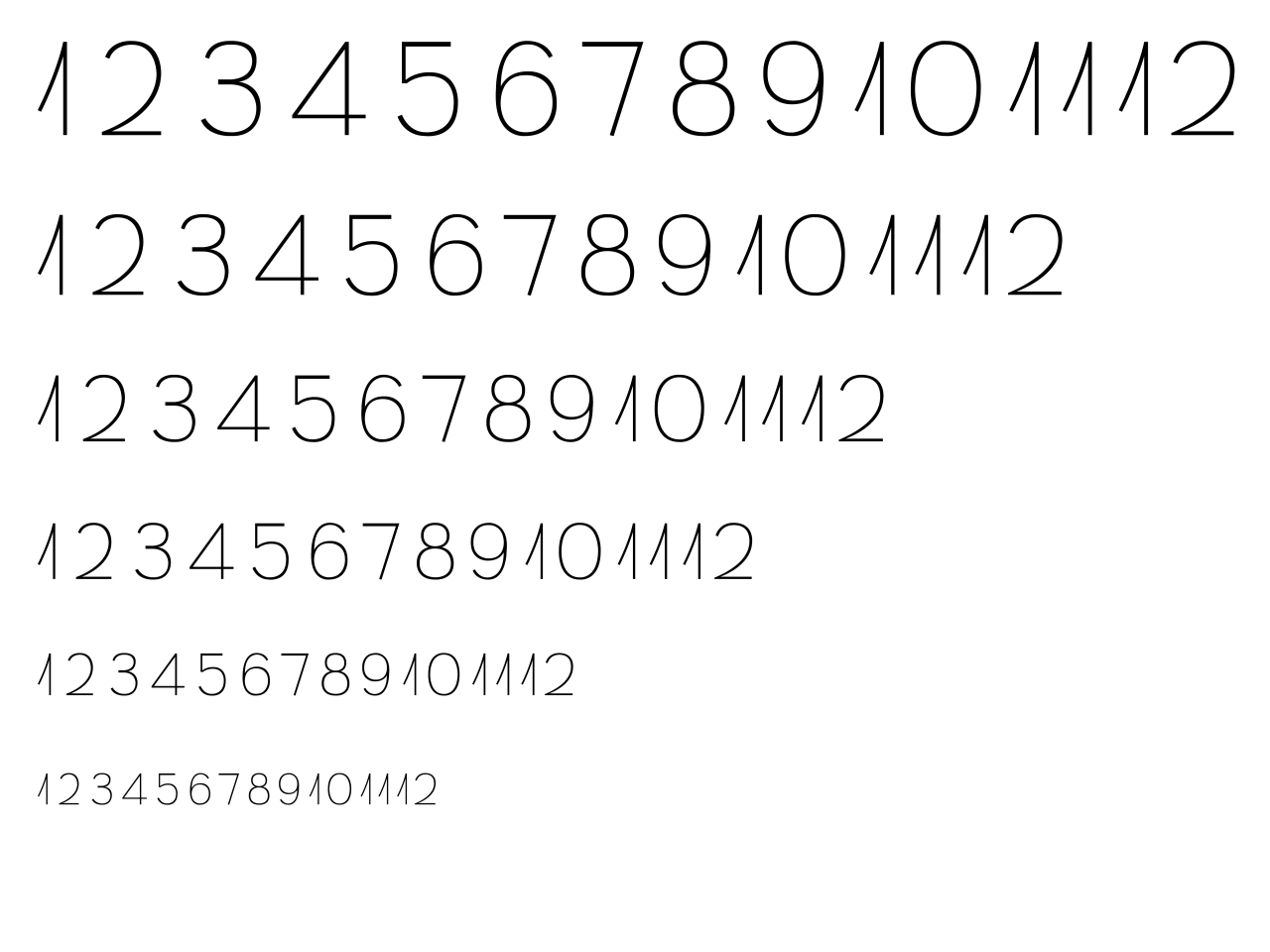
I looked up and saw God’s design: clouds, stars, rain, snow, birds, all light in weight. So I designed the typeface to match. Black numbers on white, minimal, light, thin.

A typeface drawn for this face.

The numbers 1 to 12 in the custom typeface, at six sizes

Where it belongs

Made to be enjoyed, not consulted

Where it fits

  • School
  • Home
  • Office
  • Lobby
  • Library
  • Fashion store

Places where viewers relax and enjoy the clock, or expect to see exciting objects.

Where it does not

  • Hospital

Viewers there care more about the time than about the clock design.

Inside

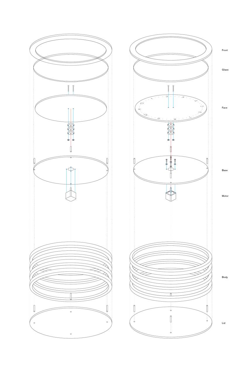
Seven layers and a motor

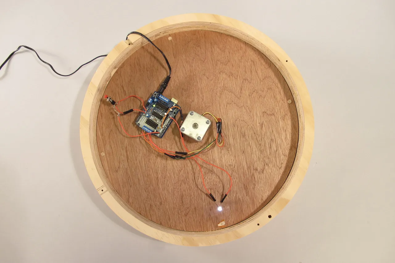
Behind the face sit a stepper motor, a microcontroller board with a motor shield, and an LED.

Exploded drawing of the clock in two views, with the parts labelled Front, Glass, Face, Base, Motor, Body and Lid
The back of the clock with its cover off, showing the stepper motor, the circuit board, the wiring and the LED
Inside of the clock
  • 1. Front
  • 2. Glass
  • 3. Face
  • 4. Base
  • 5. Motor
  • 6. Body
  • 7. Lid

Final outcome

The clock running

Closing

Time doesn’t have to move the way we expect.

2011/12/09

More Design Translation